
When you open your front door and step into your home, the first zone you’ll see is the hallway. This space will set the tone for the rest of your property, so it’s essential that you plan the design carefully. Do you want an open arrangement that will lead out to a contemporary zone, or do you want a more cosy space that links to multiple separate rooms?
Your hall will be a high traffic area that must be as functional as it is stylish, in order for it to connect to your home in terms of design, work for your lifestyle and deliver on practicality. Here we talk to the experts to get their top tips on how to create the ideal space.
One of the first things to avoid is creating a maze. “You should be able to read the building and not have a corridor that changes direction and feels like a warren,” says architect Ian Phillips from Van Ellen + Sheryn.
If you want to create an attractive environment that sets the tone for the rest of your home you can design your hallway to give you unobstructed views straight through the property. This is a great way to connect the interior with the exterior and blur the boundaries between both zones.


If you are self-building a small property, try to keep the hallway as simple and practical as possible. “You don’t want to have an excessive amount of space dedicated to it, as it can become unused and redundant,” says Ian. As long as you give consideration to getting the balance right and apportion a space that is relative to the rest of your home, the hallway should work well.
For narrow areas Building Regulations require a corridor width to be a minimum of 900mm. At ‘pinch points’, for example where there is a radiator, this can be reduced to 750mm. If you would like to make the home more accessible to all ages and abilities, aim to exceed the measurements given above.
In a smaller space, careful planning and orientation will be beneficial. If your stairs lead straight to the front door, you could add a return at the very end to ensure that it is not the first thing that you see upon entry.
“You should give some breathing space before you meet the staircase and don’t want to walk straight into it. A small area where you can step in and take off your shoes and outerwear before you walk into the main entranceway is ideal,” says Ian.
“The hallway is the central hub of the home and everything comes off from there. It is the first point of entry to the building so whatever size it is, it needs to have that wow factor,” says architect Laurie Scott from AR Design. “Light is one of the greatest factors in design because it is naturally uplifting. If your space has a limited amount of brightness there are several ways to increase it, for example by adding a glazed panel by the main entrance door.”
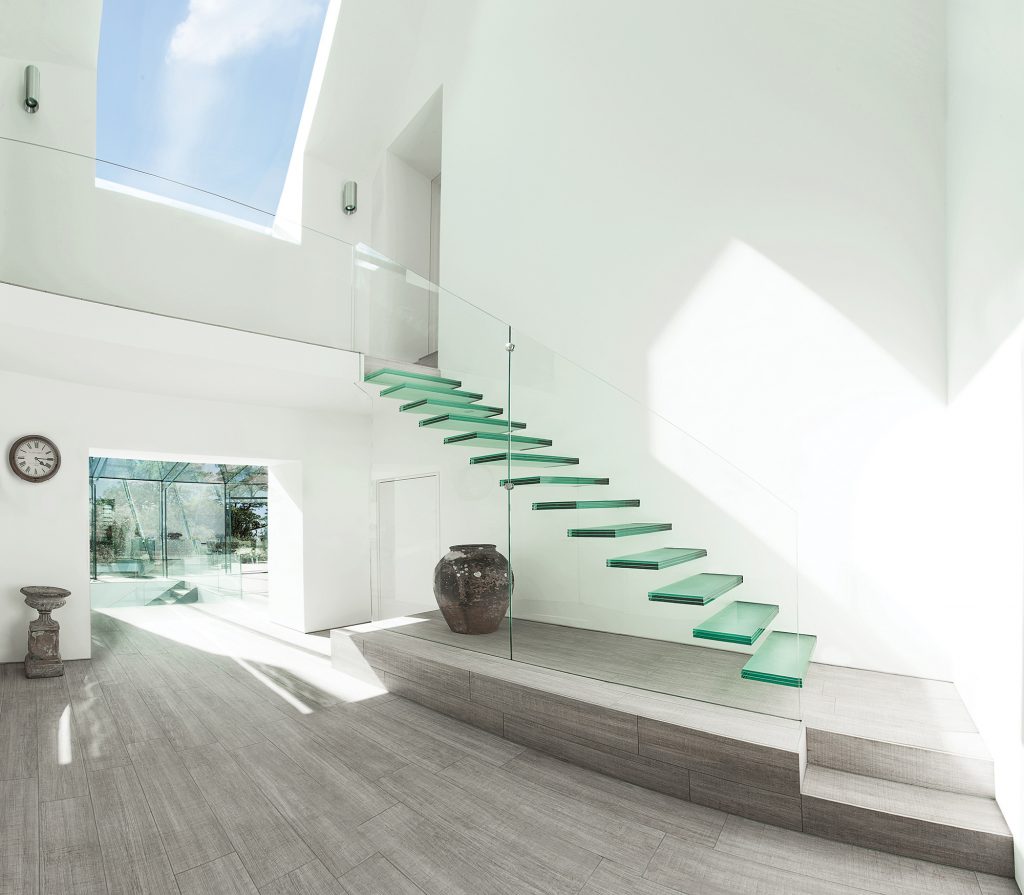
You can use your staircase to boost natural light, too: try open or glazed treads and pick pale or reflective finishes. You could even use a portion of the upper storey to create a roomy double height zone, or should space not allow this then consider using a glass floor for a section of the ceiling to let sunshine filter through.
In terms of artificial light, installing a home automation system can make entering your home a real experience, while saving on energy at the same time. “Use motion sensors that will turn lights on when you enter the space or off when you leave it. The detection system can be set to turn off after 10 or 20 seconds. Perhaps even more effective and accurate are pressure pads, which will trigger your illumination as soon as you step into the zone,” says Daniel Knight, technical director from Fibaro.
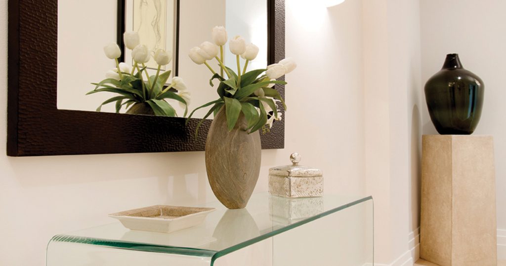
Don’t forget that finishing touches can work wonders for making your entryway really feel like home, so make use of it and don’t let it become dead space. “Leave enough room to have a chest of drawers or a console table to put your keys on when you enter the zone,” says Ben Bambrough, interiors expert from bB Design House. “You can open a space up and make it appear much bigger by placing a large mirror on the wall and other reflective furniture in the zone”.
If you have a good amount of natural light then why not create a statement in the hallway with paint? “Just use a dramatic colour like purple, which is very inviting and warm,” says Rebecca Williamson, colour and design manager from Dulux. “You should especially look for a hue that has elements of red in it”.
If you are restricted with the amount of natural illumination that you can bring into this zone the Dulux Light + Space range offers pastels hues that are designed to reflect light particles around the room. “These colours will immediately lift the space and you can still choose warm, soft shades such as the peaches and pinks so that you instill some variety and personality into your scheme,” says Rebecca.
Photo: Dulux MixLab Twilight Cinders paint used in characterful entrance space


Comments are closed.