Learn from the experts with our online training course!
Use the code BUILD for 20% off
Learn from the experts with our online training course!
Use the code BUILD for 20% offThe crunch point of a house design – the first time that all your ideas and hopes come up against hard reality – is when the initial scaled plan is drawn up. This is because, whatever the budget, most of us would like a larger house than we can afford and it is painful when a size limit has to be set. Obviously the larger the planned building the more it will cost, but it is impossible to predict the exact price of each square metre.
To start the planning of a house, the money available for its construction is estimated and divided by a realistic £/m2 rate that allows for the desired level of construction quality. This calculation produces a total floor area that can be divided into separate rooms.
At this early stage it is quite difficult to imagine what areas described in square metres will actually look like in reality and whether they will be appropriate. But sharing out the space between rooms efficiently is essential to make the best use of your money.
A good starting point is to measure rooms that you know well and decide roughly how much larger or smaller you would like the new ones to be. If you have tolerant friends and relatives you can even try getting the tape measure out when you visit their homes.
Some branches of Ikea have life-sized mock-ups of apartments filled with their products, with the total floor area helpfully displayed. This is a useful way of getting an impression of how square metreage might translate into a completed building.
Don’t expect to learn much by visiting the show homes of any housing estates under construction in your area, though, because newly-built houses in the UK are the smallest in Europe. A recent study by the RIBA found that on average, they are 92% of the minimum recommended size (see the table below for a list of baseline sizes).
Many of the volume house builders get around this inconvenient truth by having show home furniture built to an artificially small size, which gives the illusion of more space. A better option is to identify your own favourite chairs and tables, measure them and then ask your designer to draw them to scale on the plans so that you can clearly see how they will fit into the new rooms.
If you want to go a step further you can take a leaf out of the architects’ book and use room data sheets. These are intended for large building projects to ensure that the plan is efficiently designed but they can be easily adapted to a smaller scale of house plan.
A sheet is prepared for each zone, listing as much detail as possible about its use and contents to aid a designer when advising how much space will be needed. They can be completed well before the design process begins and each family member can have a sheet for their own rooms.
Taking this approach doesn’t necessarily mean that you should limit each area to a size just big enough for its contents, because aside from practical requirements there are aesthetic judgements to be made. For example, you may wish to make a room spacious so that it feels relaxing or even luxurious.
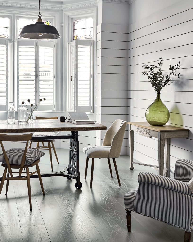
Design techniques can also come to your aid when an area is smaller than you would prefer. Light-coloured finishes to the floor, walls and ceilings make a space appear larger than darker tones. In a similar way, providing lots of natural and artificial light gives the illusion of spaciousness. Large mirrors offer a crude but effective way to do this, especially in very small zones.

If you want to see how well these techniques work, visit one of those show homes and as you go around it, turn off all the lights (which will usually be on even if there is bright sunshine outside) and see how the rooms appear to shrink as you do so. My personal record for doing this is 15 different lamps and lightbulbs in one living room (that was before I was pointedly asked to leave by a sales rep).
Another way to make a house seem larger is to make the principal downstairs rooms open plan. In addition to creating one large space, floor area that would otherwise be set aside for hallways and corridors is absorbed into the whole.
Just as important as the square metreage is the shape of a room. The uses of an average sized living zone may be limited if it is in an L-shape because this tends to split the space into two parts, and circulation routes are increased.
But the same configuration can work quite well with very large areas where it can be used to separate different functions, perhaps differentiated by a change in the finishes and lighting rather than with walls. Likewise, a room plan that is too long and narrow will feel cramped, with much of its volume wasted on circulation space.
If the floor area that’s needed for movement between private zones (such as on a first floor) can be reduced, the space saved could be added to bedrooms or bathrooms. But actually, if it’s possible to bring extra space to the hallway and stairwell it will make a house seem larger, especially to guests visiting for the first time.
Efficient planning of circulation around the house is so important that it is often the starting point for a designer devising the plan. A popular method is to have a central location for the staircase, hall and landing with the rooms radiating off and corridor runs made as short as possible.
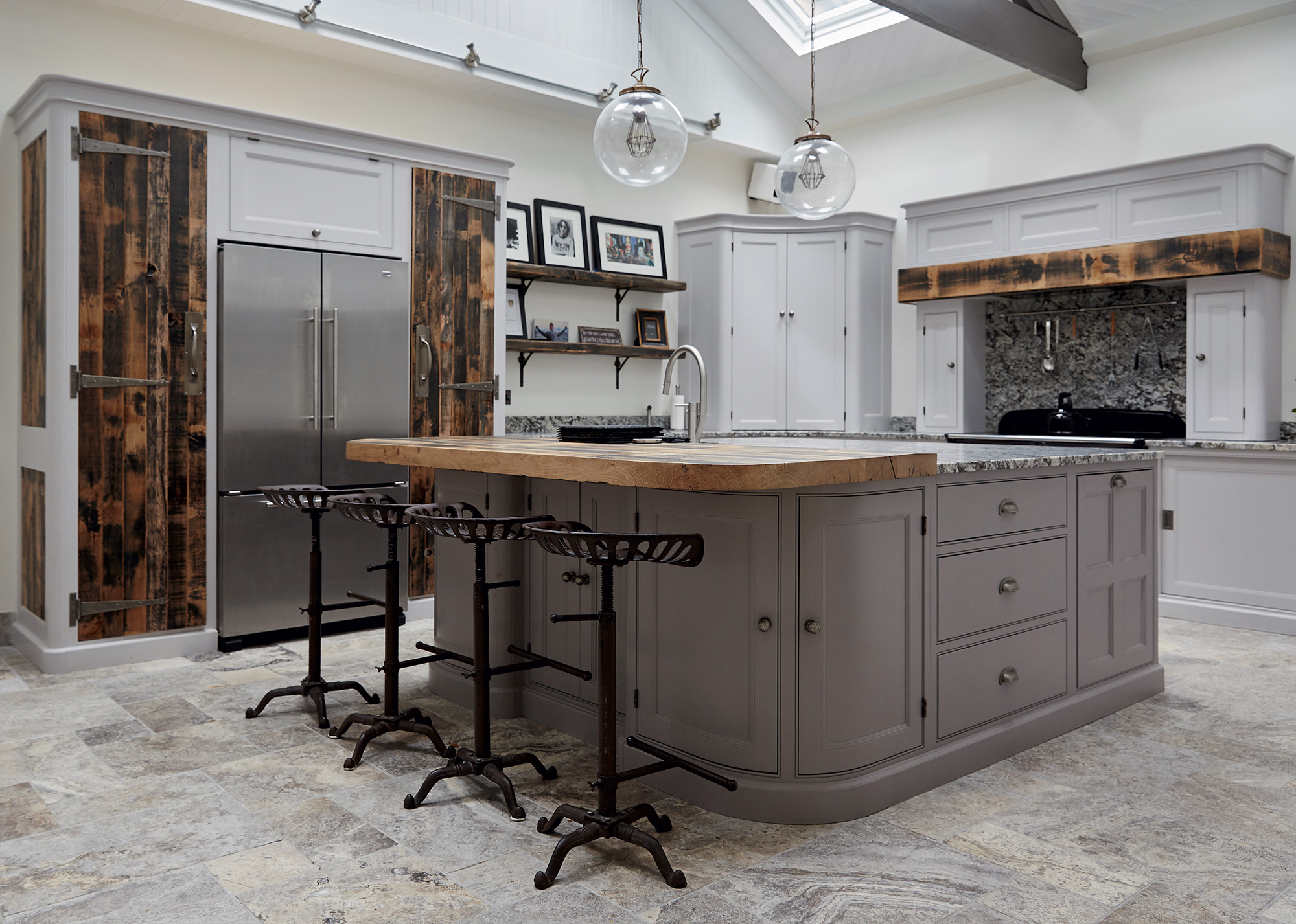
When it comes to individual rooms, the designer needs to have a very clear idea of the likely contents and their use, to ensure that the shape and size are at an optimum. In many ways kitchens are the most complex to plan because there are so many activities to cater for and there is a great deal of movement involved when they are in use.


A key consideration for this zone is how many people will be preparing food at any one time. If it is likely to be just one person then the layout can be more compact, which will make moving between the cooker, sink, storage and food preparation areas very efficient.
If there are to be several people working at once it can be inconvenient (and even dangerous) if there is not enough room for them to move around each other carrying such things as knives and hot saucepans. It is easy to underestimate how many gadgets are to be found in a typical modern kitchen, all of which need room on the worktop with nearby power sockets, so it is worth listing all the kettles, coffee-making machines, food processors and other appliances that may have to be accommodated on the surfaces.
Linked to the planning of the kitchen is whether a utility room will be needed. It can be a useful interface with the garden and isolate the noise and moisture generated by clothes washing from the rest of the house. But modern appliances are quieter than they used to be and driers reduce the need to hang up clothes inside in winter, so it may be better to incorporate them into a larger kitchen.
Quick guide: Minimum internal floor areas recommended by ShelterOne-bedroom flat (one person): 37m2 Three-bedroom flat (four people): 74m2 Two-bedroom house (four people): 83m2 Three-bedroom house (four people): 87m2 Four-bedroom house (five people): 100m2 Four-bedroom house (six people): 107m2 |
A working bathroom can be crammed into a surprisingly small space and the current trend is to provide new houses with tiny ensuites to all the bedrooms in place of a family bathroom.
This may be a missed opportunity because there is a definite element of luxury to a sizeable main bathroom, offering space in which to move around without bumping into the sanitaryware.
Perhaps the ultimate in pampering is to relax in a freestanding roll top bath with a book and the radio on, even if it means that the kids may have to wait for their turn.
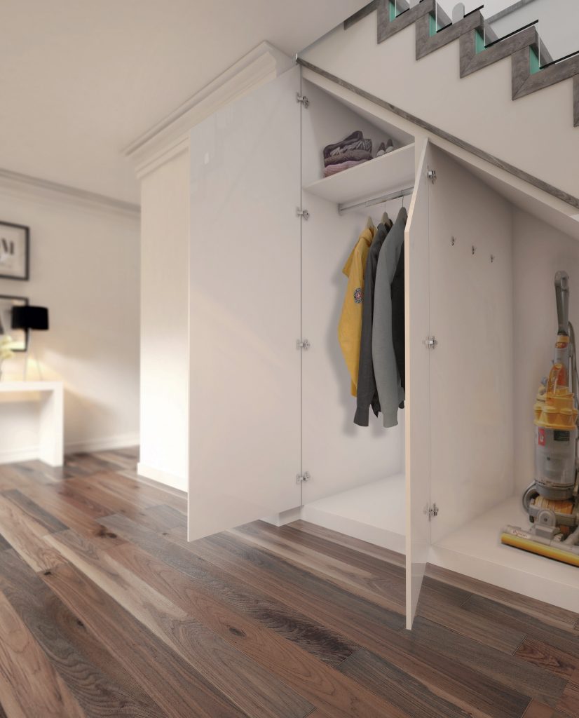
An often-overlooked aspect when devising a house plan is storage. Few of us want all our possessions out on display, so make sure to include neatly built-in cupboards and other voids such as attics for them to be put away. Otherwise they will pile up in the rooms and undermine any attempt to create a calm, clutter-free home.


Comments are closed.