Learn from the experts with our online training course!
Use the code BUILD for 20% off
Learn from the experts with our online training course!
Use the code BUILD for 20% offArchitect Tim Bayman says that the key to converting and renovating his own home was that nothing was expensive. “I like the ethos of buying off-the-shelf things and creating something special with basic materials,” he says.
The Edinburgh house was the first project he tackled after founding his fledgling practice, Tim Bayman Architecture, and saw the transformation of a former shop unit into a family home for him, his wife Lizzie and their young son (plus George, the family spaniel).
Tim not only designed the radical redevelopment but was also responsible for a lot of the hard graft. He worked alongside Guy Scott, a fellow architect who decided to leave a large practice and go solo as a joiner rather than a designer.
“I knew the scale of the job that Guy and I would be able to take on and we spoke about which bits we’d need the builders for,” says Tim. “Meeting the tight budget informed the design and planning quite a bit.”
Tim decided to take the plunge immediately after purchasing the property near Edinburgh city centre. It’s an odd former shop unit attached to a Victorian terrace that had already been converted into a dark single storey (with basement) semi-detached house in the 1980s.
“We had a maximum budget of £230,000, which would have just about afforded a small Georgian or Victorian terrace apartment in the neighbourhood,” says Tim. “But when I first visited this place I took some general dimensions and realised that, at 96m2, it had a bigger footprint than many residential properties on the street. I put together some ideas and spoke to the planners, who said that anything would be better than what’s there now!
“The 1980s conversion tried to make it house-like by taking out elements such as the large glass window at the front of the building, which cut out all the light,” continues Tim, who adds that his proposition did not enamour wife, Lizzie at the time: “When I showed the schedule to my wife, she said ‘No way!’ immediately.”
However, he managed cajole her to the point of buying the place for £161,000, which left a little under £70,000 to bring the property back to life after its botched conversion. “It wasn’t a huge budget for a complete refit of a house, with the additional cost of a mezzanine and a new roof, so that’s why it made sense to try to build as much as possible myself, with the help of Guy.”
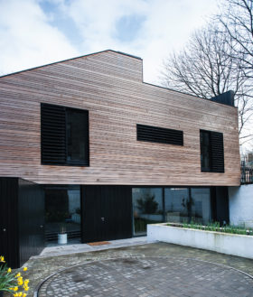
Central to the project was the idea of reintroducing light back into the building, which meant reinstating the large shop front window at the house’s facade. Adding a new steel pitched roof was also key.
“The roof is a standard product that is often used in supermarkets and big industrial sheds,” says Tim. “We bought it directly from Tata Steel, which makes it in big long sheets. The only drawback was that we needed just a tiny amount; it turned out to be nearly as expensive to have it delivered to site as it was to buy the raw material, which was frustrating.”
The new pitched roof, in combination with utilising neglected space over a dropped ceiling, means that natural light has once again been channelled back into the building. Opening up a void under this new facade glazing, and moving the staircase from the centre of the plan to this void, has also funnelled light into the basement and freed up the centre of the plan for living spaces.
The new open-plan home and studio features an entrance-level living, dining and kitchen area, with a bathroom and guest bedroom tucked in at the far end of the house.
The yellow painted steel staircase zigzags up to a new mezzanine level office area, while a bespoke plywood flight leads down the basement living room with woodburning stove. The underground storey also features an en-suite master bedroom.
Tim and Guy completed the interior refit over a five-month period. “I needed a builder for the structural work and Inscape Joinery did a fantastic job for a contract sum of just £37,316,” says Tim. “The builders completed all the structural elements, such as the external wall insulation, cladding, windows and doors. They were also responsible for all the structural steelwork for the mezzanine and the hole in the floor where the light comes into the basement, as well as building up the stone wall outside.
Following the main structural works, Tim was left with just over £36,000 to cover the flooring, joinery, electrics, plumbing and heating as well as all the fixtures and finishes. “To keep the project affordable, the ethos I established at the start was that inside everything would be plasterboard, glass, yellow painted steel and plywood,” says Tim. “We kept costs down as we found that general builders’ merchants will invariably give you discounts when you buy materials directly from them.”
“The stainless steel staircase is fairly crude − deliberately so,” continues Tim. “I approached it from the point of view that I wanted to do just enough to finish the job, if you like. I don’t need to take it beyond where it needs to be. It was manufactured by Gordon Bow Engineering, which supplies steel to Inscape Joinery. We gave the company the drawings and it arrived with a stringer and the individual treads and it was welded on site.”
This economical approach extends to the fixtures and finishes, including the Ikea kitchen, which came in at around £1,800. “In the bathroom we’ve used Trespa panels, which are usually used as cladding or to kit out changing-room cubicles at local swimming pools. This is more expensive than tiling but it only took us two hours to install and is zero maintenance. We knew we’d get a good finish without having to be great craftsmen. Again it’s that economical, ‘just enough’ approach.”
Overall this robust approach to the build has worked remarkably well. However, in retrospect Tim admits that he might have changed one or two elements of the project.
“What’s missing and what will eventually be done is that the things you touch – such as the handrail to the stainless steel staircase – should have more tactile qualities; so eventually the banister will have a warm piece of wood added. Interior finishes should be nice to touch,” he says. “One other thing is that I would also have installed underfloor heating in the basement rather than radiators as we discovered that there is an insulated slab there already.”
These niggles aside, Tim says he has no regrets. “As an architect, it was great to be involved in the actual hands-on joinery work, from rough framing to finished birch ply bookshelves. For a profession that designs buildings, it can be easy to get lost in the structural specification and overall design and lose touch with the buildability. I enjoyed the experience – if size becomes an issue and we need to move, we’d like to build somewhere from scratch next time.”

