Early Bird Offer! Free tickets to meet independent experts at this summer's Build It Live
Save £24 - Book Now!
Early Bird Offer! Free tickets to meet independent experts at this summer's Build It Live
Save £24 - Book Now!Apart from its colour, the aptly named Black House is barely noticeable to passers-by. No wider than a garage door and tucked between period houses, it’s easy to drive past without giving the property a second glance.
Yet, this modest frontage disguises one of York’s best kept secrets.
Through an enclosed, cobbled street and past a compact car-turning circle is a door that opens into an ingenious and very private four-bedroom family home.
With accommodation spread over three storeys, Michael and Erica Hammill have used extraordinary design and industrial materials to link the building’s history as a commercial mechanical garage to its new identity.
|
This home won the Build It Awards 2019! |
The couple initially spotted the old garage in an advert placed by a local estate agent. It’d been empty for 10 years and another developer had tried to buy it and turn it into student accommodation. These plans had been rejected, largely due to the fact that the property
was positioned in the middle of many single, private houses.
Many people would not have had the vision or the imagination to take on this project, but with Michael having done up and lived in around 30 homes, he saw the potential.
Before the Hammills took the plunge and bought the garage as an empty shell, it was dark, cold and damp. Parts of the roof were missing, there were oppressive steel beams spanning the former workshops and pigeon droppings congealed on the floors – yet Michael was undeterred.
“I could visualise how it could look,” he says. “There were so many aspects of it that Erica and I liked, including cobbled floors, huge timber A-frames and beautiful old brick walls. It was rotten and falling down in places, but the essence was all there.”
While the previous owner had his plans to carve up the garage into a multi-accommodation block rejected, he had achieved permission to reconfigure it into a family home with living rooms downstairs and bedrooms upstairs.
But Michael saw this traditional layout proposal as a missed opportunity. He applied for planning permission to convert the garage into a more contemporary home. He flipped the plan on its head by bringing the kitchen, dining and lounge areas onto the first floor, into the heart of the property.
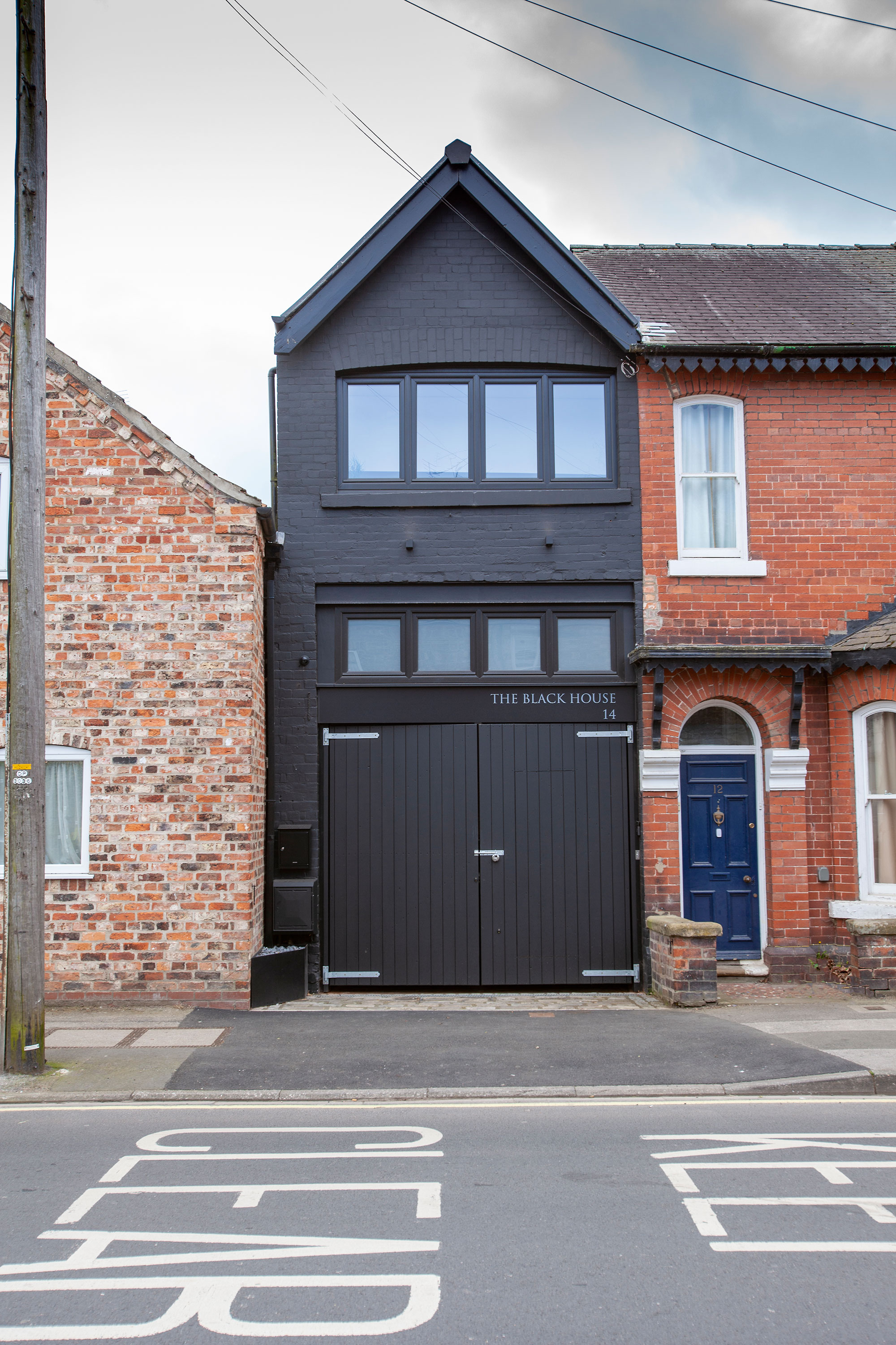
The garage conversion is unassuming from the outside
It took nine months to get planning consent for the new design, which came with around 20 conditions, including the requirement for a bat survey and permitted development restrictions.
“To me, it just made sense to have the main living area where there was most natural light, the best views, and the most interesting architectural features,” says Michael. “I loved its character, which really whet my appetite – although that’s not a sensible way to approach something like this, because it’s easy to get carried away.”
In fact, Michael ended up underestimating the cost of the project. “I hadn’t taken into account things like the masonry repointing; on a building of this size and nature, it’s a massive undertaking,” he says.
Michael, a chartered surveyor, brought in a build team that he had partnered with on many previous projects.
“We’ve worked together for years on a variety of schemes. They understand the need to consider the effects of their work on following trades,” he says. “They adhere to design drawings to the millimetre, so the outcome is extremely high quality and raised above ordinary level.”
The first task was to clear the building of debris and assess what was salvageable and what needed replacing. Many of the original beams and wall posts were rotten. However, the main trusses were in good enough condition to bring back to life with a high temperature, bacteria-busting steam cleaner.
The rafters and slate roof all had to be replaced and the entire roof needed insulating. Michael did manage to save the original overhead windows and reused ridge tiles, as well as some of the slates within the main roof structure.
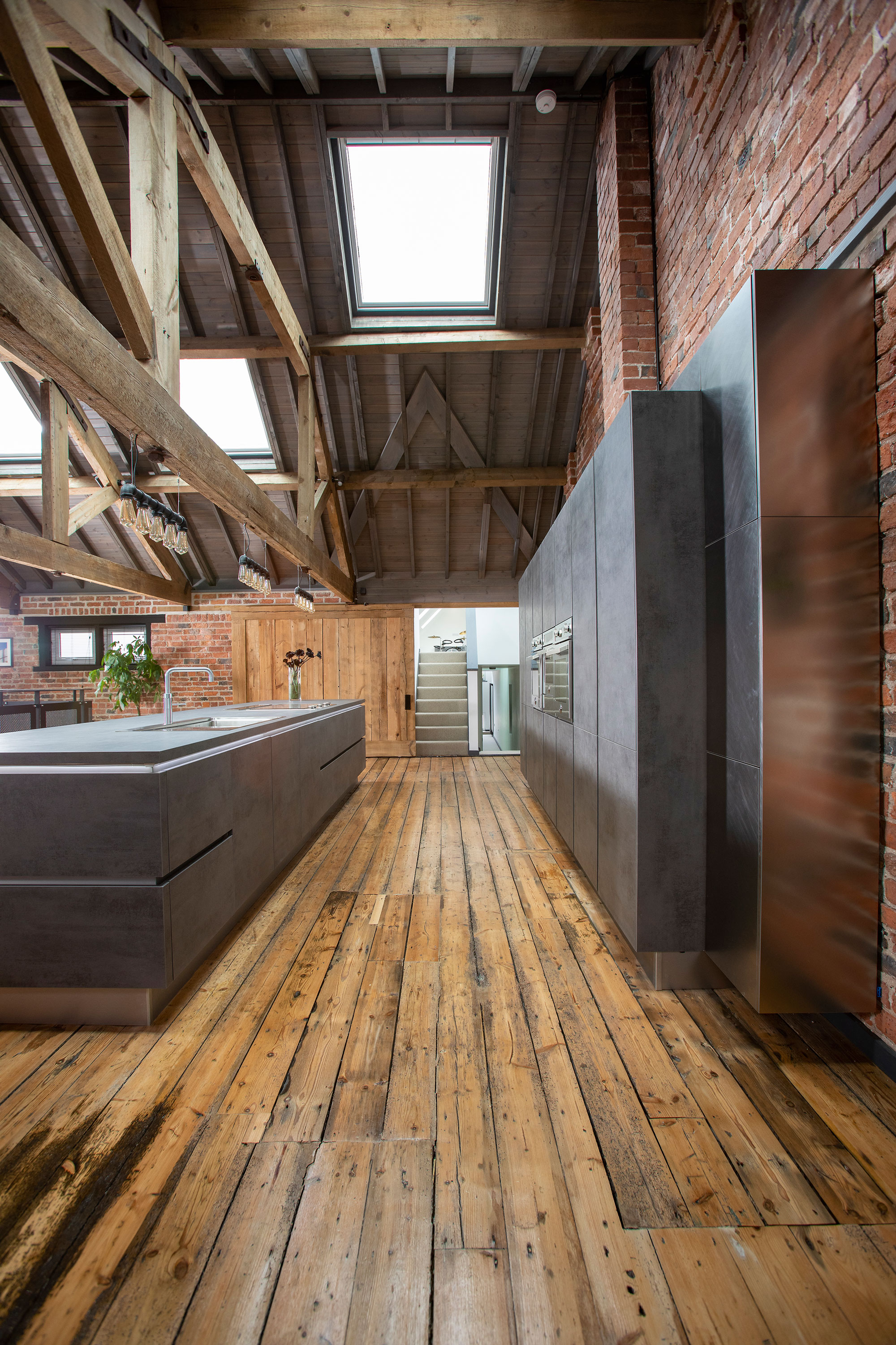
The streamlined kitchen units come from Kutchenhaus, along with laminate worktop
“The neighbours were really helpful in terms of providing access to put the scaffolding up,” says Michael.
The floor of the property was in disarray and without a damp proof course, so large sections of it were dug out and levelled, plus drains put in for the bathrooms. In places where pigeons had created mess or oil stains permeated the floors, the boards were sand blasted clean. Most of the debris was wheelbarrowed out and taken off-site in a tipper truck.
“Having changed the original design, I decided to create an outdoor space on the first floor,” says Michael. “The terrace is over the main bedroom, so we’ve reduced the ceiling height from 2.9m to 2.4m. This allowed more wall height and privacy on the patio.”
The outdoor area has a new floor structure, including a layer of fibreglass and decking. The old joists were salvaged and re-used in repairs to the upper floor. Surplus materials were turned into a headboard, coffee table and internal sliding gate.
One of the biggest challenges was installing the cantilevered staircase. It leads straight up to the main living area from the ground floor which houses most of the bedrooms and bathrooms.
While Michael was happy to shift massive steel beams, rearrange floors and leave great swathes of the building’s industrial heritage un-modernised, he almost met his match with this feature flight.
“It’s one of the first things you see when you walk through the door and I wanted to create something stunning – a statement piece,” he says. “It tested us all. It came in four parts and the material is so heavy it’s a dead weight, and it had to be forklifted in.”
The heavy treads are cantilevered onto long, strong metal beams hidden in the wall and the metal balustrade was perfectly measured to achieve the right angles and proportions. The staircase alone cost £15,000.
Numerous huge steel beams, each 300mm deep, were taken out and buried in the concrete floor at ground level because they were too big to take off site. Others were repositioned to create the various floor levels of the main living space.
The industrial brick walls were cracked in some areas but these were mesh secured, rebuilt and repointed. Light pours into the building via large Velux rooflights. The bespoke metal balustrade separating the kitchen-dining zone from the lower sitting area maintains the open style of the split level room.
There are further half levels off this main living space, accessed through a huge sliding wooden door. On one storey, these lead to a bedroom, dressing area and twin shower room, and
a multi-purpose games room tucked into the roof space on another.
Michael and Erica are thrilled with the outcome of their project.
“Although it was originally an industrial building, our home has such warmth and character. It’s easy to forget that it was once full of cars and mechanical paraphernalia,” says Michael.
“We love the fact that the main living area is really light and open and that we can walk directly out of the sitting area onto the terrace. Although it’s close to the centre of York, it’s very private and peaceful.”
Key learning points from this conversion project
|
The couple are also pleased with how well the layout of the house complements their lifestyle. “We like the fact that the bedrooms are separate from the main living space and that accommodation is spread across different levels,” says Michael.
“It’s a very versatile home. Even though we’ve kept the furniture to a minimum it still
has a comfortable and welcoming feel.”
For Michael, one of the biggest challenges of this project was to ensure the proportions and were detailing right. “I wanted to get it absolutely correct, where different metals meet, for instance,” he says.
“Rather than hide joints I was keen to make them pure and simple, which meant they had to be really well finished.”
According to Michael, the true beauty of the building is in the fabric itself. “I love the textures and natural materials that work side by side to create this open, industrial look. It was never going to be a straightforward conversion, but it’s been immensely satisfying to have given a dilapidated old garage a whole new lease of life.”
