

When Linda and Vic bought a 1980s bungalow on the outskirts of Glasgow, they were keen to retain the spirit of the original building, with its prominent double gables on the front facade. However, its small, dark rooms and poor energy efficiency was a far cry from the sustainable, light-filled, open plan they envisaged.
“The house was built in 1985 and hadn’t been changed since then, but we could see its potential,” says Linda. “I liked its history, loved the frontage and knew there was an opportunity to modernise it. Although it would have been cheaper to knock down and rebuild – as we would have saved on VAT – I hate waste, so the last thing I wanted to do was demolish everything and start again.”
The house has a beautiful garden of nearly half an acre, which was what drew Linda and Vic to the property. “I was responsible for the renovation and interior design of our previous flat in the West End of Glasgow, so I had a vision for the modern look we wanted to achieve, with lots of beautiful clean lines,” says Linda. “It’s just the two of us, so we were looking for a larger house with bright, open-plan living spaces looking out to the garden, a leisure area with a pool table, bar and gym, as well as an office space to give us the option of working from home.”
Linda and Vic were keen to press ahead with updating and upgrading their new house as they were in the process of moving out of their previous home and didn’t want to spend too much time in rented accommodation. At this point, the couple were recommended to reach out to Farahbod Nakhaei of Glasgow-based NVDC Architects. The couple immediately established a close working relationship with him, allowing the project to move apace.
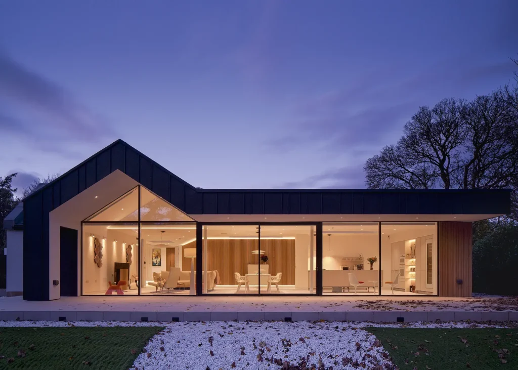
The open-plan space at the rear of the property has a strong connection with the outdoors
The architects initially looked at adding another storey to the bungalow. “To meet the brief in terms of their accommodation needs, we knew the footprint of the existing house had to be at least doubled,” says Farahbod. “Most people don’t like the word bungalow – it doesn’t sound very modern. But we determined that two storeys might be controversial when it came to gaining planning permission and would also take a lot longer to design and build. Since Linda and Vic were keen to proceed right away, time was of the essence.”
The new scheme retains the single-storey bungalow character of the house, but almost doubles the floor space from 150m² to 280m². An L-shaped extension wraps around the house with the two main bedrooms on the east elevation to catch the morning sun.
The 10-month project went on site in November 2022. In order to speed up the construction process, Vic and Linda appointed a contractor directly. “I’ve worked with Conturo, the main contractor, before and they are excellent to deal with,” says Farahbod. “Going through the tendering process would have caused delays, so the contract was signed straight away.”
| BEFORE The extension has completely opened up the house to garden, adding a vast, light-filled space that transforms the property beyond recognition.
DEMOLITION & CONSTRUCTION The existing building was entirely gutted, and large sections demolished. Some of the original walls have been replaced by the timber and steel frame structure shown here, which is ready for the zinc cladding to be installed. |
Access to the site didn’t present any real issues during the build. “The house is on a narrow, private road, so lorries would struggle to turn. But ultimately there were no major problems or delays,” says Farahbod. “The driveway is shared by two neighbours and they were very accommodating. The contractor kept everyone up to date with what was happening so that inconvenience was kept to a minimum.”
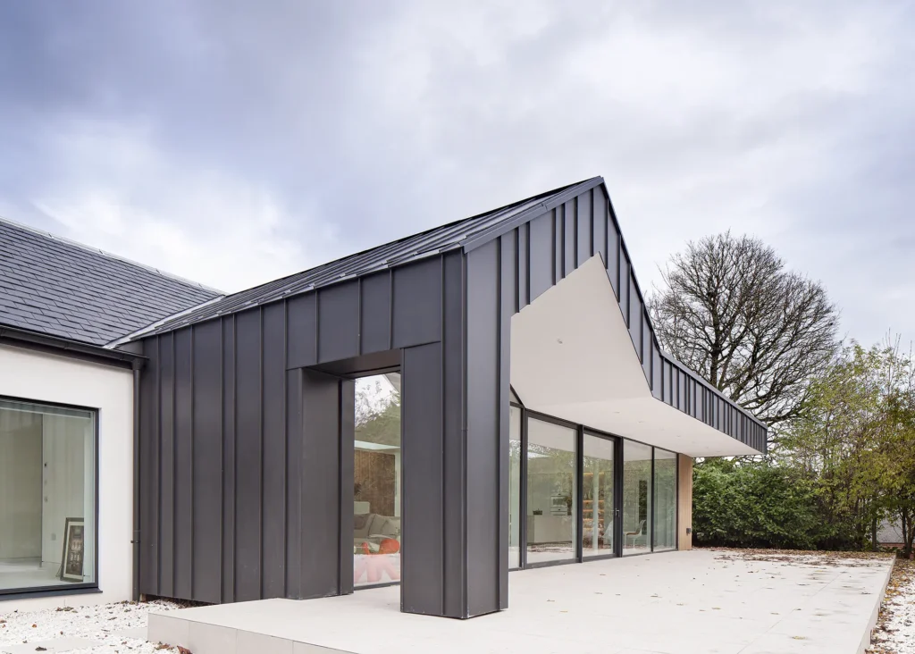
A combination of NedZink zinc from Copper & Grey Roofing and timber-effect composite cladding from Millboard gives the facades of the home a low-maintenance finish
The builders started immediately by carrying out the necessary demolitions and laying new foundations before the structures were erected. “We removed more than 50% of the external walls,” says Farahbod. Other than two external walls and the roof, everything was demolished internally. “We put in a steel frame to support the roof structure, as well as the glazed facade on the extension,” adds Farahbod. “With the steel structure, we were also able to achieve details like the glass corner in the master bedroom, which has a lovely aspect into the garden.”
The new house has three bedrooms, two of which have an ensuite, with the master having a sectioned-off walk-in wardrobe. It also has a large entertainment room-cum-gym, which can be subdivided into an additional bedroom in future if needed.

Rooflights from CRL make a huge difference in illuminating the space, bringing natural light deeper into a once dark and disconnected plan, as well as opening up views of the sky
The main living spaces, which features an open plan kitchen/lounge/dining area, is set behind double-glazed curtain walling to the south, which allows the Woods to take full advantage of the garden views. In the centre of the plan is a pod of ancillary spaces, such as the plant room, utility room, more storage and a spa. A wide hallway circles around this core zone to allow for fluid movement around the house.
Creating a seamless flow throughout the living spaces as a whole was a key consideration. “In the existing house, all the bedrooms and bathrooms were on a raised platform – three steps up from the lounge, kitchen and dining room, which would not have complied with accessibility regulations,” says Farahbod. The new design places three of the bedrooms and the bathrooms on the same level as the main living area, with the leisure spaces in the elevated section.
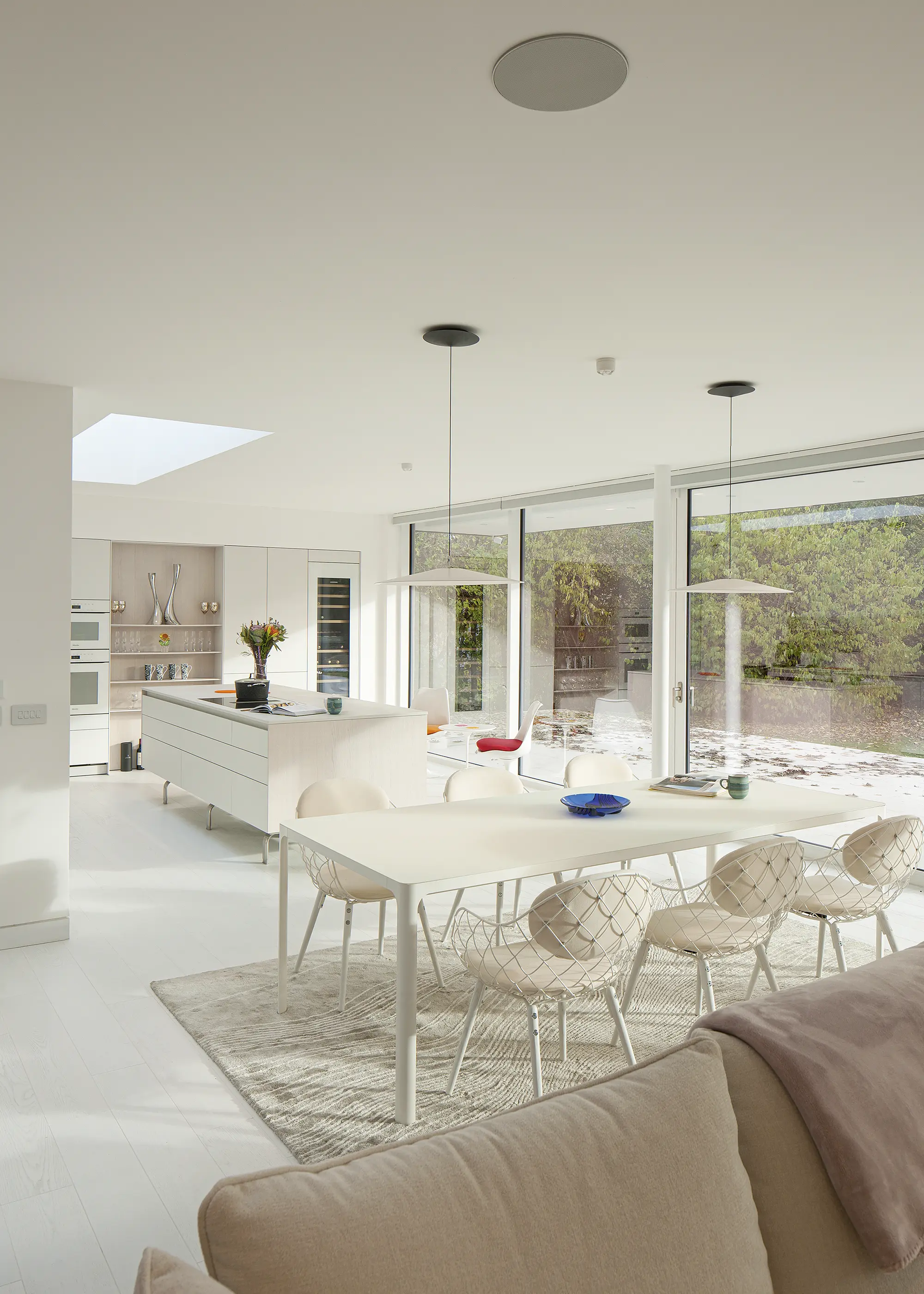
The kitchen design features clean, crisp lines and a mostly neutral colour palette, with the exception of a few intentional pops of colour from the interior decor
The patio outside the main living space creates a flush threshold between the newly landscaped garden into the interiors, which blur nicely into one another through the use of a light stone externally and a bright-white engineered wood floor inside. Oak wall panels introduce a contrast to the all white interiors of the main living space. Heritage-style internal glazing, constructed by the main contractor, separates the leisure room from the rest of the plan, creating a characterful feature for light to travel through.
CLOSER LOOK Low-maintenance external finishesThe extension’s zinc cladding was chosen for its clean, contemporary look, echoing the original slate roof. Its longevity and low-maintenance properties were also a factor in this choice. “We were keen to incorporate as many finishes that didn’t require much maintenance as possible,” says Farahbod. The timber-effect composite cladding installed at the front of the property is hard-wearing and weatherproof, echoing the interior wall panels for one unified design inside to out. The soffit also consists of a waterproof render finish applied to render boards. |
Another important detail for Linda was the ceilings. “Our previous Victorian period flat had amazing 4.5m-tall ceilings. My concern was that anything considerably lower would feel claustrophobic,” she says. To tackle this, Farahbod incorporated rooflights into the design, which have been strategically placed to illuminate deeper areas of the plan and create a sense of drama upon entry to the house. “It feels so much bigger and airier,” says Linda.
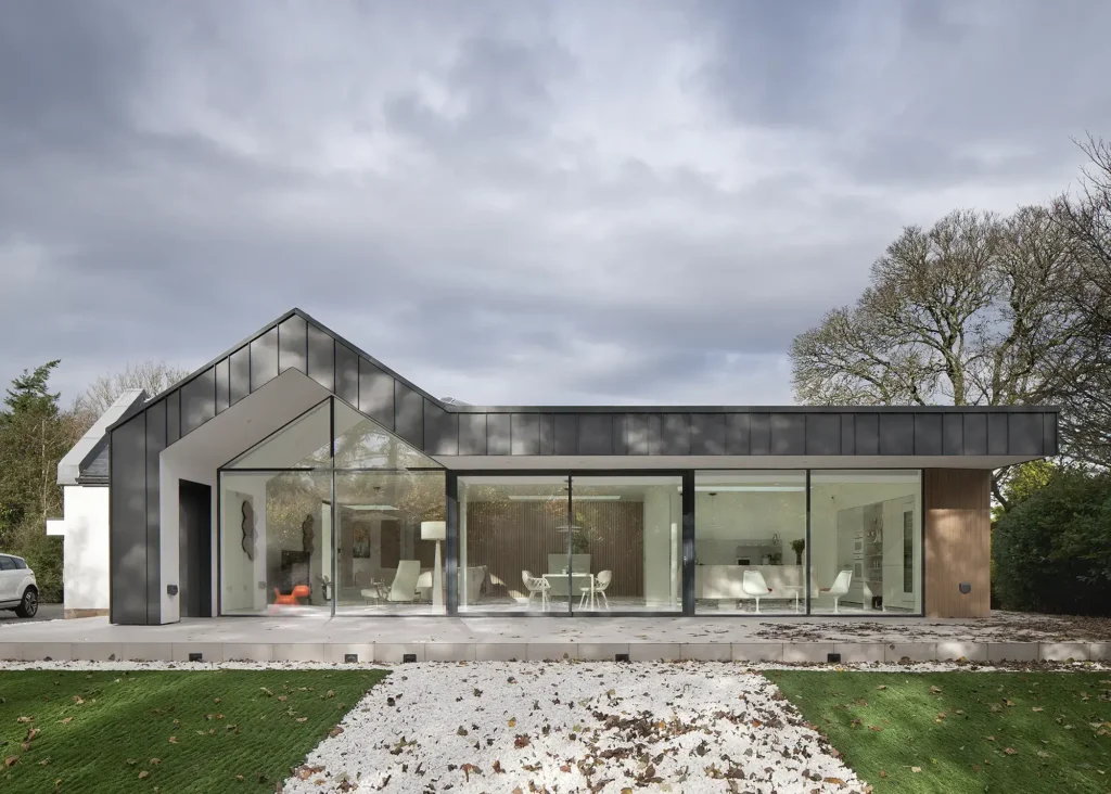
The extension’s zinc cladding was chosen for its clean, contemporary look, echoing the original slate roof. Its longevity and low-maintenance properties were also a factor in this choice
Optimising the build’s performance in the most sustainable way possible was central to Linda and Vic’s rationale. There was originally no insulation in the floors and cavity walls, and only 100mm of loft insulation in the attic – most of which had deteriorated due to condensation and leaks. So, the external walls were stripped back to the brick skin and insulated from the inside to meet current Building Regulations.
The floor coverings were also removed to install insulation both in between the floor joists and on top of existing concrete floors. What was left of the existing insulation was then replaced with new 300mm insulation.
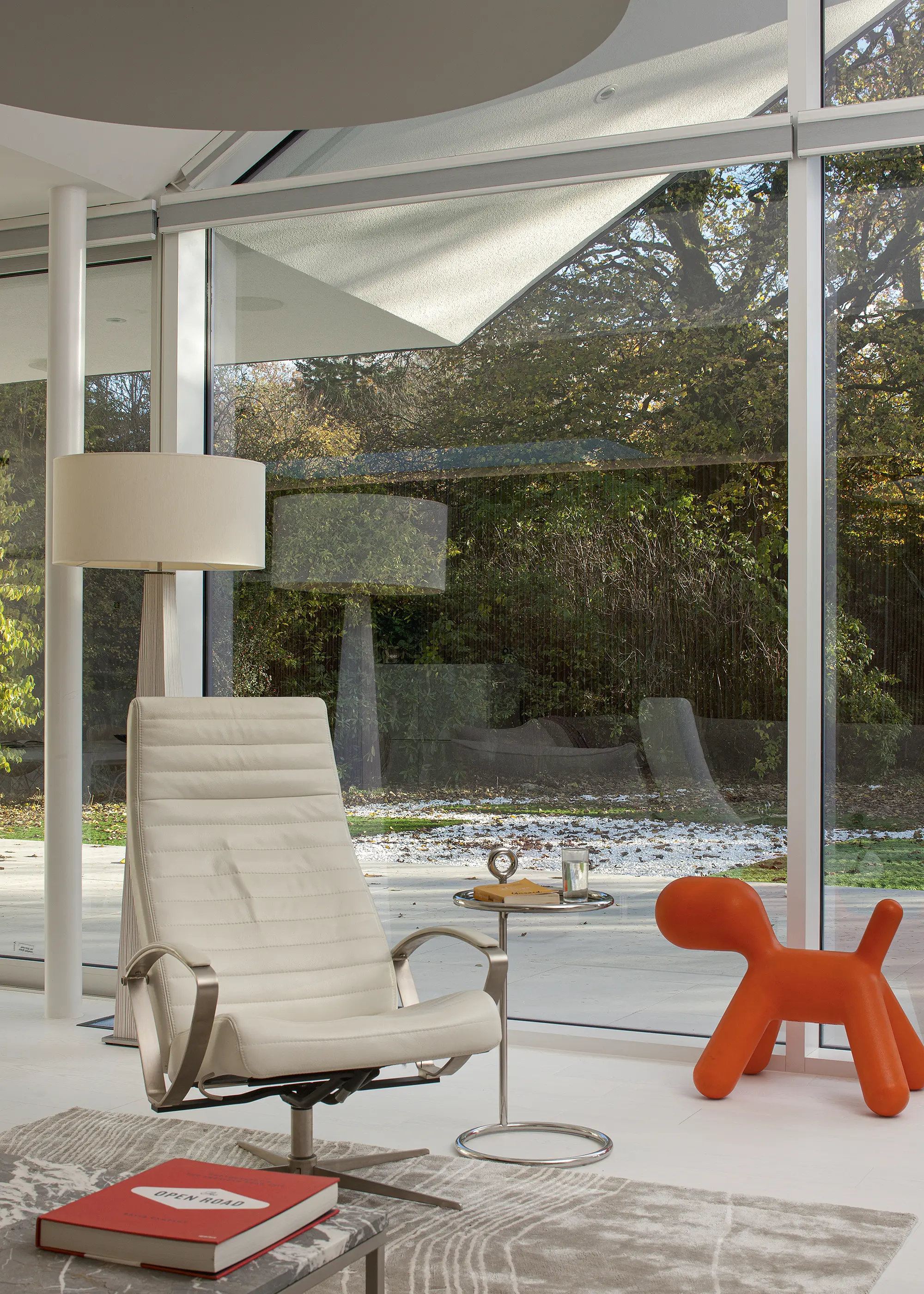
The apex window above the living room adds extra height to the ceiling for the lofty, airy feel that Linda and Vic were keen to achieve
All the windows were replaced with new triple glazed units from Rationel, with frames specified in RAL Anthracite Grey. The original slate roof was removed and upgraded, with new sarking boards laid with 5mm gaps and a breather membrane installed to provide sufficient ventilation in the attic space.
Linda and Vic also specified green technology for their home, such as an air source heat pump that powers their underfloor heating system. The vast swathes of glazing throughout the property, particularly on the south-facing facade, have been designed to limit excessive solar gains. The roofline is extruded to form a veranda that provides both solar shading and a sheltered outside space on the patio – ideal for the rainier days in Scotland.
The build took 10 months to complete, with the couple moving in last September, and they are delighted with the transformation of their new home. “It’s a place that’s full of sunshine, even on a grey day. The minute you walk in, you have the rooflight above you, which makes the entrance so bright and inviting,” says Linda. “The different materials throughout the interiors also help reflect the light, unlike the previous property, where wood panelling on the ceilings made it feel like it was closing in on you.” And, despite the home’s large footprint, it doesn’t feel too vast.
“It’s amazing to us that, although the house is almost 280m², it feels like everything is close to you,” says Linda. “We can see so much of the garden now that wasn’t possible before. It’s given us the lifestyle we wanted, and there is a real sense of calm through the house.”
WE LEARNED…
|