

The safest way to gain approval for an extension is usually to design it so that it is in keeping with the existing property. But on the other hand, you may want to be more adventurous and wish to transform a relatively uninteresting building into something more unexpected and striking. This needs a certain amount of courage because there is always a risk that a contemporary scheme will not look as good in real life as it does in your imagination.
Therefore a highly skilled designer is needed to ensure a pleasing end result. You will have to break away from the comfortable familiarity of traditional design and investigate the wide range of alternative styles available. But it’s worth the extra time and trouble, because your house will be transformed into the distinctive 21st-century home you’re seeking.
Take an early decision on whether you want to give the whole house a makeover, so that the end result is a complete modern design. The alternative is to build a strikingly different extension and exploit the contrast between old and new to dramatic effect.
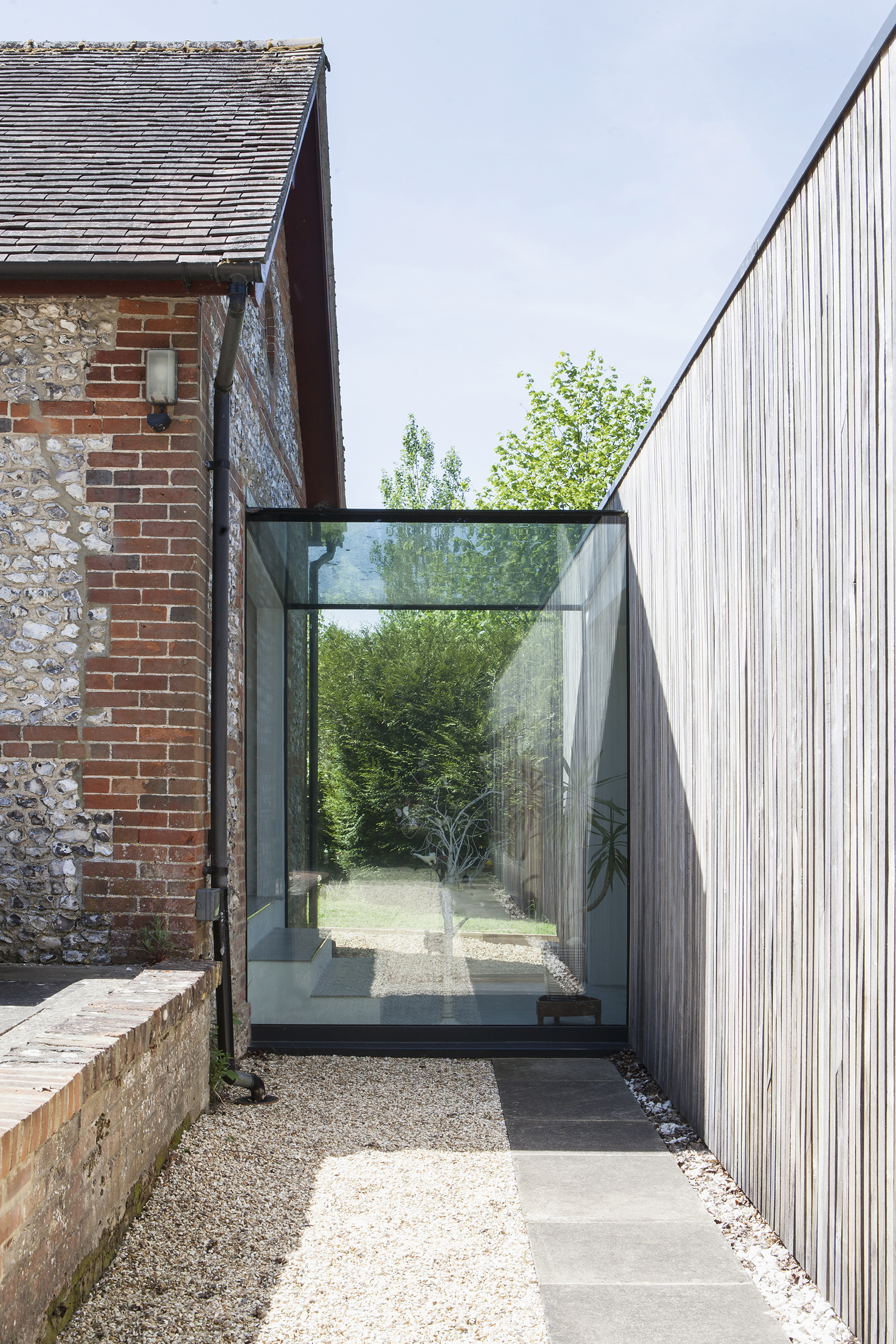
This glass link connects the contemporary extension to the traditional main building. Read the full story
For instance, if the existing building is a period property that already has an intrinsic charm, there is a danger that a new addition trying to match it will spoil its appeal. This problem can be solved by ensuring that the extension is a complete contrast in style and materials, to the extent that when seen together, the original looks like a separate building.
This idea can be taken further by using a glass link to join the two, which visually separates them, leaving the original part of the house uncorrupted by the extension.
Large open internal spaces will give a contemporary feel to the interior of a home and are also more suited to the way that many families – who prefer to relax, eat and entertain friends in the same large room – want to live now. By incorporating steel beams, you can remove existing walls and create open plan areas that break away from the limitations of separate rooms that are shut off from one another.
The new space created can be subdivided by changing the floor, wall and ceiling material to define the different uses within it. Another way of defining the zones is to change the levels of the floors and ceilings, or even remove sections of the ceiling to create double-height spaces, perhaps with a gallery to link to the first floor.
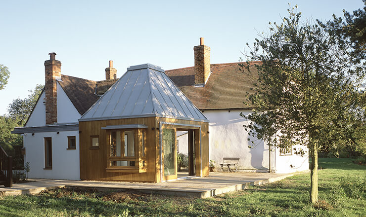
Jasmine Heaps’ house was extended by architect Jeremy King. The squared-off roof blends in with the existing gables, but the use of contrasting materials – oak and terne-coated stainless steel – make it stand out Photo: Charlotte Wood |
A refreshing alternative to the traditional row of standard windows lined up together on an elevation is to use large expanses of glass to break up the massing of the extension, as well as flood the interior with natural light. Just as effective is the incorporation of glass ceilings, rooflights or lanterns that maximise brightness and offer views up to the sky.
You can also control how natural illumination seeps into your interiors by using transparent and translucent internal walls. Glass blocks, slatted screens or blinds will filter the light and add depth to the spaces they separate.
Just as important is artificial lighting, which has come a long way from the 20th-century arrangement of a lightbulb hanging from the centre of the ceiling. LEDs, strip lights, spotlights, mini-spots, coloured bulbs and programmable designs allow even a very simple space to be transformed in the evening. Today, achieving a sophisticated lighting scheme that can adapt to your mood or to the changing use of a room need not be too expensive.
Smooth surfaces, with minimal details and clean, sharp junctions between the walls, floor and ceiling, are commonly seen in modern buildings such as hotels, offices and upmarket fashion stores but there is no reason why they shouldn’t also be used in a house.
Details such as skirtings and cornices (used in the past to conceal irregularities in junctions between walls) are unnecessary, and can be replaced with clean, sharp and precise lines where surfaces meet.
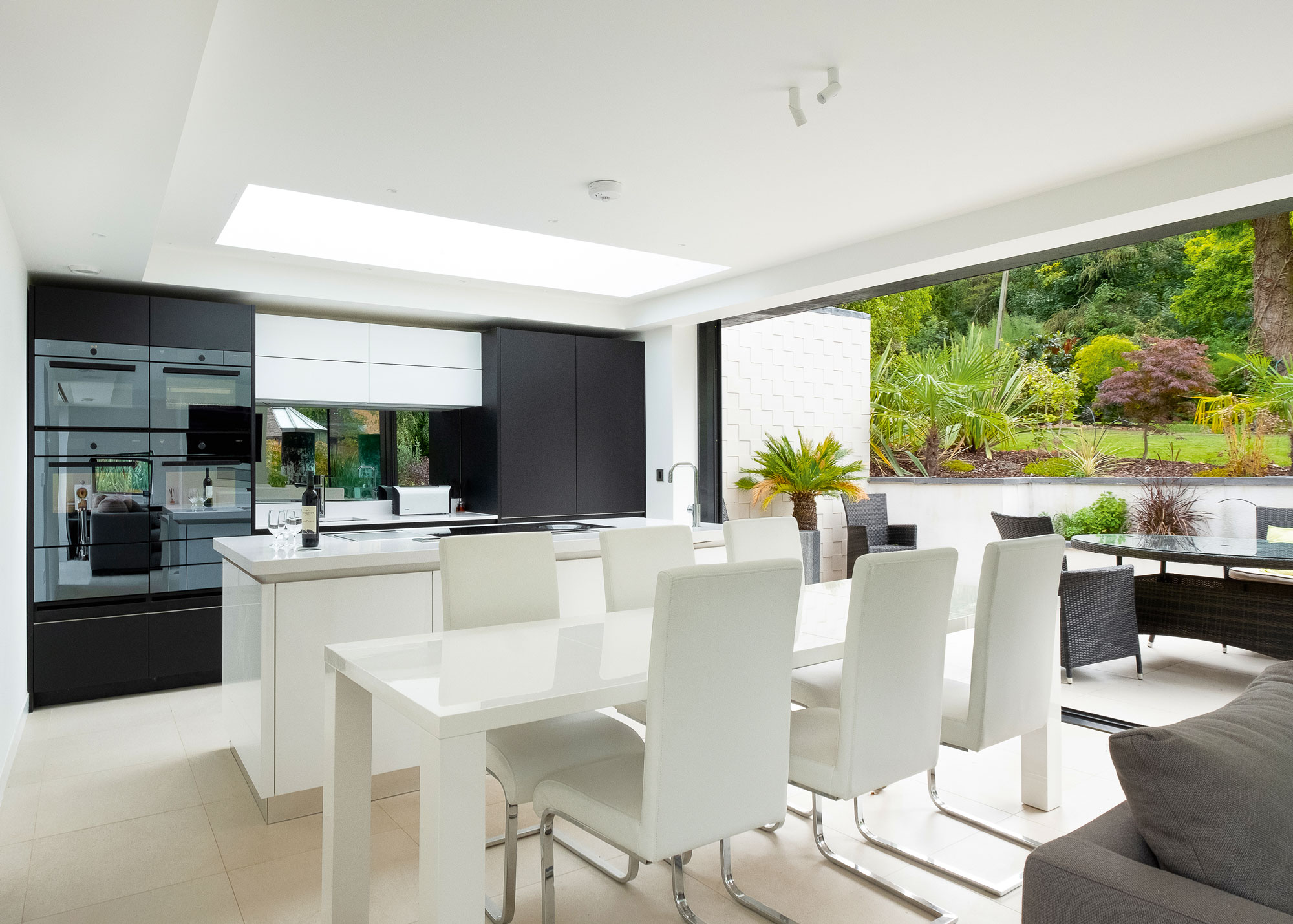
Low profile, thermally broken aluminium doors and windows from Greenways Contemporary allow maximum natural light to enter this building, while flush thresholds and the use of the same floor finishes inside and out enable the extension and outside space to flow together. Explore the home
To work well, this minimalist concept has to be followed through to the services, which can be concealed by the use of features such as underfloor heating and switches and sockets that are discreetly flush with the walls.
The proportions and massing of an extension are as important as its materials. In the hands of a good architect, an extension that takes a different scale and form to the existing house will provide the elusive wow-factor, regardless of how it is constructed. Curved and angular walls can be used to emphasise the differences between the new and existing parts of the house.
There is a huge range of products available that can help to make your extension strikingly modern. Folding sliding doors are currently very popular, because apart from offering a great view of the garden, they can allow a room to be opened up to let the outside in. The same idea can be applied inside with solid doors that either fold away or disappear by sliding into the depths of adjoining walls.
An expensive but eye-catching option is to use structural frameless glass to form a conservatory, sunroom or corridor. The glass is made strong enough to be self-supporting, which means that it does not need a frame and all that is seen between the panes is a thin strip of mastic.
There are plenty of alternatives to bricks for external cladding. In the UK, modern materials such as profiled steel, formed polyurethane, polycarbonate panels, stainless steel, unfinished concrete and even titanium are just some of the options available.
However, there seems to be a strong resistance to their use in a domestic setting, often expressed through the negative reception they are sometimes given by local planners. There are no practical reasons why they shouldn’t be used, but usually they are only deemed acceptable if added onto the back of the house where they will not be seen from a public road.
It is usually easier to gain planning permission for timber cladding used in a contemporary style, which is an attractive, economical finish. Untreated boards can be applied in vertical or horizontal arrangements, and will look the part if they are machined to have clean, straight edges and concealed fixings. Alternatives include staining the wood black or using thin strips of timber set on a dark backing board.
Main image: This barn extension in Hertfordshire by Nicolas Tye Architects screens off the neighbours with a solid timber wall, while sliding glazed doors open onto a patio
Comments are closed.