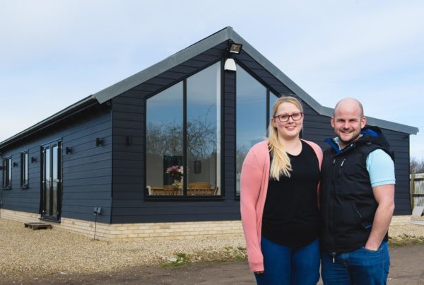
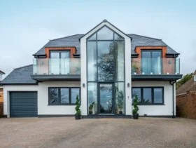
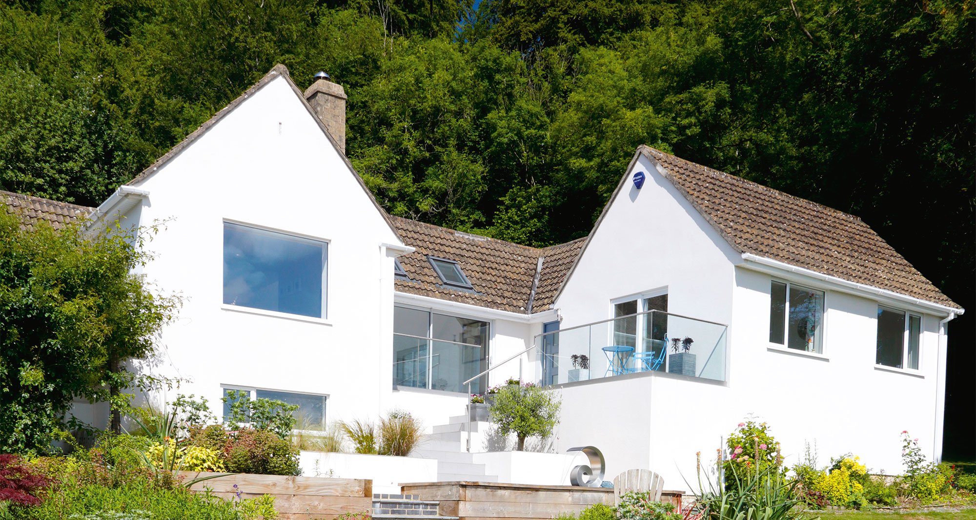
1960s bungalow gets a contemporary facelift
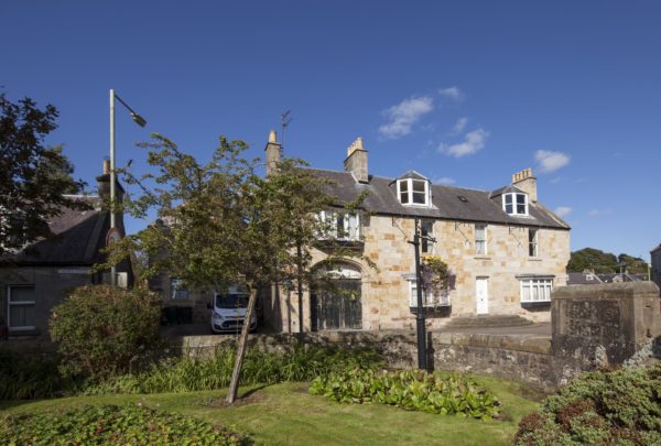
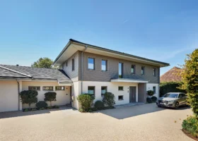
When Mandi and Tim Horwood decided to take early retirement, they were living in a traditional, Cornish cob-built cottage dating back to the 1850s. It sat on the hills above St Agnes with views of the North Cornish coast, seven acres, stabling and an equine arena.
“We enjoyed living in Cornwall, but I was retiring from teaching and competing horses, which gave us more freedom to visit friends and family further afield and to travel,” says Mandi.
Following the sale of their home, an eight-month property search ensued to find somewhere with potential for renovation.
Looking between Cornwall and West Sussex, they spotted a bungalow with a small loft conversion in the Slad Valley, Gloucestershire. The location and views were the biggest selling point, plus, having been extended in the 1990s, it had potential for further change.
Read more: Bungalow design for renovation projects
- NamesTim & Mandi Horwood
- LocationGloucestershire
- Type of ProjectRenovation
- Project routeCommissioned architect & builder; owner project managed
- Plot size0.75 acre
- Land cost (2015)£675,000
- House size250m2
- Project cost£183,584
- Project cost per m2£734
- Total cost£858,584
- Building work took (2016)26 weeks
- Current value£1,000,000
“It had a hotchpotch of small rooms and corridors that could be adapted to create our ideal house,” says Mandi.
They had gleaned some prior building project knowledge from demolishing a small barn beside their cottage in Cornwall and replacing it with a carport, which included a guest bedroom and bathroom above.
But this was going to be a bigger project, so to reassure themselves they were making the right choice and guard against any hidden pitfalls, they took a builder friend along to view it.
Getting it right
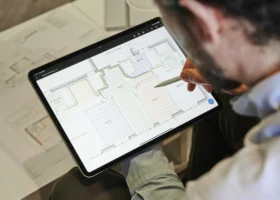
Confident in the knowledge that it was indeed the right property for them, once in they wasted no time in gathering ideas; sketching plans, reading magazines and attending trade shows to help develop their ideas.
“We went to the National Self Build & Renovation Centre (NSBRC) at Swindon several times,” says Mandi.
They employed architect Danny Sullivan of Design for Living to draw up plans to enlarge the existing dining room by adding an extension to join the two wings at the front of the house together.
“At this point he suggested we could create extra height by vaulting the dining room ceiling, which we were particularly excited about as it would add the wow factor we were looking for,” says Mandi.
It took two months to get planning permission for the revision, after which Building Regulations plans were submitted.
The couple sought tenders from four building firms – a process that ended up altering their course dramatically. “It was a valuable exercise to get different perspectives, but we didn’t quite expect it to change our plans,” says Tim.
A suggestion from one of the builders persuaded them that extending might not be the best route forward. “We realised that we had enough space, it was just badly configured. In the end we decided to rework the house instead,” says Mandi.
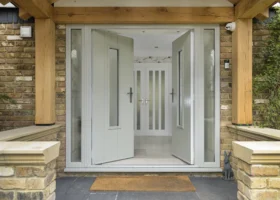
They went back to the architect with their revised plans, but not before they decided to move the front door, too.
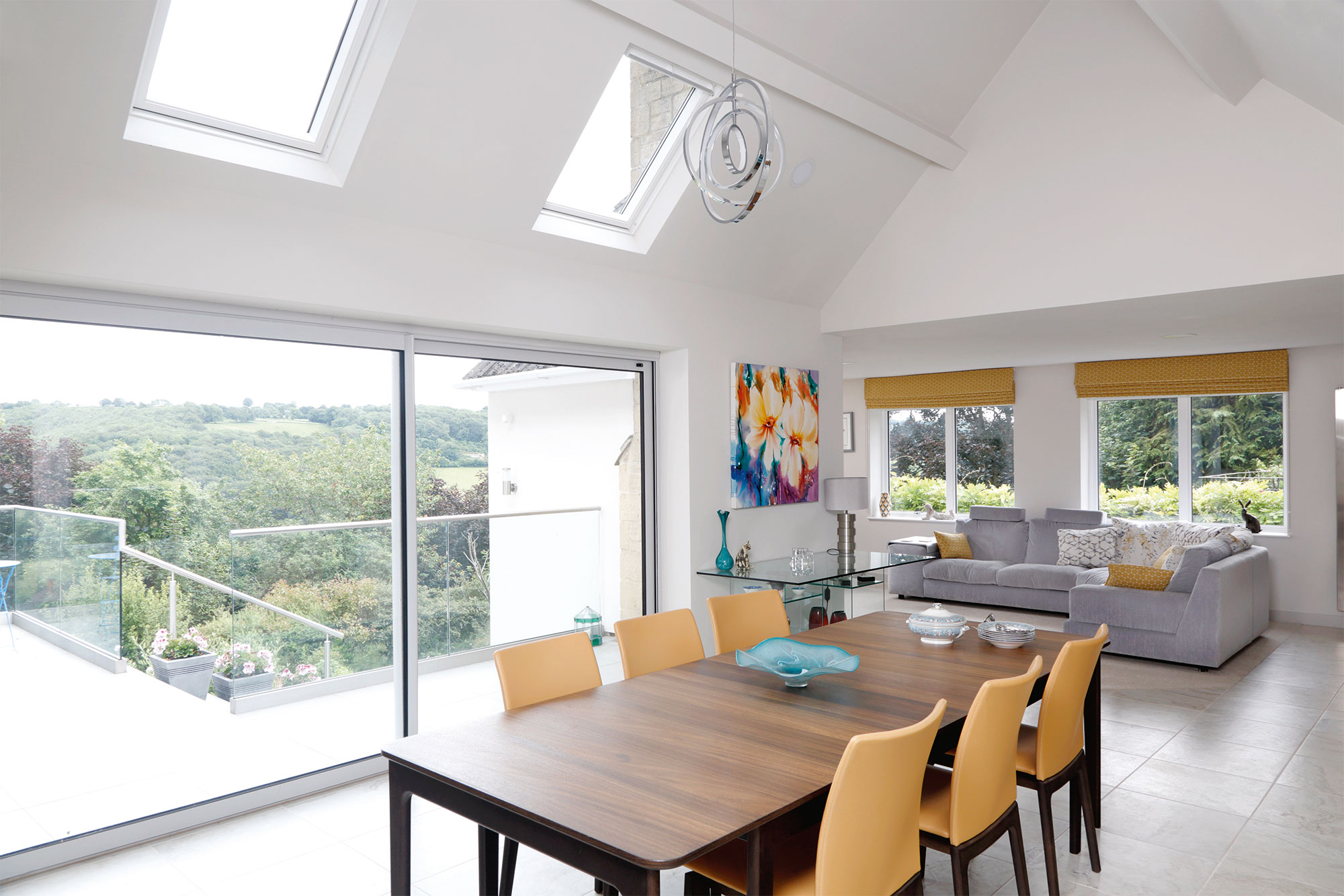
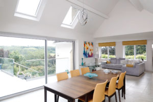
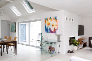
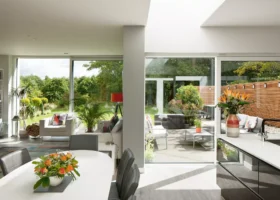
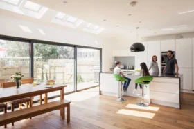
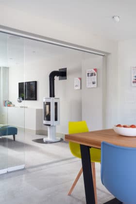
The open-plan, L-shaped space helps to zone while providing a contemporary feel
“The night before we were due to revisit our designer, Tim had one of those light bulb moments,” says Mandi. “He realised that if we relocated the front door to the right wing of the house we could free up the living area further and create a new hall where an existing corridor and ensuite were in the right wing.”
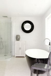
More changes followed. With the bathroom gone, they gave up a guest bedroom, turning it into the main bathroom and chose to adapt the remaining part of the corridor in order to form a cloakroom, which now leads off the dining room.
Taking shape
After much deliberation, the final reconfiguration was going to open up the house and make it altogether more contemporary.
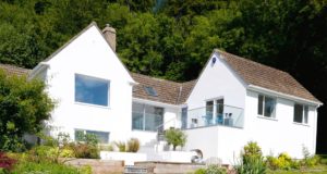
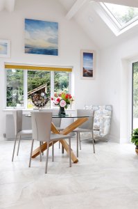
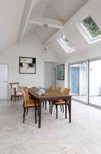
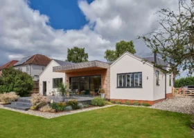
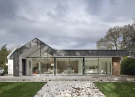
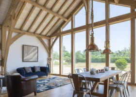
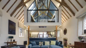
Some walls were removed to create the L-shaped plan and doors were blocked up and replaced with windows. To create a striking voluminous space, the ceiling in the dining area has been vaulted and rooflights added, plus the existing windows replaced with sliding doors that open out onto the balcony.
“Seeing the walls coming down was the best part of the project,” says Mandi. “Until that point it was hard to visualise.”

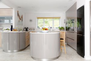
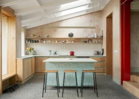
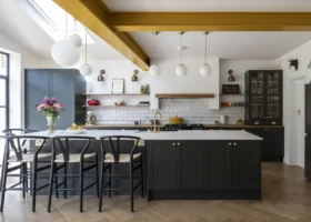
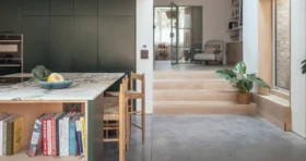
The Schuller Gala Castell kitchen is mainly ex-display supplied by Dajon Interiors
In the kitchen, removing a disused chimney and back end wall of the old bathroom where the previous water tank was has increased floorspace.
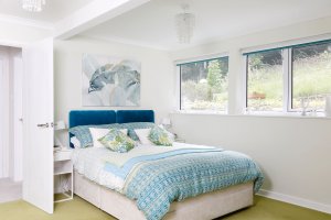
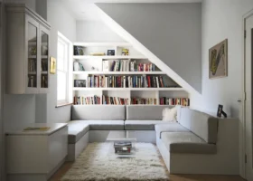
To compensate for the loss of the guest bedroom, the attic room has been transformed into a tranquil, light-filled bedroom next to the adjoining refurbished den.
“This space was the one room we tackled ourselves,” says Mandi. “Tim built in shelving hiding the roof that inclined into the den, as well as fitting storage along the eaves of both rooms.”
Growing budget
Removing walls uncovered issues they hadn’t anticipated. “We didn’t realise there would be five differing floor levels to contend with, made up of a mixture of cement, parquet, tiled and floating floorboards,” says Tim.
To overcome the problem, after the parquet floor in the dining area was removed, sections were levelled to bring them to the same point as the floating floor in the living area.
The parquet flooring in the breakfast room was so secure they decided to tile over it and the existing kitchen tiles, only to discover this surface sloped. The tilers’ skills were put to test with the majority of the new units having to be individually levelled.
“Looking on the bright side, it meant we could install the electric underfloor heating at the same time, but it did increase our budget,” says Mandi.
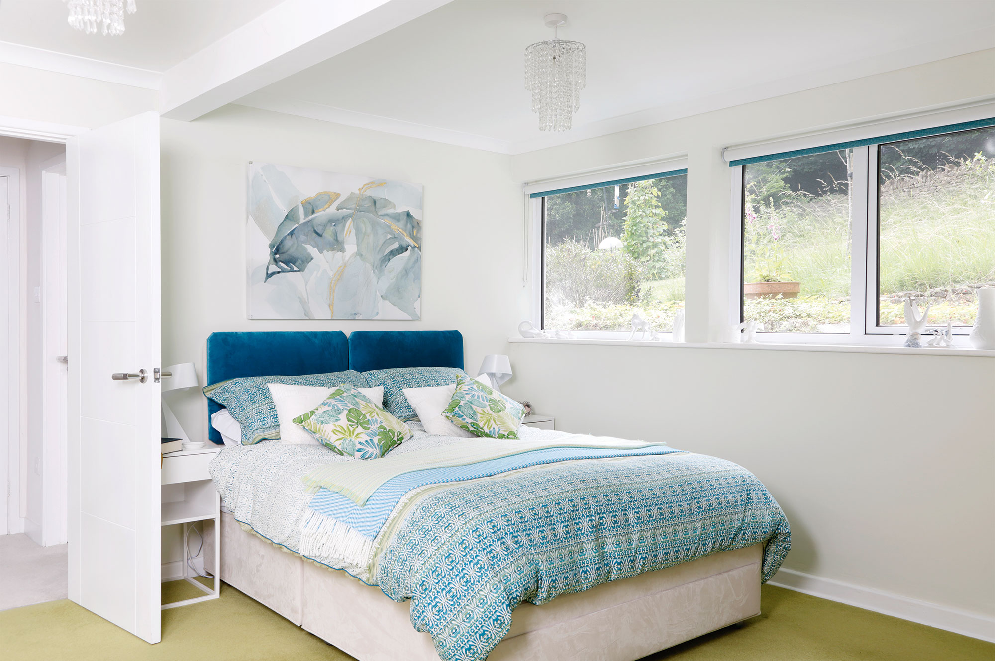
The spacious home features four bedrooms
The Horwoods were funding the project using savings, but two other factors caused costs to grow, eventually leading the couple to take out a mortgage in order to finish the job.
They decided to vault the ceiling of the breakfast room, and relocating the front door meant the external landscaping had to be redone.
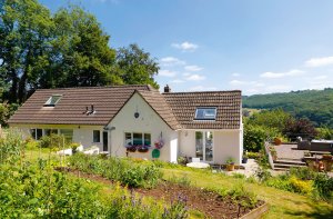
They had this designed and put together by James Turkington from Stroud Living Landscapes; it includes steps and a terraced pathway leading up through the garden to the newly positioned entrance. “We realised our budget was evolving as well as the project, but we were determined to get it right,” says Tim.
Learning curve
They chose the building company with the clearest, itemised quote, who subcontracted the electrical work, but the couple decided to employ their Cornish plumber, Dave Ewins from Davana.
“It was great to have him with us, but we came a bit unstuck when it came to the electrics,” says Mandi.
Once the wiring had been put in place in the vaulting they had made the assumption that the building company would take care of the light positions and switches.
However, they came to understand that they needed help producing a lighting design in order to properly instruct the builder.
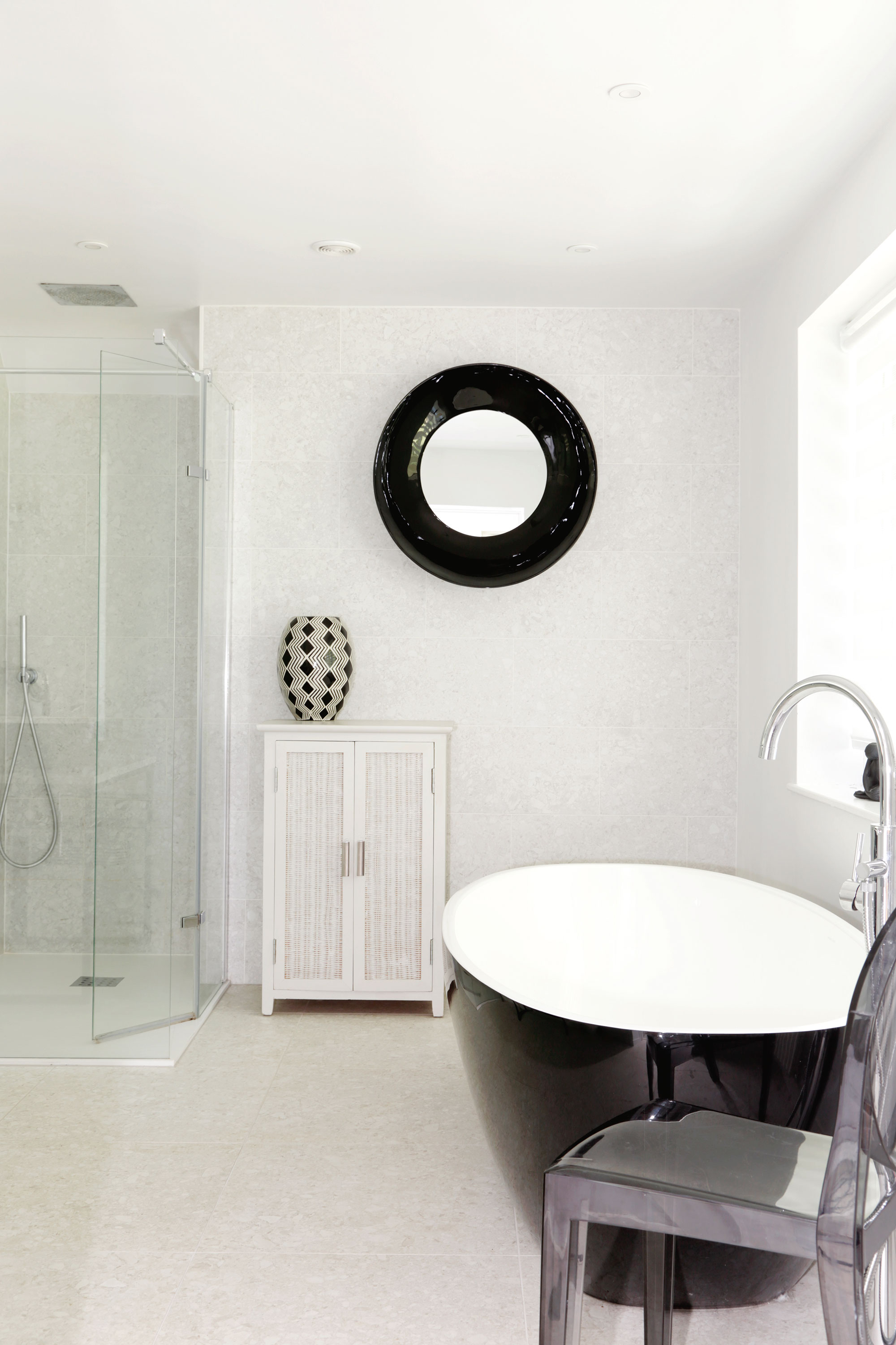
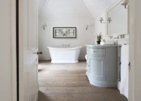
The couple bought an ex-display Victoria & Albert bath and basin to produce a high end finish on a budget
The couple consulted Stuart Palmer at ES Electrical Design, who supplied them with a plan to include varying sizes of down lights and a central pendent light in the dining area.
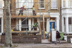
The internal renovations took seven months to complete and the exterior work a further six. The last thing to be done was the new render application.
Tim and Mandi lived in the property throughout the build, which could be pretty full on at times.
“We went on holiday for a few days in May and even then had a phone call to ask about placement of light switches – we were on top of a city tour bus at the time,” says Mandi.
But despite a few minor struggles along the way, the couple are thoroughly pleased with the end result.
“The open plan interconnecting living zones with the vaulted ceilings and views from all of the rooms are fantastic,” says Mandi. “We would both do it again – maybe a similar project, but on a smaller scale, perhaps making something contemporary out of a dated property.”






























 Login/register to save Article for later
