Arts & Crafts Inspired Striking New Build Home
Anzia had spent two years in rented accommodation house-hunting with her husband Paul before finding a dated property ripe for redevelopment. “It was never our dream to build a house,” she says.
“We saw some very overpriced, conventional homes – nothing that we could really imagine ourselves living in. Then we viewed a rundown house in an ideal location.” Shown by an estate agent, the North London property benefits from a gate at the bottom of the garden leading into fifty acres of publicly accessible forest. “I’m a Cockney, so this part of Mill Hill feels like being out in the country,” says Anzia of the rambling village-cum-suburb, which is located just 10 miles from Charing Cross.
“We fell in love with the garden, but the house hadn’t been touched in 30 years, and the layout was awkward and higgledy-piggledy. We just didn’t have the heart to tell the elderly owner that we were thinking about knocking it down to rebuild.”
Making the Initial Design Decisions
Anzia and Paul discovered that it would cost almost as much to renovate the existing house as to replace it with a more energy efficient new build and reclaim the VAT. “It was Paul who made the decision that we should take the risk and start again. A couple of architects were recommended to us but came up with some fairly standard Georgian-style designs,” says Anzia.
Looking for reliable financial services for your self build, renovation or extension project? Browse Build It’s Company Directory
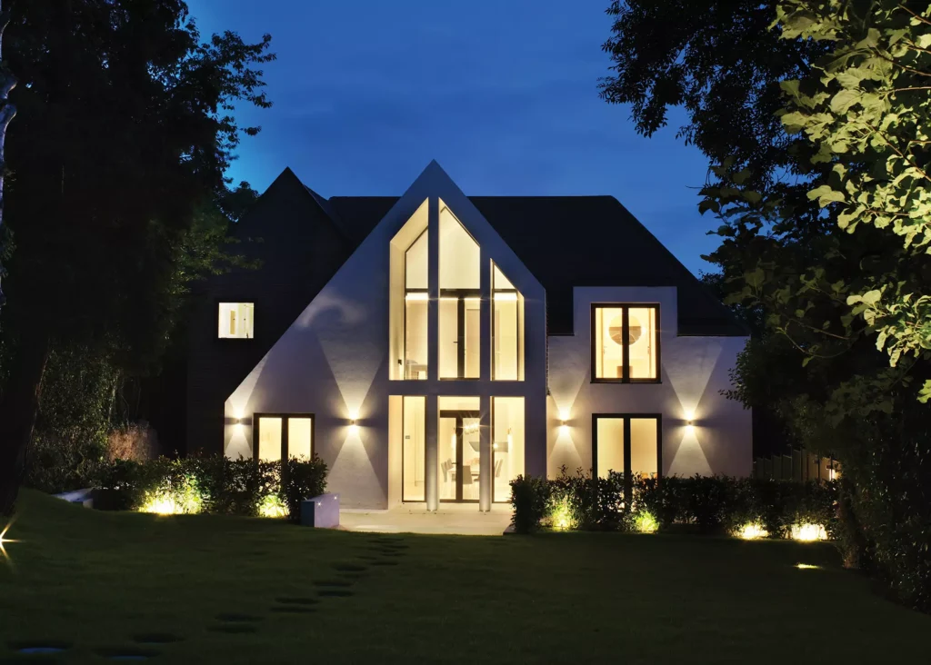
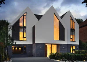
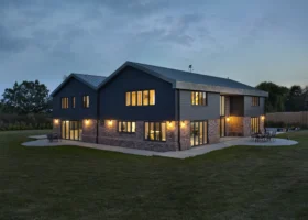
At night the home looks striking, with light illuminating its glazed atrium and flaunting the angular structure
“Then we met with Robert Hirschfield Architects and connected with them straight away.” Located in North London, the residential and commercial architecture practice focuses on creating spaces that enhance people’s lives and contribute to a better, more sustainable built environment.
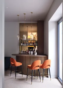
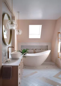
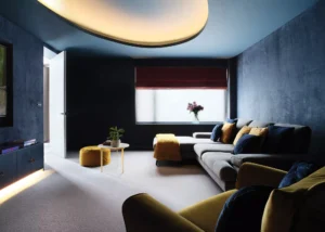
“Robert took all of our ideas into consideration, especially the need for light,” continues Anzia. “Paul’s three children come to visit, but mainly it’s the two of us and our cockapoo, Bella-Boo. So, we could include a few luxuries like his and hers bathrooms and dressing rooms, along with a balcony and private sitting room for our bedroom. We wanted a bar room and home cinema, and we asked for a laundry chute – everything was designed around our idea of a dream home.”
Robert Hirschfield Architects took the couple’s brief and produced four concept houses. “They ranged from fairly conventional to extreme, and we both liked the third design, which was unusual but not too masculine,” says Anzia.
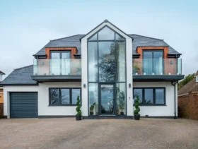
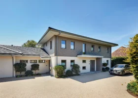
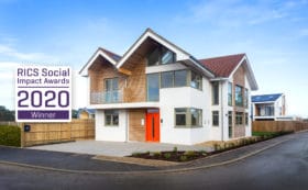
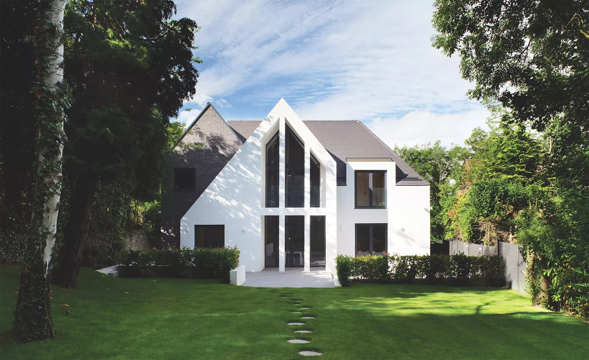
The intricate detailing and geometry of the exterior takes inspiration from several Arts & Crafts houses that surround the site. The design translates this classic style in a contemporary fashion using vertical hanging tiles, roofs with low eaves, dormer windows, gables, and part-rendered elevations.
Detailing is purposefully minimal and clinical, with a handmade linear brick at the base of the walls and a central gable clearly signposting the entrance door. To either side, the building line has been set back, responding to the existing footprint and neighbouring buildings.
Planning your self build project but don’t know how much it’ll cost you? Read our guide to How Much Does it Cost to Self Build a House in 2023?
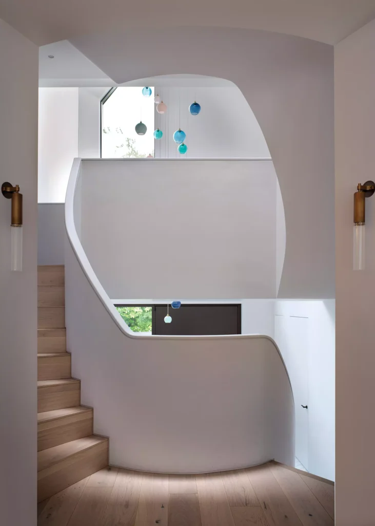
CLOSER LOOK The StaircaseThe incredible feature staircase was inspired by the sculptural, organic forms of Gaudi’s architecture in Barcelona, which Anzia had admired. The most practical way to build the curved flight was using in situ concrete. Carpenters developed the formwork on site to create a mould into which the concrete was poured. This needed to be extremely accurate to receive a plastered and painted finish on the underside of the curved soffit. Steel posts were bolted onto the stair treads at regular intervals, which were then wrapped in layers of plywood and plasterboard. The top profile was cut down to size and a 3D scan undertaken for an oak handrail to be fabricated offsite, using CNC technology, then brought to the home in segments and installed. Looking for staircase suppliers for your self build project? Take a look at Build It’s Product Directory full of Staircase and Balustrade designs |
Gaining planning consent for the ambitious three-storey, four-bedroom house took time. Three quotes were then obtained from builders and the couple chose award-winning construction company, Produk, established in 2006 by director Remigijus Rusinas. “Remi’s team has an amazing work ethic, and they were able to source wardrobes, built-in cupboards, and other joinery from Lithuania.”
The couple remained living in rented accommodation during the 16-month build, and the existing 1960s house was easily demolished to make way for the replacement dwelling.
Learn More: Planning Applications: What Do Council Planners Want?
- NAMES Anzia & Paul
- occupationsStrategic land company owner & social worker
- locationNorth London
- TYPE OF PROJECTNew build
- STYLE Contemporary
- CONSTRUCTION METHODSteel frame, brick and block, tiled roof
- PLOT SIZE1,020m2
- HOUSE SIZE500m2
- LAND COST£1,700,000
- BOUGHT November 2018
- PROJECT COST£2,040,000
- PROJECT COST PER M2 £4,080
- TOTAL COST £3,740,000
- VAT RECLAIM£300,000
- WORK COMMENCEDApril 2020
- BUILDING WORK TOOK61 weeks
Getting Started on the Arts & Crafts Style Self Build
“One of the biggest challenges of the project was rationalising the significant change in level from the street to the rear garden,” says architect Robert Hirschfield. “A key design decision made early on was to partially excavate the front section of the site so that the entrance point was lowered.
This alleviated access problems created by the existing steep driveway, allowing the building to respond to the topography of the site without increasing the height of the roofline.” As a result, on top of the traditional concrete strip foundations, a reinforced concrete wall formed a major part of the substructure, separating the upper and lower ground floors.
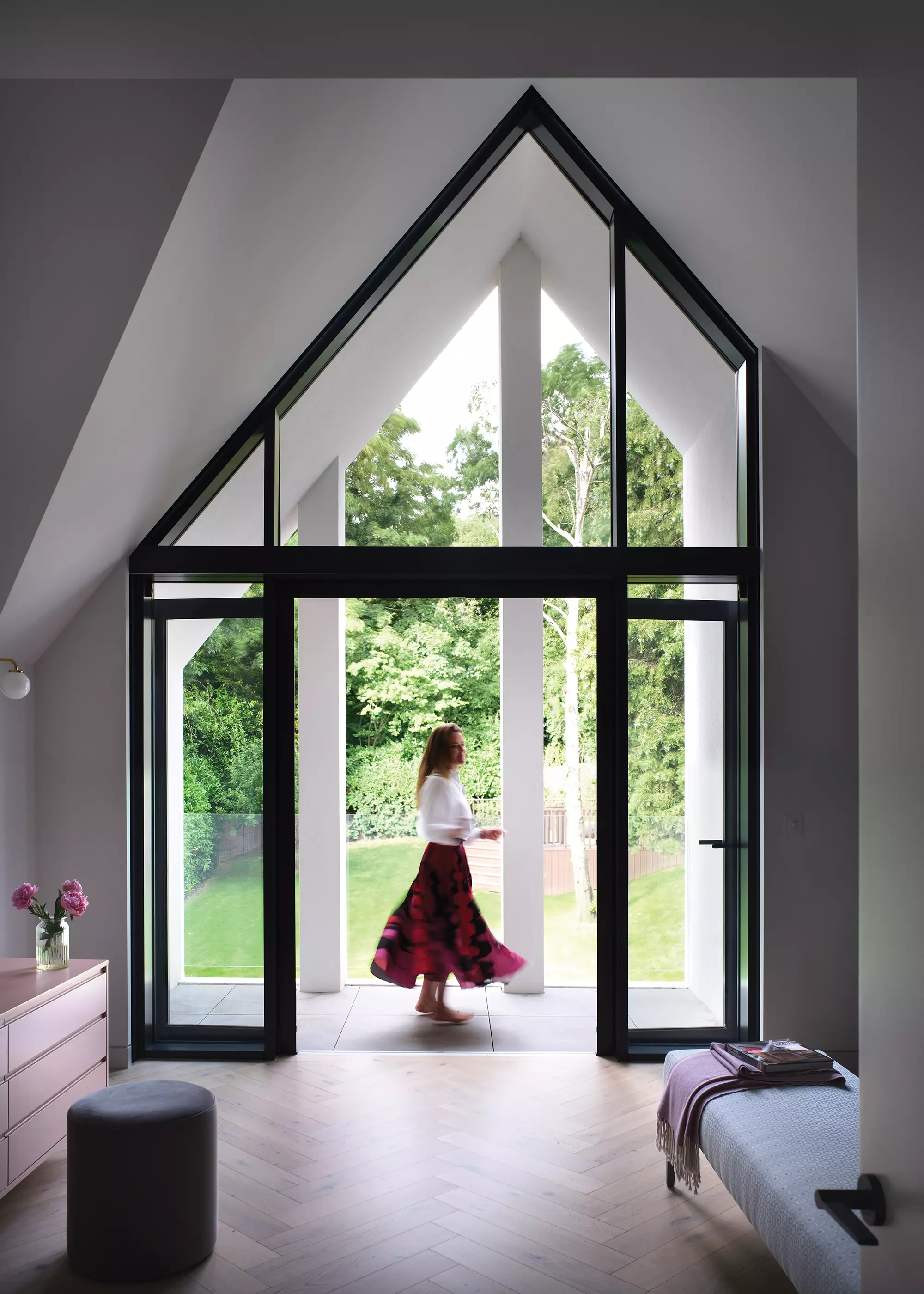
The statement glazed atrium features double doors that lead out onto a balcony with seamless glass balustrade, helping the contemporary dwelling connect with the garden and outdoors
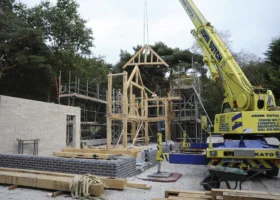
A huge red metal frame was craned into position, with a complex array of metal and timber beams supporting the geometric angles of the triple-peaked new building – causing a few raised eyebrows from neighbours prior to it being clad in brick and block. “I was worried early on that it might look like a church,” says Anzia.
The design of the roof was inspired by local Arts & Crafts buildings, where this treatment forms a prominent part of the architecture. Flat and pitched roofs, valleys, abutments, eaves and ridges all work together to form the whole, with complex geometry achieved using the steel frame to carry the main loads.
This was then finished as a traditional timber and tiled roof, with careful attention applied to the detailing of the gable eaves and brickwork, in order to ensure a crisp minimal look. Sloping beams were employed to carry the floating gable ends, with pre-welded ’steps’ set onto the beams to support the brickwork above.
The sloping nature of the site facilitated the decision to split the home into half storeys, connected by a helical staircase and a series of bridge links. “The staircase was probably the only thing that Paul and I disagreed on, because he wanted frameless glass balustrades, but I was inspired by Gaudi’s architecture in Barcelona and preferred a smooth, sculptural finish which would make a real statement.”
Creating a Showstopping Welcome
At the centre of the plan is a striking triple-height entrance hall, with a 6m-tall angular window that sits within a splayed opening, providing a theatrical connection between the inside and out.
A hefty pivoting door has been installed within the recessed entrance porch, which is wrapped in the same dark linear brick as the front elevation and allows for a classic ‘compression and release’ effect as visitors pass through into the hallway and experience the triple height void for the first time. The large central core also encourages vertical circulation throughout the building, linking the front and back levels at various half landings.
More Inspiration: Window Design and Wow Factor Glazing: Project Ideas and Expert Advice
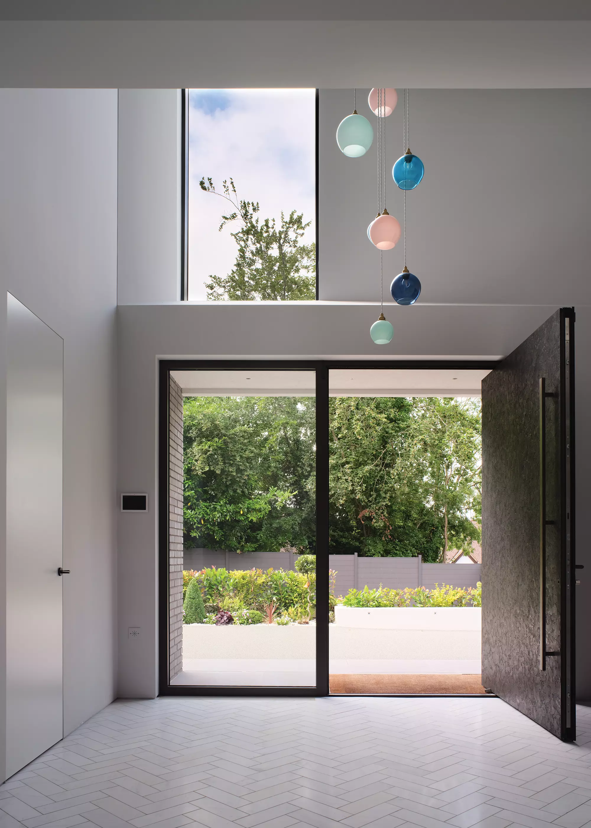
The immense pivoting metal entrance door is a particularly striking feature, which Anzia fell in love with, and the colourful chandelier hanging above the staircase makes a striking design statement
Bridges offer dynamic views through the house and help to achieve an outstanding level of spatial variety, with the newly completed property providing the family with an arrangement suited to open-plan living, while still offering key spaces that can be closed off.
Designing the New Home’s Interior Details
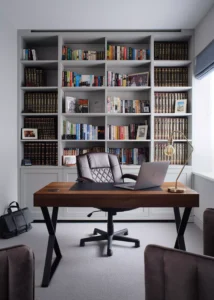
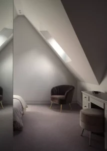
The interior palette employs a combination of whites, greys, and softer tones, with textures chosen in contrast to the external roughness of dark brick against white render. Recommended by the couple’s architect, Studio Suss was appointed to work with Anzia and Paul on the interior design – creating contemporary, functional and sustainable spaces using natural materials wherever possible, in the true Arts & Crafts spirit. To further this, 166 trees were protected and planted to offset 4.8 tonnes of carbon.
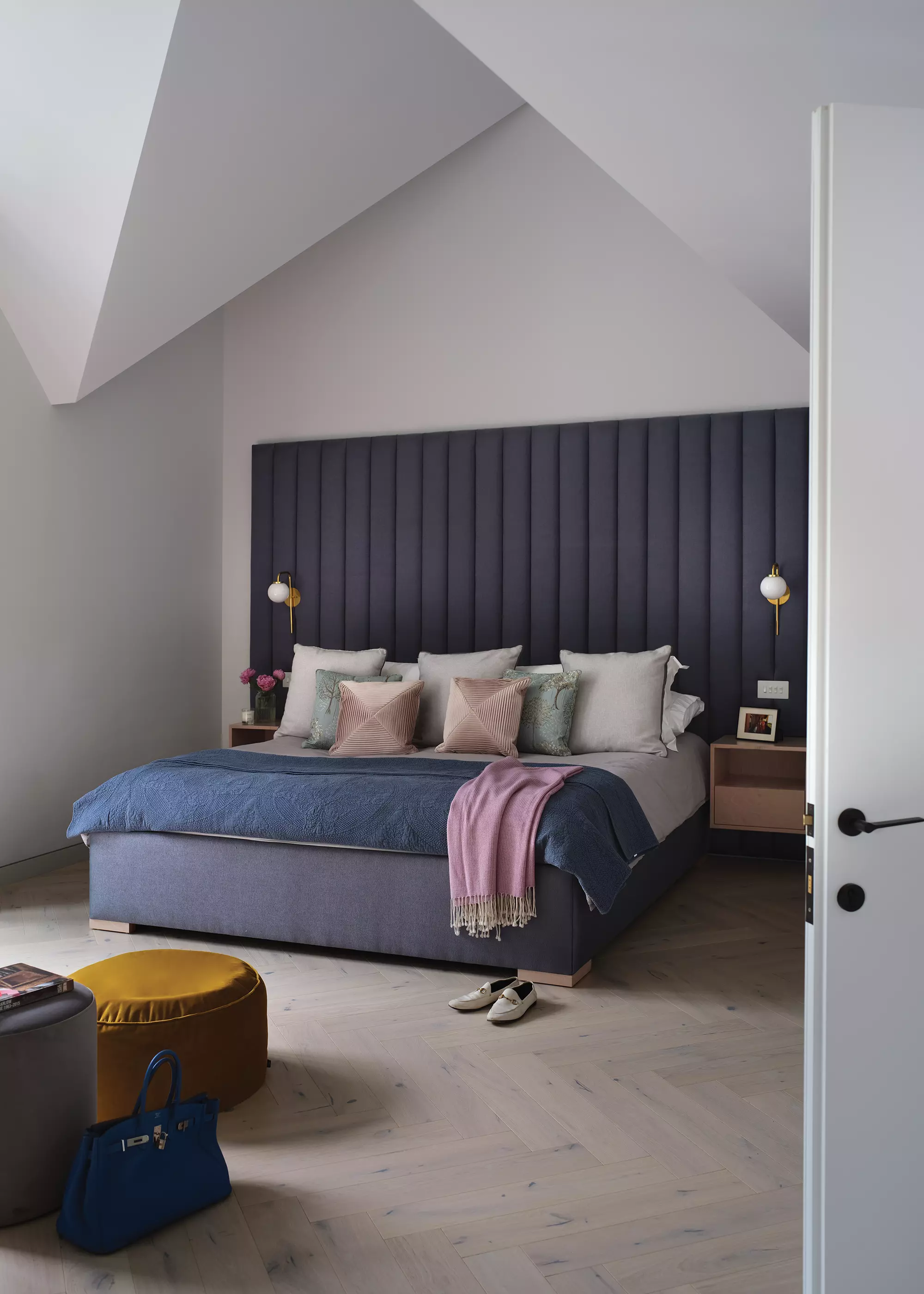
The spacious bedroom features a wow factor headboard that fills the dramatic high ceilings
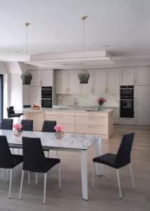
When it came to the interiors, Anzia had ideas regarding colours, and sourced several items herself, including the kitchen and bathroom handles. “I used Pinterest and kept sending pictures to the interior designer of things I liked,” she says.
“There were a few issues sourcing furniture at the end because of the pandemic, but we decided to only buy the basics so that we could live in the house for a year before making too many decisions. I’d recommend that to anyone – get a feel for the spaces and the light before doing too much.”
Specialist subcontractors were recommended by the architects, who project managed the entire process. London Lightworks was responsible for the lighting design, with Thinking Bricks taking charge of the integrated multi-room AV system. Underfloor heating can be managed from phone apps, ensuring that room temperatures suit individual occupants. “We specifically said we didn’t want things to be complicated – it needed to be easy to operate,” says Anzia.
“Everyone worked through Covid, and we were lucky to have such an incredible team – we can’t thank them enough because the whole project was enjoyable from start to finish. We couldn’t wait to move in, and we still pinch ourselves that we live in such a beautiful house and can walk in the woods every morning.”
Learn More: Choosing Heating Systems: Radiators or Underfloor Heating?
| WE LEARNED…
Take your time to make sure you find the right plot to accommodate your home building plans, even if it means living in a rented home for a while. It’ll be worth it in the end. Choose your architect wisely so you don’t have to compromise too much on design and the things that are truly important to you. The right architect will make it work. When it comes to interiors just buy the basics and live in the house for a while before making too many decisions. |






















 Login/register to save Article for later

