Clever & Contemporary Studio Renovation in South London
As an architect in London, I see a lot of Victorian houses, so it is refreshing to be in a different kind of space,” says Louise Glynn, who is one half of architectural practice Studio 29. Having lived in a small Victorian flat conversion for some time, by 2019, Louise was ready for a change of scene. Her search for a new home began in areas within easy reach of central London.
That was when she discovered Bermondsey, with its converted factories, food markets and easy access to the River Thames. “I am always an advocate for location. For me, it’s important, and I get more enjoyment from my location than I would from having an extra bathroom.”
Louise, who describes herself as having “a passion for mini spaces”, loved her new home at first sight. It is a studio in a building that was formerly a Victorian seal fur factory. This was later remodelled in the 1930s by Wallis, Gilbert and Partners, the architectural firm famous for designing the art deco Hoover Building and Victoria Coach Station. At just 40m², the property may be tiny, but it is striking.
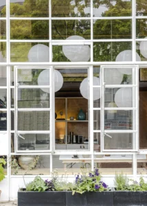
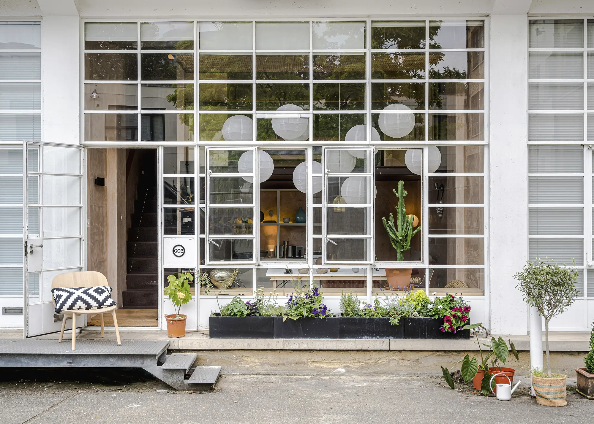
The ceiling is 5m high and the entire front is a wall of original Crittall steel-framed glazing. Inside, it is largely open plan, with a mezzanine sleeping area open to the living areas below and two service rooms – the kitchen and bathroom. Both spaces are tucked away from the main living area. “It was just a white box when I saw it,” says Louise.
“This made the studio feel even smaller than it is. Plus, it had no storage; even less than my previous 24m² flat!” Yet, thanks to those windows, light floods into the studio and the ceiling height creates an almost luxurious sense of space. “You buy square footage in London, not height,” says Louise. “But height really is the wow factor.”
Careful Design Choices
For Louise, the challenge was not to rip everything out, as she was limited by her position in the building and by the historic features, such as those windows. Yet, the studio was very basic, to the point of having limited useful functions. She therefore had to find a way to remodel and refinish it within the existing constraints. The works included designing and building custom storage, a new bathroom and kitchen, technical lighting and finding a way to address privacy in a mezzanine bedroom that opened onto a 4m high window.
Looking for a plot for your self build, renovation or conversion project? Take a look at PlotBrowser.com to find 1,000s of UK plots and properties, all with outline or full planning permission in place

The Crittall windows are the front entrance to Louise’s studio, so she has placed pots with plants along the edge for privacy, as the height of the glazing means the light will continue to flood in
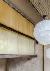
For design inspiration, Louise started with the industrial origin of the building, which means heavy concrete and geometric shapes. Louise softened this, making it more homely in a way that is still sympathetic to the building. Raw pink plaster is both industrial yet soft and simple, and this works well with light birch plywood.
Large Japandi-style paper lanterns keep the studio cosy and add a touch of whimsy. Louise also added chocolate-brown coloured paint on the structural elements and the ceilings in the service rooms. “Darker ceilings recede and don’t sit so heavily,” she says.
- NAMELouise Glynn
- OCCUPATIONArchitect
- LOCATION Southeast London
- TYPE OF PROJECT Studio renovation in period property
- STYLEContemporary
- PROJECT ROUTEOwner designed and projected managed alongside trades
- BOUGHT2020
- STUDIO SIZE40m2
- STUDIO COST£420,000
- PROJECT COST£40,000
- PROJECT COST PER M2£1,000
- TOTAL COST£440,000
- BUILDING WORK COMMENCED March 2020
- BUILDING WORK TOOK12 weeks
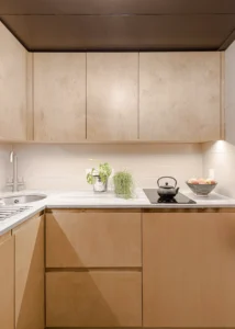
By restricting her choice of materials and colours to a limited palette, Louise could save on costs and enhance the feeling of space. A significant material was the light birch plywood (which comes in different grades, with the top BB grade best suited to furniture and interior finishing). Louise used this plywood for all her built-in storage, including the kitchen cabinetry. “It’s very versatile as a material,” says Louise.
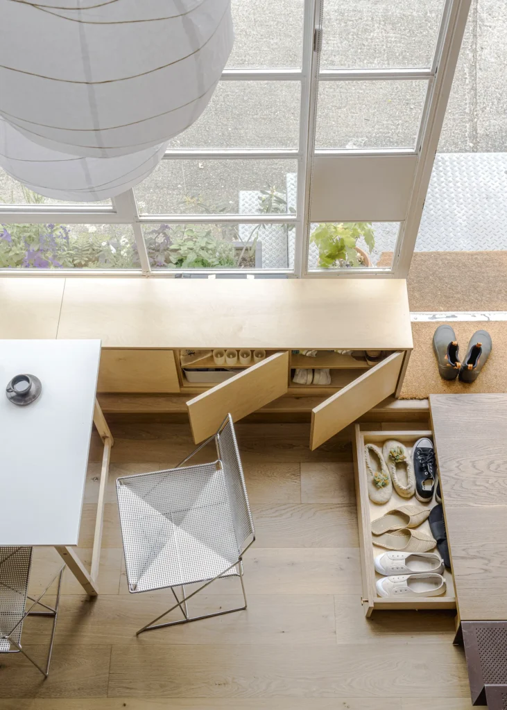
The studio was entirely open plan when Louise bought it and the stairs were constructed from perforated metal. She added built-in storage wherever possible to make the open space work more effectively. This includes a new coat-hanging space under the stairs, wardrobes in the bedroom, shelving throughout, a built-in bench over the industrial radiator and a new landing at the foot of the stairs, which provides a hidden place to store shoes.

Clever storage was critical to the functioning of this compact studio. Louise incorporated it in innovative ways that wouldn’t compromise available space
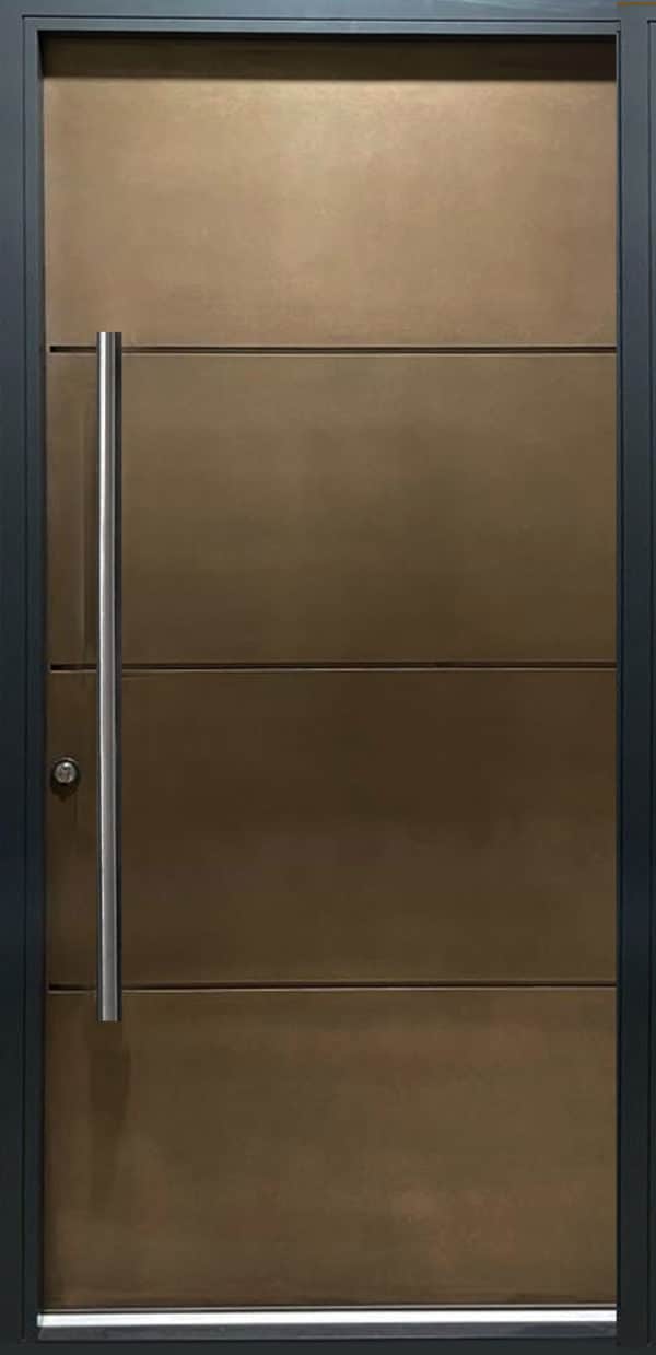
New painted door blanks now also close off the kitchen and bathroom. Louise gave these more interest with weathered brass ironmongery in the same T-shaped design that is used on the Orient Express, a train known for its Art Deco glamour.
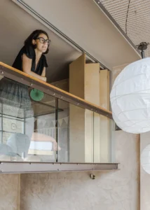
At mezzanine level, a long folding door fixed just behind the balustrade creates a more flexible space, which Louise uses as her bedroom. When she needs privacy, the door, constructed from birch plywood panels, opens out, creating a division between the bedroom, the rest of the studio and the window beyond.
When it’s not needed, the door folds back, taking up limited space. Louise designed all of these elements herself, her choices determined partly by the tight £40,000 budget and partly by her want for fittings that were lightweight and easy to install. These fixtures were built and fitted by her joiner, Tomasz of Tomkin Construction, with whom she’s worked many times before. “He’s super reliable,” says Louise.
Learn More: Home Renovations: 10 Steps to Successfully Renovating a House
Working Remotely & Perfecting the Interior Scheme
Louise’s design choices were kept simple and made offsite, which was crucial when it came to navigating the biggest challenge Louise faced; getting the studio renovated during lockdown. Since she couldn’t have groups of tradesmen in the studio together, constructing everything offsite wasn’t just easier for project planning, but also for working around Covid restrictions. “The worst thing was people calling me about the number of people in the flat and the queues at the builders’ merchants,” says Louise, who was forced to project manage over the phone.
One area where Louise could take a relaxed approach was the kitchen. Although it had hardly any cupboards, she kept the existing appliances, adding custom-made cabinetry, and turning the galley into an L-shape. A circular sink in the corner makes the most of otherwise wasted space, and a quartz kitchen worktop is both durable and stylish. “I’ve even cooked for dinner parties in there,” says Louise. “Although I have to admit, there are plenty of restaurants on my doorstep.”
CLOSER LOOK Retaining original featuresLouise’s period studio flat is full of original Victorian and Art Deco features. Despite the building not being listed, she decided to retain these features for the unique character and history they add to her home. The floors are the original solid timber throughout. “It didn’t make sense to rip the flooring out, so I sanded it back and resealed it and it looks good,” says Louise. The property also has Crittall windows that date back to the remodelling of the building in the 1930s, and at 4m high, they represent a significant proportion of the external facade. These original hot-rolled steel frames became synonymous with the Art Deco and Modernist buildings of the early 20th century so, although they’re single glazed and draughty as a result of the steel frames degrading over time, they were a big selling point for Louise, and replacing them wasn’t an option. More Ideas: Window Replacement: Should You Repair or Replace Your Home’s Windows? |
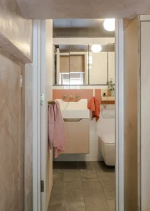
The bathroom required rather more work. Originally just a shower room, Louise ripped everything out and started again, redesigning the space to allow for a compact bath with a shower over it. A basin with storage underneath and mirrored cabinets enhances the sense of space, while the new door adds essential privacy.
The existing lighting was, like everything else, basic to the point of useless. Louise added in different types of lighting at different levels of the home in a carefully considered plan that highlights specific objects and areas in a way that would create the illusion of space. At the top of the studio, there are downlights. Globe lights add a nod to the Art Deco design of the building, while wall lights shine upwards in the living area to create that sense of infinite space.
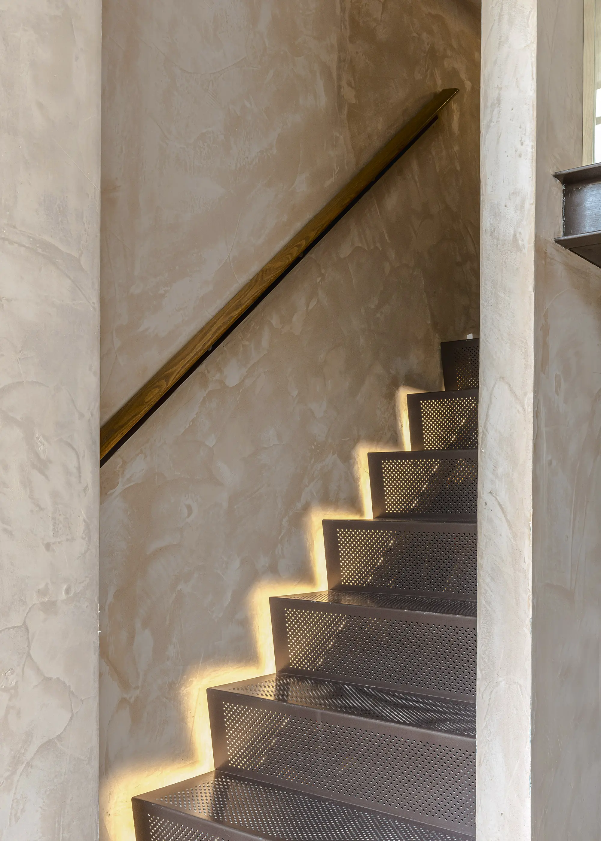
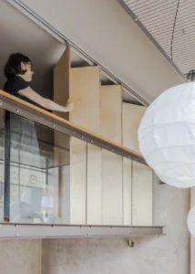
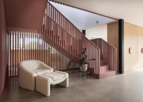
The metal staircase and plaster finish on the walls create an effective visual contrast
In the double-height area, three spotlights point at different objects and emphasise the room’s height. The stairs, which are a dominating feature, now have gentle step-level illumination from small LED lights. These are simply taped into the gap between the wall and the staircase. “It gives a nice wash of light across the wall,” says Louise.
The Urban Renovation’s Finishing Touches
For the finishing touches, Louise took on some DIY and adapted an Ikea table, using MDF and gloss paint to get the finish and size she needed. Placed in the centre of that window, it has become the focal point of the studio. Louise then added a few vintage pieces of furniture to add character and depth to the internal scheme. Carefully collected over the years, these include vintage Danish-made Niels Jorgen Haugeson metal chairs. Mid-century in style, like the stairs they are made from perforated metal, in keeping with the material and colour accents throughout the scheme and adding a touch of character.
Considering the challenges Louise faced, the project went extremely smoothly. The only low point was when she had to move in and the kitchen wasn’t ready. “I was heavily pregnant. I just bought a George Foreman grill and got on with it,” says Louise. In the race between her impending birth and the completion of the project, the renovation won.
More Ideas: Period Home Renovations & Extensions: Design Ideas For Combining Old & New
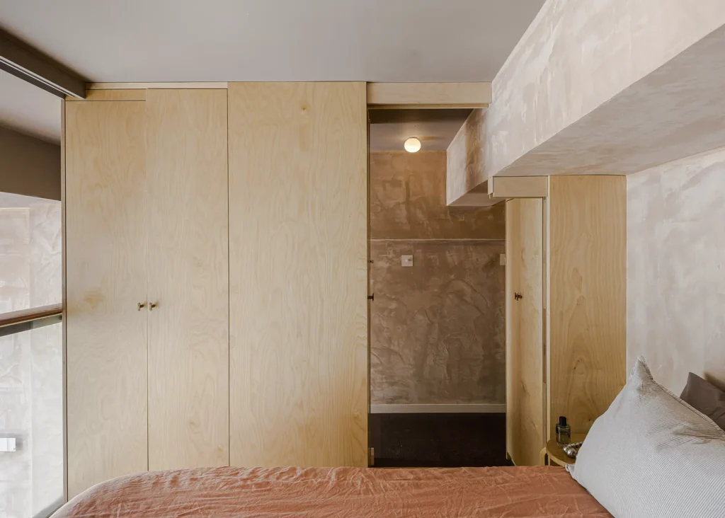
Creating flexible space on the mezzanine level is a clever way to achieve both a sense of space and privacy when needed
Despite Louise’s home being designed for one person, it was easily adapted for two. “It is still working for us as a family, but the time is approaching when I will need a second bedroom,” says Louise.
“I will be very sad to leave here, though.” The studio is very roomy for its size, however. This was proven when Louise managed to fit in a tall Christmas tree and welcomed friends over for a housewarming party shortly after moving in, which was one of the high points in the project for her. The renovation of this tiny property has created a home that Louise loves, making a big difference to her life and allowing her to have a clutter-free, serene space – even with the arrival of a newborn baby!
I LEARNED…
|





















 Login/register to save Article for later
