Contemporary Renovation and Extension to Traditional Bungalow
When John and Susan Yates were looking to move from the west coast of Scotland to Edinburgh, their initial plan was to find a flat in the centre. However, a short drive east of the city to the coast at Portobello would turn out to be serendipitous, as the couple was inspired by a bungalow that was being renovated in a suburban street.
“This introduced us to the idea of what could be done with a single-storey home,” explains John. “There was a similar property for sale on the same road, so we bought it knowing we could do something with it – we didn’t know what exactly, but we knew there was potential.”
The first thing John and Susan did was contact the architecture firm working on the neighbouring renovation, Chambers McMillan. “We met with Ian McMillan and Thea Chambers to discuss what we had in mind for the bungalow,” says John. The couple wanted this property to be their forever home. Their main brief was to channel lots of natural light into the building and rearrange the floorplan to make more usable spaces. “We met several times and had a brainstorming session,” he says.
“Ian and Thea then came to us with an outline plan based on these ideas, which we really liked. We are very risk au fait and really pushed the boundaries to take our ideas further. They listened to us and took on board everything we spoke about and really went the extra mile – it’s bold what they’ve done.”
Reconfiguring the Bungalow Layout
The post-war brick and rendered bungalow had three main rooms for living rooms/bedrooms – two at the front and one at the back – plus a kitchen and WC at the rear. The attached garage to the right of the house had been converted into a bedroom and the loft turned into another room. The reconfigurations had created an unusual floorplan, with a staircase in the front room and through routes via living spaces.
Read More: Bungalow Extensions: How to Add Value to a Single Storey Home
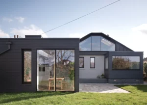
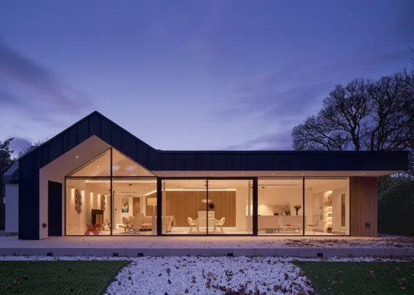
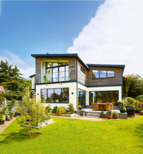
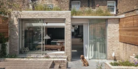
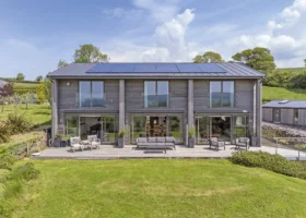
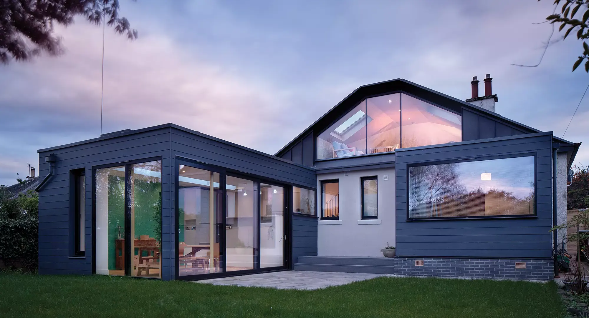
The back of the bungalow has undergone a contemporary transformation thanks to a kitchen-diner extension, small addition out from the main bedroom and new glazed dormer upstairs
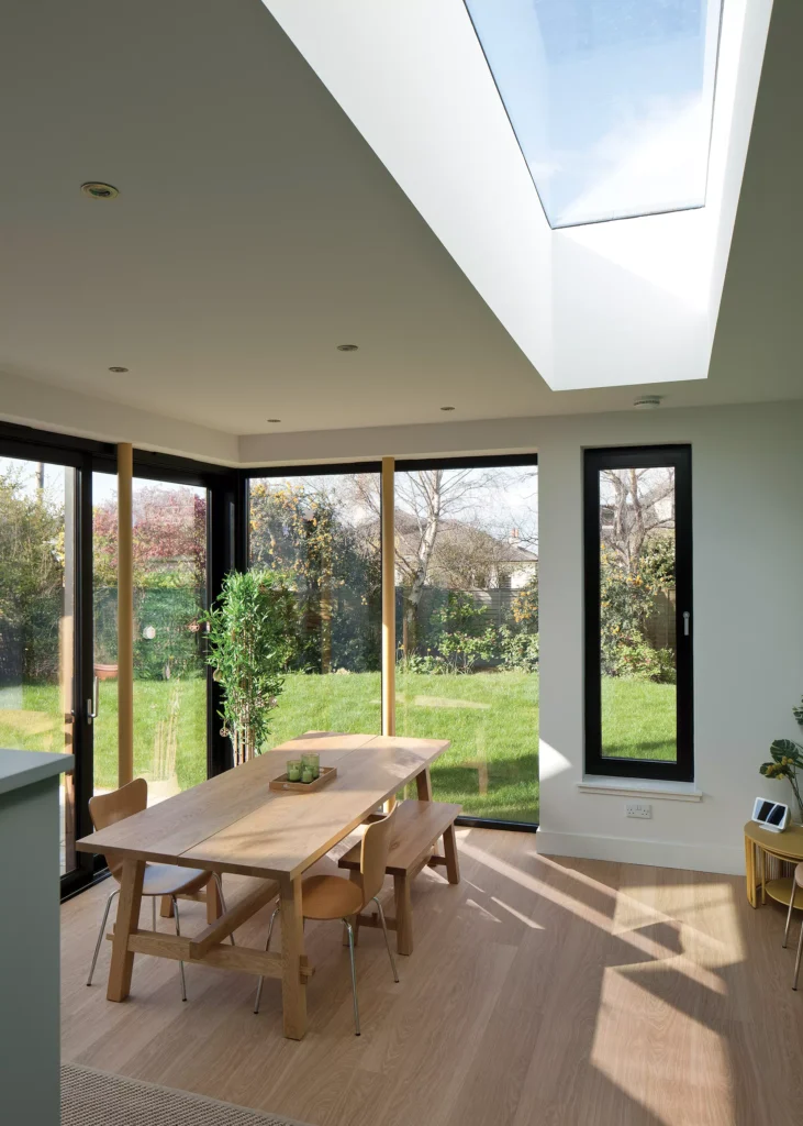
Chambers McMillan’s main proposal was to reconfigure the property to make the layout work better and add several extensions. A rear kitchen-diner extension with lots of glazing connects the living spaces with the garden and meets the brief of maximising daylight. And a new dormer extension in the roof enlarges the room upstairs.
- NAMESJohn & Susan Yates
- OCCUPATIONSIT consultant
- LOCATIONEdinburgh
- TYPE OF PROJECT Renovation & extension
- STYLEContemporary extension to traditional bungalow
- CONSTRUCTION METHOD Masonry cavity
- PROJECT ROUTEArchitect designed, project managed by the builder
- PROPERTY COST£425,000
- BOUGHT October 2017
- HOUSE SIZE151m2
- PROJECT COST£227,500
- PROJECT COST PER M2 £1,507
- TOTAL COST£652,500
- BUILDING WORK COMMENCEDSeptember 2020
- BUILDING WORK TOOKNine months
- CURRENT VALUE £675,000
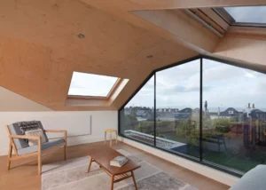
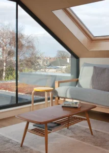
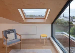
“Rather than add an attic bedroom, we decided to use it as another living space,” says John. “Although the space is small, it opens out onto fabulous sea views over the Firth of Forth, which really lifts the soul, and gives an enormous sense of wellbeing for such a simple area.”
The plan also involved extending out from the main bedroom to create a larger room. “We wanted the new parts of the house to look distinct and visible from the existing house. Using zinc cladding for the new parts helps to contrast with the Scots slate on the original building,” explains Ian McMillan. “John is from the US, so likes the horizontal clapperboard feel of the cladding, in contrast to the traditional rendered Scottish masonry walls elsewhere.”
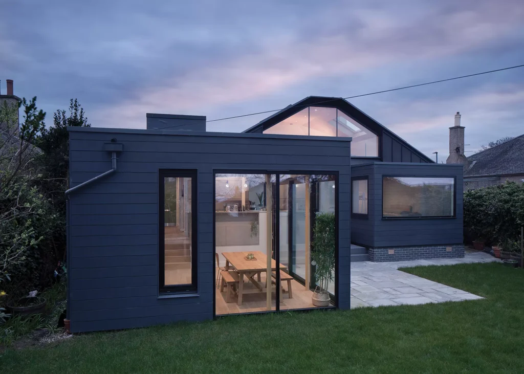
The new additions are clad in a grey zinc, with high performance aluminium framed thermally broken windows in a similar grey-black colour. The roof of the kitchen-diner extension is a slate grey single ply membrane with a sedum blanket
A key part of the layout reconfiguration involved moving the front door entrance from the middle of the front elevation further along to the right, where the garage once was. However, the local planners insisted that the original front door was left in place so that the authentic bungalow style could still be recognised.
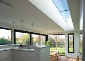
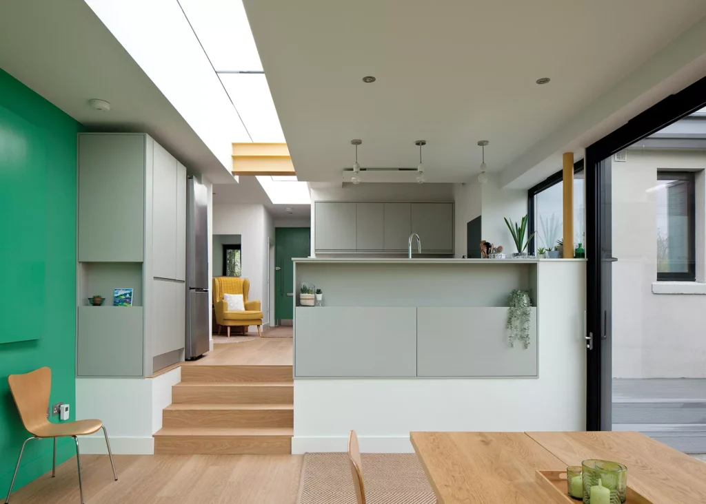
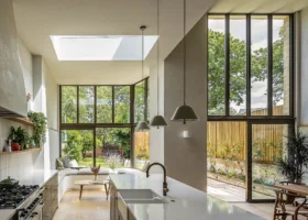
A long linear rooflight leads from the new entrance through a small snug, directly into the large extension, where the kitchen-diner opens up to the garden. The staircase comes off from here and works with the slope of the roof to access the upstairs living area.
The internal alterations to the original building streamline the flow, helping to divide the bedrooms from living zones and providing space for a central hallway that accesses each room – something that the floorplan didn’t previously allow. Other changes include placing a bathroom where the front entrance used to be and reconfiguring the original bathroom into an ensuite for the main bedroom.
Learn More: Planning Applications: What Do Council Planners Want?

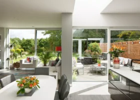
The new kitchen-diner extension is strikingly contemporary with its 15m long rooflight that leads the eye from the front door straight through the addition and out to the garden
The couple didn’t want to make too many changes to the outside of the house at the front, but were keen for the rear to bring some wow factor impact. “We wanted to respect our neighbours,” says John.
“We knew that Chambers McMillan’s plans are always very considerate to the neighbourhood and in terms of our planning process, Ian was very forthcoming and upfront about the potential challenges, particularly with the upstairs window.”
Some locals were concerned that the attic dormer would overlook them, but the architects model demonstrated this wouldn’t be the case. The local council were on board with the project and the planning process took just eight weeks.
CLOSER LOOK Channelling light inside…A design issue that needed to be addressed with the renovation was the lack of sunlight at the rear of the house. The building’s position on a north facing sloped site meant it overshadowed the garden, so getting natural light into a new rear extension required some thought. More Inspiration: Window Design and Wow Factor Glazing: Project Ideas and Expert Advice “Our architects came up with the concept of a long extension out into the garden, which catches the afternoon and evening sun directly,” says John. “We also get light through to the new front door thanks to the 15m long linear rooflight, which draws you from the entrance straight into the garden. It offers views of the sky and weather outside from all parts of the new living space. It’s a real wow factor feature that all our friends comment on, and a focal feature in the house.” |
Overcoming Lockdown Hurdles
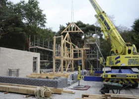
The build itself was less straightforward, mainly due to the pandemic, which led to delays and cost increases. “The frameless glazing was bespoke and had to come from Germany, which was an issue due to Brexit plus the pandemic. It took longer than expected – about four months after the main glazing was installed. Plywood was fitted in the rooflights as a stop gap,” says Ian.
Overall the build cost increased by 10% from the initial estimate. Some of this was down to variations decided during the project, but savings were made by making several details simpler. “Some prices did go up during the early stages of the Covid pandemic, and the glazing costs could only be held for two weeks,” adds Ian.
Read More: 10 Ways to Maximise your Self Build Budget
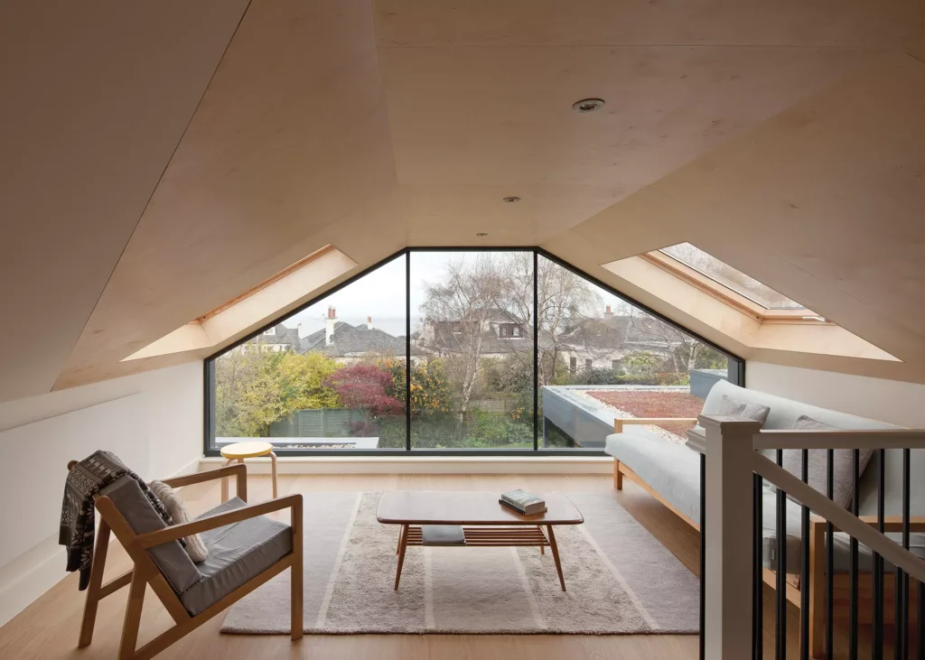
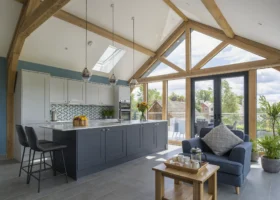
When John and Susan bought the bungalow the attic had already been converted into a room. Their renovation project has enlarged the space by adding a glazed dormer. The spectacular result has amazing views out towards the coast and the natural wood finishes help to create a peaceful space. It’s one of the couple’s favourite parts of their new home
John and Susan managed to avoid a lot of the disruption as they were living in the US at the time. “We had a fortnightly Zoom call with the project manager and Ian to keep up to date,” says John. “We came back when the infrastructure was 80% done and could move in.” The couple were thrilled by what they saw when they arrived at their new home.
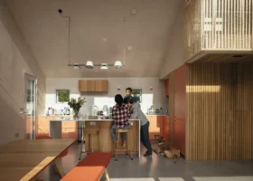
“We’re white and grey people and had no inclination to have any colour in the house,” says John. “But thankfully Ian and Thea persuaded us otherwise – they said we could paint over it if we didn’t like it. When we saw the colourful result, we thought it looked amazing!”

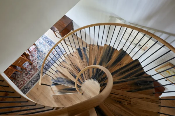
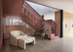
The staircase leads from the largest extension up to the first floor living space. To get into the bedrooms, you walk beneath the stairs, where a diagonal storage wall has a real sculptural quality
In contrast, the upstairs lounge features neutral timber floors and plywood walls and ceilings. “It was always in our plans to have a quiet lounge area there and it’s very relaxing. We don’t have a television in the room, just beanbags and a sofa bed. We love just sitting and watching the views over the city with a coffee,” says John.
Read More: 12 Golden Rules For Specifying Timber Flooring
Creating an Energy Efficient and Eco Friendly Home
All finishes were chosen with the homeowners in mind. John has asthma, so hypoallergenic products, such as low VOC paints, were used. They also opted for infrared heating, which produces radiant heat that warms objects and surfaces rather than the air in between, so dust doesn’t circulate, which is better for people with allergies.
A natural vinyl floor was also chosen for allergen-friendly properties. Energy efficiency was also a key priority for the renovated home’s design. “We used high performance glazing, with the aim to keep down energy consumption,” says Ian.
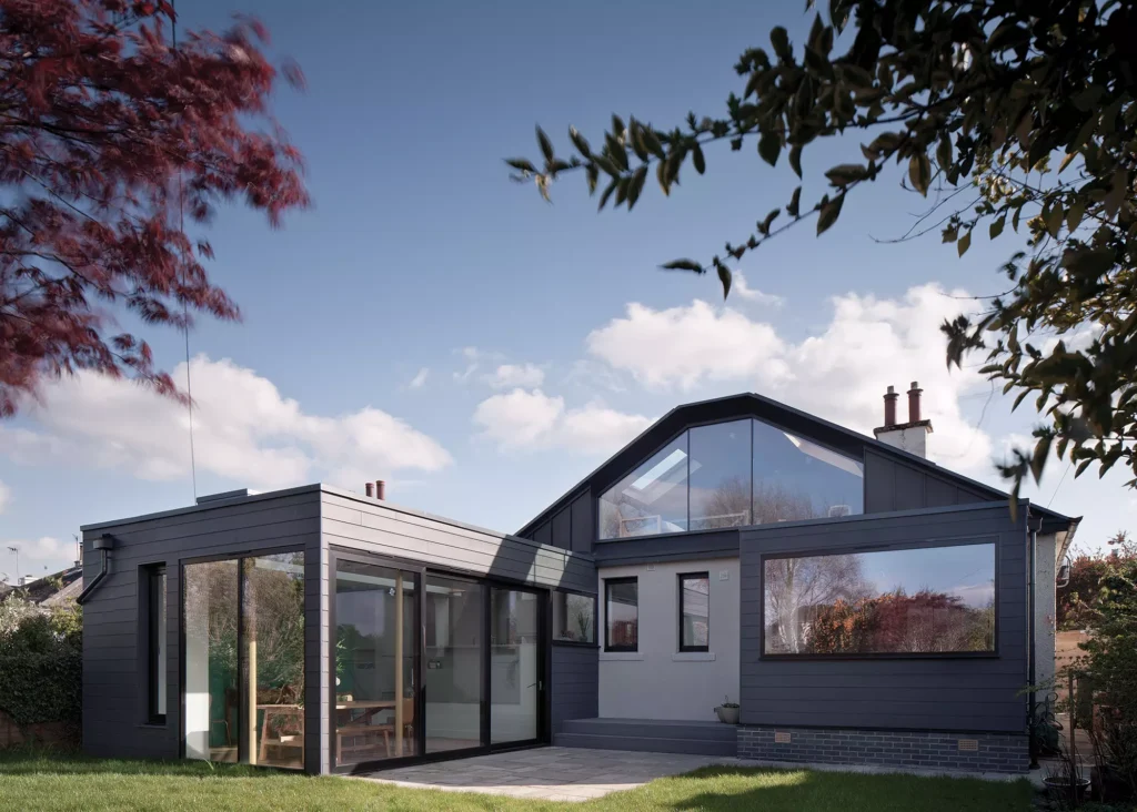
The back of the bungalow has undergone a contemporary transformation thanks to a kitchen-diner extension, small addition out from the main bedroom and new glazed dormer upstairs
“We also went all electric, to cut out fossil fuels – and 98% of domestic energy in Scotland is generated through renewables. We have solar PV panels and battery storage, so we can use an agile nighttime tariff. There’s a sedum roof on the extension to help with local biodiversity, and this replaced the garden space that we used by building out.”
A key aim was to upgrade the fabric of the building to get the house to be more efficient, consume much less and help them save on energy bills before considering renewable technology. There was previously no insulation, so 100mm insulation was added to the walls and 200mm below the existing floors. “The calculations show this reduced the energy loss of the house by a factor of 10,” says Ian. “The house has gone from an EPC D rating to an EPC A.”
Learn More: Home Insulation: Best Ways to Reduce Heat Loss & Stay Warm
Creating a Dream Home
For renovators John and Susan, the finished result of their revamped bungalow is a delight. “We’ve never done a project on this scale and it has absolutely exceeded our thoughts and expectations, thanks to Ian and Thea,” says John.
“We wanted light, and the sliding doors to the extension and rooflight are unbelievable at bringing that in. As soon as you walk into the house the light from overhead just hits you. And the colours are the icing on top of the cake,” he continues.
“In terms of space, when our family comes over to stay, the house can comfortably accommodate seven of us at one time, which is great for a property of this size. Moving here has been a 10 out of 10 for both the location and the work done to create this home. If we were to do it again, Ian and Thea would definitely be involved.”
We Learned…We didn’t have a plan for how the house could be reworked when we saw it, but we had a gut instinct it could be transformed. Approaching architects that were doing a similar project nearby turned out to be a great move. A poor epc rating for the house when we bought it wasn’t an issue. Our architect suggested we fully insulate the property as part of the project. We decided to take out the gas boiler, and opt for energy efficient infrared heating panels, which tied in with solar PV panels on the roof and a home energy battery. The EPC rating is now an A. Changing the layout of the original part of the house means the circulation works so much better – this was so important because it’s mostly on one storey. We moved the front door and now there’s a clear divide between bedrooms and living spaces. |
More Inspiration: 20 Sustainable Eco Homes to Inspire Your Project

























 Login/register to save Article for later

