Industrial Style Renovation and Extension to London Home
Paul Corrall’s home – a ground floor flat located within a converted Victorian terrace in North London – has been transformed from a cramped space into a bright and ergonomic house, with a beautiful sense of flow.
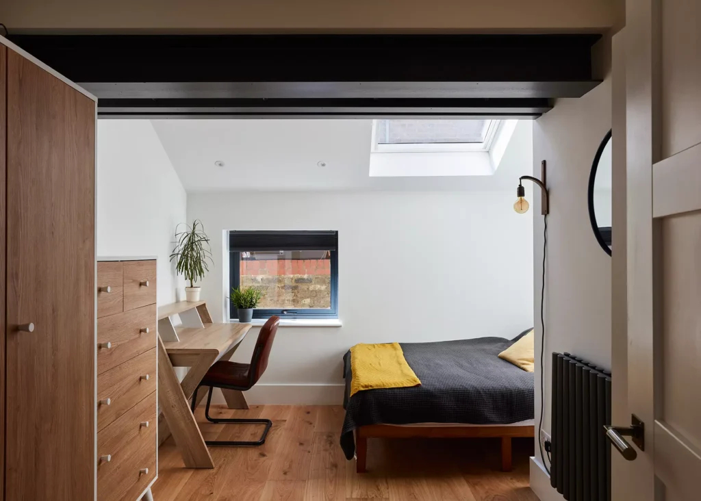
After seeing a scheme by Model Projects online, Paul got in touch with the architectural studio and discussed his requirements. “He wanted to make the kitchen larger to include a dining area and increase the size of the second bedroom, too,” explains architect James Hood of Model Projects.
“He wanted to create a sense of wow factor; for his home to be something different and contemporary, and he would like it to be finished by the end of the year.”
Responding to the Renovation Brief
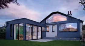
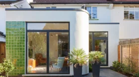
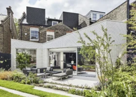
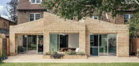
In response to Paul’s ideas, Model Projects designed a new single storey wraparound extension, which has an angled wall at the back and a vaulted pitched roof.
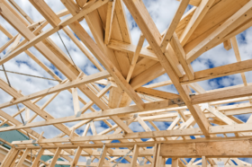
“Often with a Victorian terrace, the rear annexe element has a lower ceiling than the main part of the property. So, one of the big challenges for us was to create that feeling of space and openness towards the end property, while not impacting on the neighbours. Incorporating the vaulted ceiling helped us to achieve this, alongside the use of oversized rooflights,” says James.
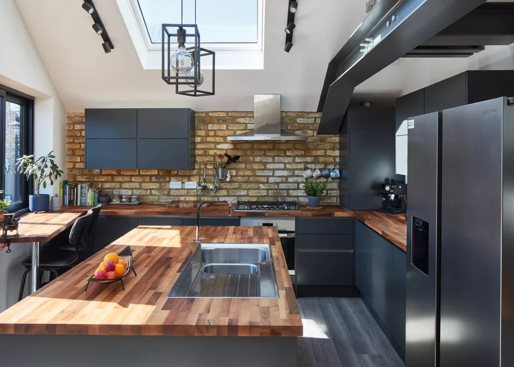
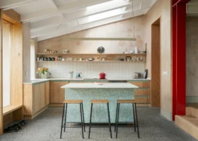
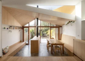
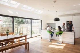
The industrial style kitchen features a vaulted ceiling and large rooflight, bringing ample daylight into the new extension throughout the day
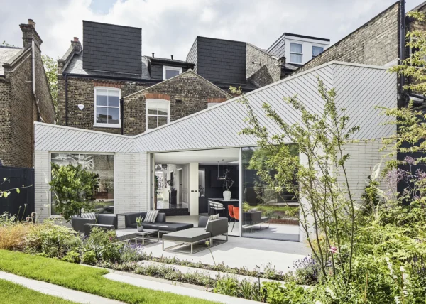
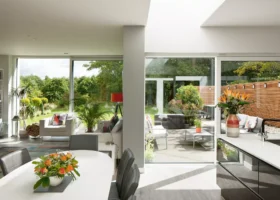
The glazing to the rear of the home includes a sliding double pane window to the kitchen, which sits in line with the breakfast bar. A set of large glazed doors leads you out into a city garden, with an external seating area and planting.
Outside, the extension features a contrast of materials – London stock brickwork and black vertical composite cladding. This mix hints at the style of the home inside.
Learn More: 21 Wow Factor Home Extension Projects
- NAMEPaul Corrall
- LOCATIONNorth London
- STYLE Industrial
- TYPE OF PROJECTRenovation & extension
- PROJECT ROUTE Architect designed
- PLOT SIZE81m2
- EXTENSION SIZE 25m2
- BUILDING WORK TOOK10 months
Updating the Interior Scheme
The interiors have an industrial feel, something that shaped the overall scheme. This was achieved by exposing the main structural beams and the use of brick feature walls.
“The exposed steel beams allow original features, like the corner of the annexe, to be on show, along with bare brickwork walls. One of the nice touches is that the stamped logo for British Steel is still visible on the beams,” says James.
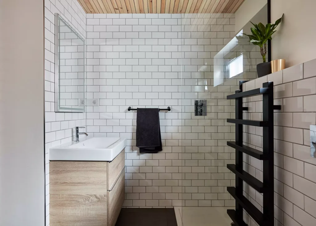
The sleek bathroom makes use of metro white wall tiles and dark slate tiles on the floor
“Lighting also formed a major part of the design, and due to the vaulted ceiling we felt spotlights may not be the best solution. So instead, we used a row of directional spots along with pendant lights, which were positioned in key areas.”
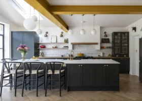
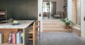
The kitchen features simple dark black handleless units, dark timber kitchen worktops and chrome appliances. This adds to the overall industrial feel, contrasting with the bright space, which is flooded with natural light. This zone is further enhanced by the vaulted ceiling that adds an unexpected wow factor as you enter.
These design features are carried through into the new family bathroom, with a sleek glass screen, simple metro white wall tiles and dark slate tiles to the floor. A suspended timber ceiling adds a unique design feature to the overall bathroom space.
Read More: Bathroom Design: How to Plan a Bathroom Layout
Gaining Planning Permission for the Renovation
As the property is a converted flat, planning had to be considered from the outset. There were no permitted development rights, and a full application had to be submitted. “Consent was achieved first time,” says James. “The planners requested that the flanks of the extension were lowered on the neighbour’s side, but luckily this was done while the application was still live.”
The finished home is spacious indeed, with a free-flowing sense of movement, and ample natural light. The extension adds 25m2 of extra space, taking the property from its original 56m2 up to an impressive 81m2 overall.
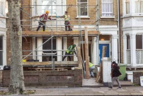
Paul’s original requirement for a quick development was achieved, too, with the project taking around six months from concept, through to the planning, technical drawings and tender phase, and around three-to-four months on site.
More Inspiration: 11 Characterful Urban Renovation Projects



















 Login/register to save Article for later

