Inspiring 1970s Bungalow Renovation
After 10 years of renting, Matt Stevens couldn’t wait for the chance to make a mark on his own property. “The timing to take on our own build had never been quite right, as I was always busy working on other people’s homes,” says Matt, who runs his own construction company.
However, when the Stevenses found out their landlord planned to sell their home, Matt seized the opportunity to start looking for his own project house. “We were forced into the decision because the owner of our existing place was selling, so we could finally design and build a house that would suit all our needs,” he says.
- NamesMatt & Kirstie Stevens
- Occupations Builder & hairdresser
- LocationWiltshire
- Type of projectRenovation, extensions & garden studio
- StyleContemporary
- Construction methodBrick & block, structural steelwork, timber frame
- Project routeArchitect designed, Matt’s company carried out construction
- Plot size0.75 acres
- Property cost £430,000
- Bought September 2017
- House size 311m2 (incl. 54m2 separate studio)
- Project cost £306,000
- Project cost per m2£984
- Total cost £736,000
- Building work commenced December 2017
- Building work took 11 weeks for first floor extension & ground floor remodel. Garden room & studio completed later
- Current value£975,000
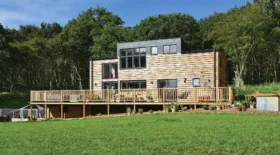
With three teenage daughters to accommodate – Bo, 19, Nina, 15, and Frankie, 13, Matt and his wife Kirstie turned their attention to the search. The pair also needed to consider their various pets, including three dogs, a tortoise, and a parrot. It was Kirstie who discovered the tired 1970s bungalow with reconstituted stone cladding that would eventually become their stylish modern home – though Matt was unimpressed at first.
“However, after viewing a couple of properties we decided that the bungalow offered the best value in terms of space and outlook,” he says. “The views from the garden were fantastic, and we could really see the potential.”
The transformation begins
Matt and Kirstie consulted an architect friend whose practice, MD Architecture, is based in Cirencester. They discussed the possibility of extending the bungalow upwards to double the living space and create first floor bedrooms, plus a family bathroom, for their three daughters.
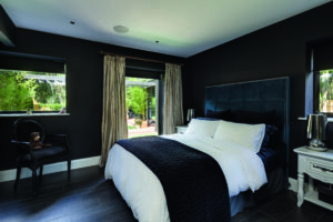
The neighbouring properties are two-storey, so the couple anticipated that gaining planning permission would be straightforward. “I actually really like bungalows and was keen to keep our bedroom on the ground floor, overlooking the garden,” says Matt, who had strong ideas about the overall design and layout.
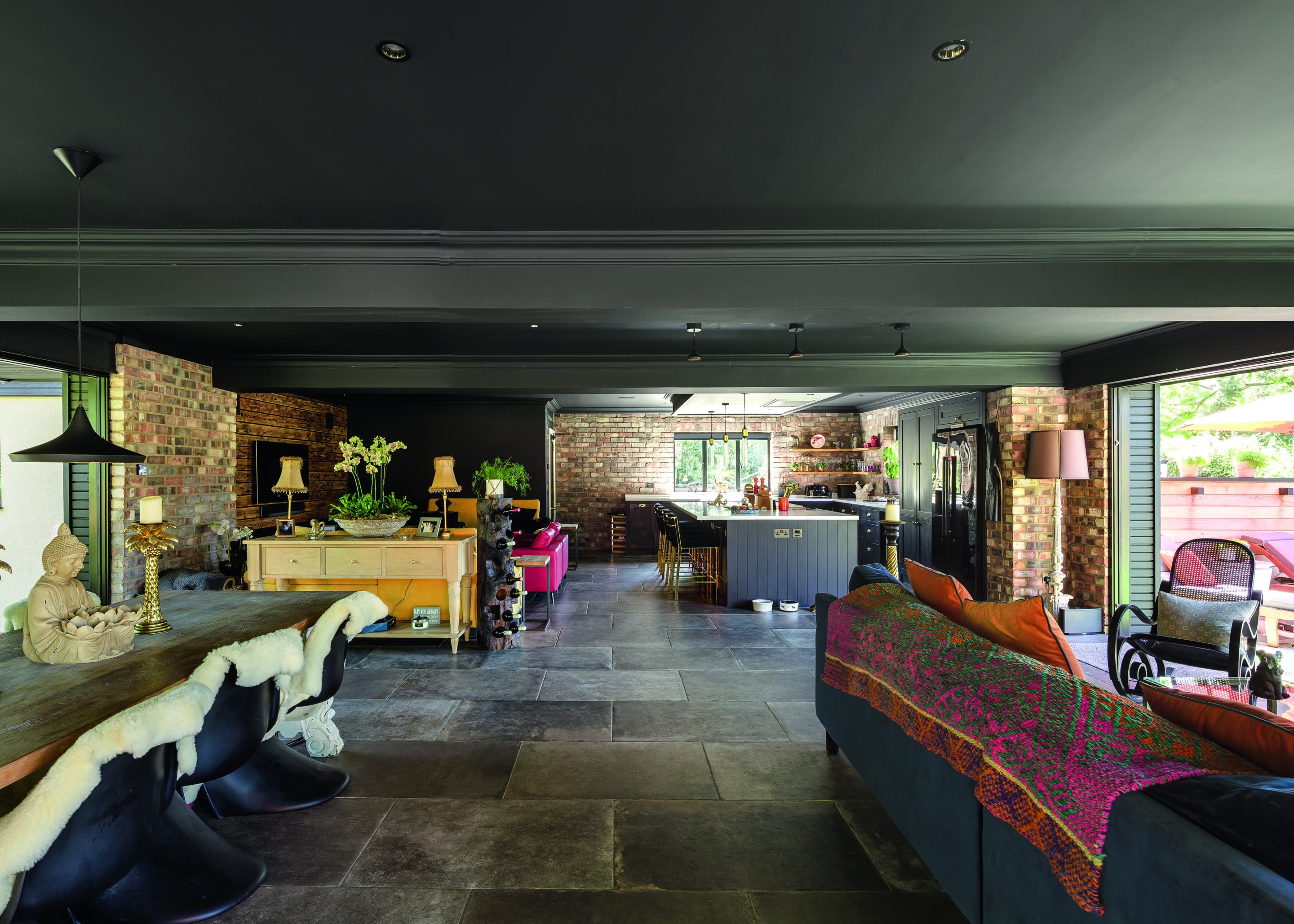
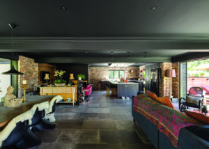
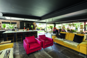
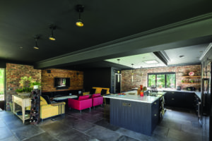
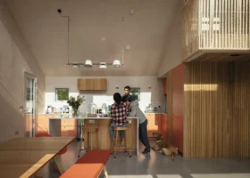
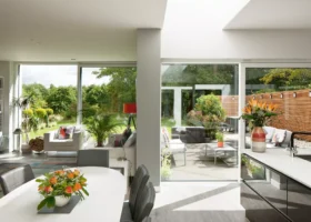
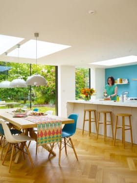
The open-plan living space comprises a kitchen, lounge, dining and garden room areas
The couple put together a scrapbook detailing everything they wanted from their home, right down to where a Christmas tree would stand and how items of furniture could be positioned.
“We went into huge detail at the design stage, but then during the build our plans changed on an almost daily basis,” says Matt.
“As a builder, I’ve come to realise that nothing should be set in stone. It is generally much easier to imagine how a room will feel once walls start to go up. Plus, flexibility is important, especially when you’re working with an existing building.”
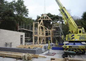
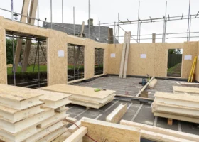
Planning approval for the first-floor extension was granted without objection, despite the conservation area setting. Within days, the roof of the old bungalow was stripped. Using timber, the wall plate height was raised by 500mm to create head height in bedrooms. A new truss roof was craned into position in just one day, with rooms formed inside. “Working with timber meant we could go ahead with the build in all weathers,” says Matt.

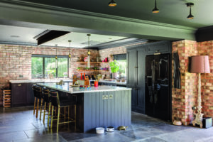
The ceilings in the kitchen have been painted black to match the hand-finished cabinets. This bold hue has been paired with contrasting white Corian worktops
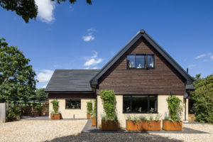
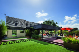
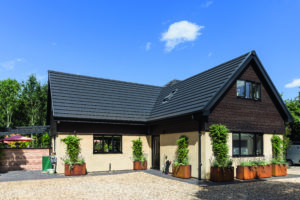
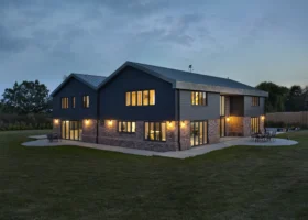
Black concrete roof tiles were chosen as an alternative to natural slate. The lightweight nature of the timber first floor meant the existing footings didn’t need any reinforcement to support the additional load, which helped save time on site. “This has probably been the fastest project our building company has ever completed, with the main house finished in just 11 weeks,” says Matt.
Speed was of the essence, as the family needed to vacate their rental home. “We had a two-week blitz on the timber frame before subcontractors, such as electricians and plasterers, were brought in,” says Matt, who continued working on other projects at the same time. “Working through the winter caused problems when we had snow, but apart from that the build really couldn’t have gone more smoothly.”
Piecemeal construction
Matt and Kirstie decided to tackle the expansion of their bungalow in several distinct stages, with the first-floor extension marking the beginning of the transformation. “We knew from the start that we also wanted to extend the living space with a glazed garden room, but just couldn’t nail down the design with our architect,” says Kirstie. “In the end, we gained planning permission for building upwards and then added the extension later, followed by the garden studio and landscaping. It meant that we could get going quicker and think about funding the other work as we went along.”
Located centrally on the south-facing plot, the footprint of the existing bungalow was retained, and the external walls and footings reused. Internally, though, virtually every partition wall was removed on the ground floor to create a more open-plan layout.
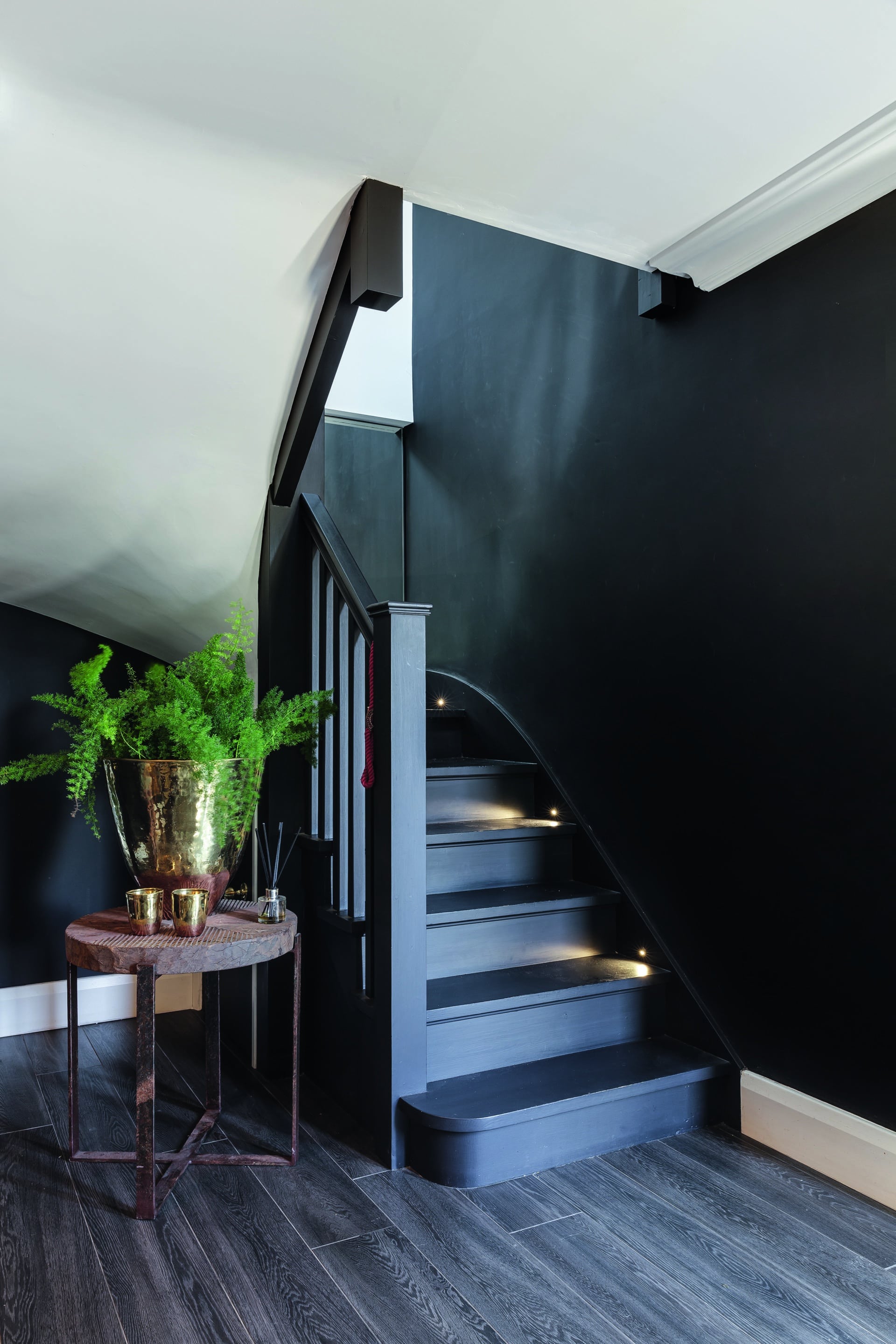
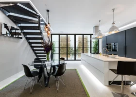
A bespoke black staircase was fitted to provide access to the new first floor rooms
A temporary stud wall was erected in the kitchen, in readiness for the new garden room extension to be added later. The principal bedroom suite is contained in one wing of the ground floor. There is also a separate snug, and a WC located off the entrance hall.
The existing ground floor concrete screed was broken up so underfloor heating (UFH) could be laid, together with 100mm insulation and a slimline liquid screed. New doors and aluminium frame windows were installed throughout, with the heads all raised to accommodate the new floor level.
“Often people choose sleek aluminium for window frames to keep sightlines to a minimum, but the engineering side of things still needs to be done right to avoid compromising the structural integrity of larger openings,” says Matt. For simplicity, he installed chunkier frames and reduced their visual impact by building and plastering around them.
Statement colours
The dark roof tiles and charred larch cladding on the house exterior aren’t the only place a bold, dark hue has been used. The interiors have also been finished in a deeper shade, including a black kitchen and ceilings. “The idea for using a dark colour overhead materialised when I was sitting in Wagamamas,” says Matt. “Kirstie and I looked up and instantly loved the idea, though others took some persuading!”
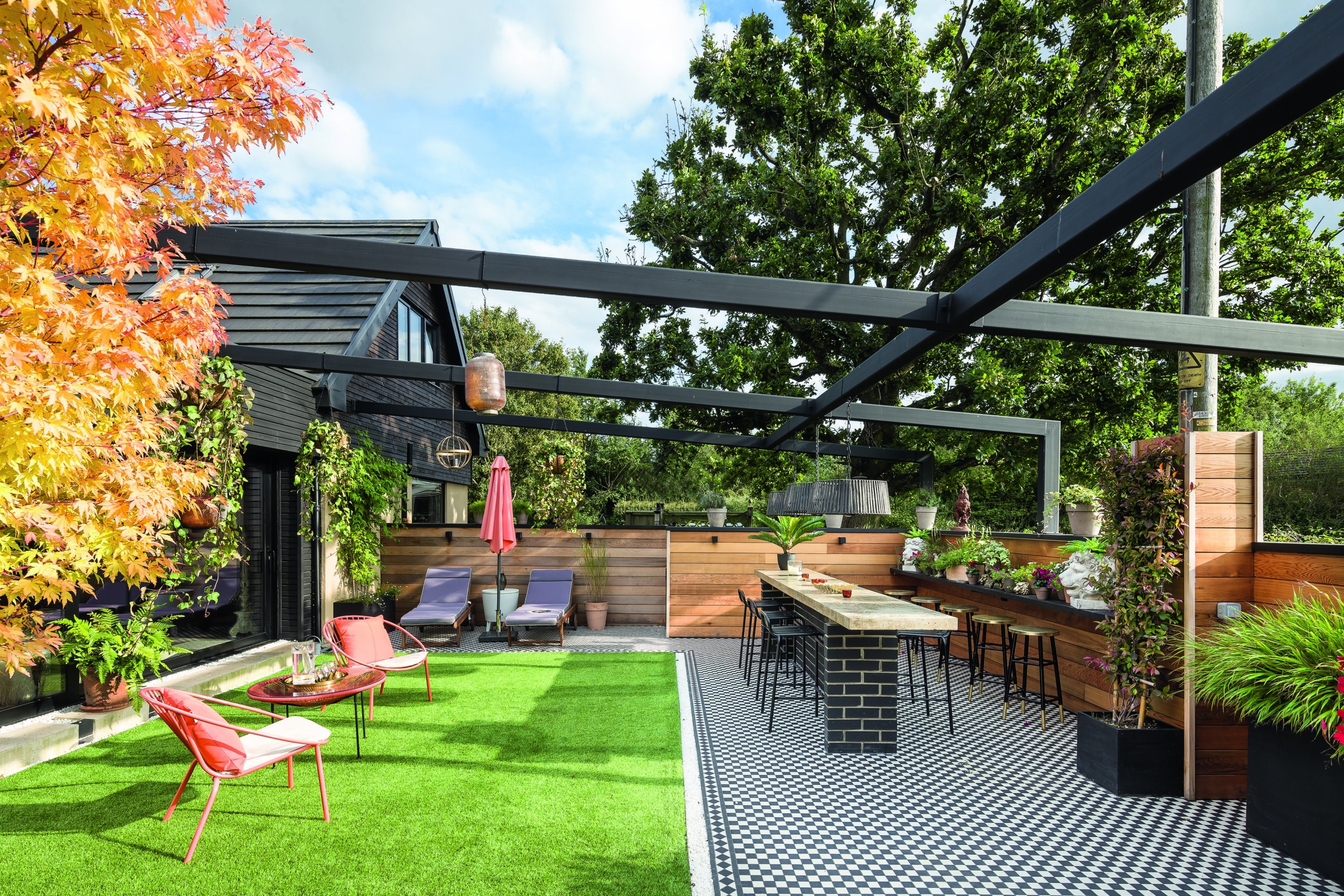
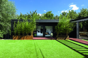
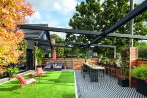
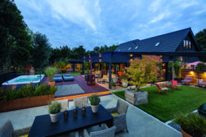
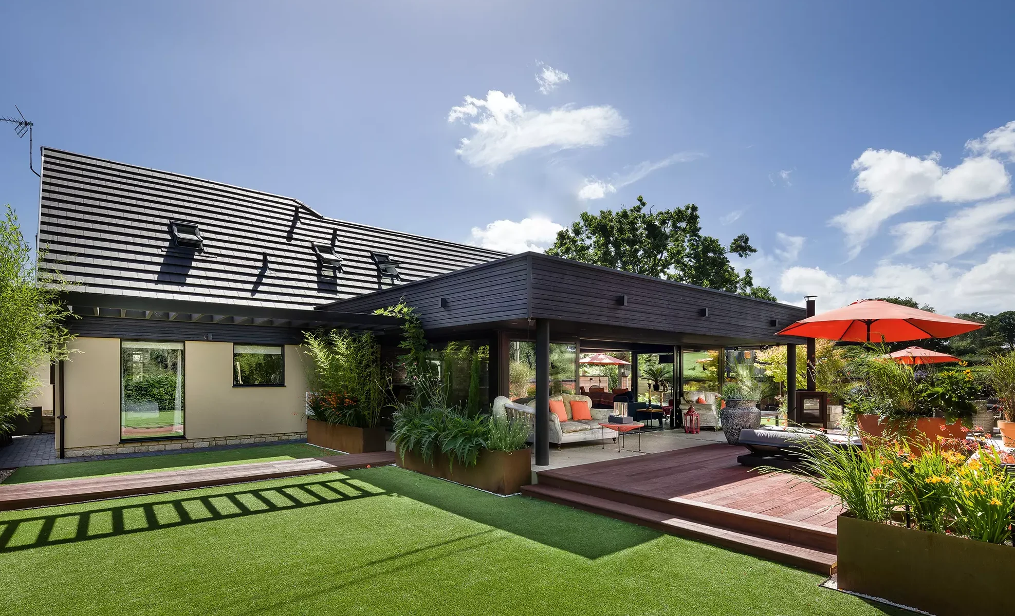
A low-maintenance garden has been designed for the three-quarter acre plot. The outdoor area encompasses an Astroturf lawn, tiled kitchen/bar, decking and a pergola, creating inviting spaces to be used all year round
After experimenting with a deep grey paint, Matt told his decorator the shade needed to be darker, and a jet-black product called Sinner was chosen. The modular Shaker kitchen was hand painted to achieve the desired effect. “Everyone is horrified when we tell them we have a black house – until they see it,” says Kirstie. “The dark kitchen stands out against the reclaimed brick slips we chose for the walls, which have been stuck on to help us avoid losing too much space.”
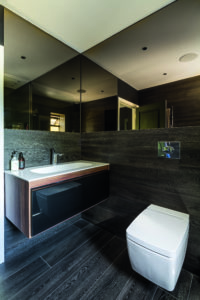
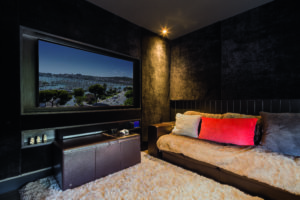
Dark ceramic floor tiles were laid atop the underfloor heating – this was after Matt and Kirstie had tested various samples by getting their dogs to walk across them, with lighter colours showing up every paw print. Matt undertook most of the tiling himself, with Kirstie and the couple’s daughters helping by painting. Music and lighting systems, plus a lavishly decorated home cinema, have also been incorporated.
Further changes
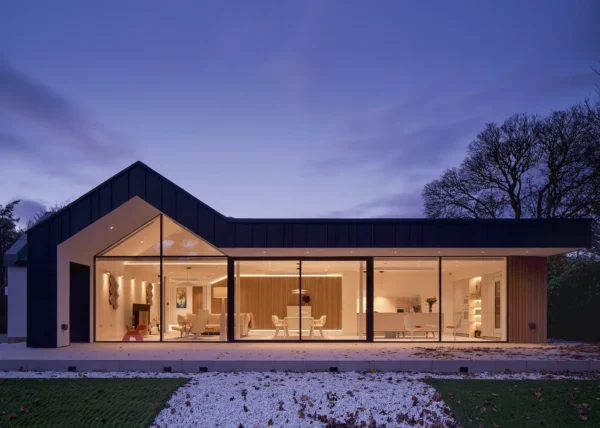
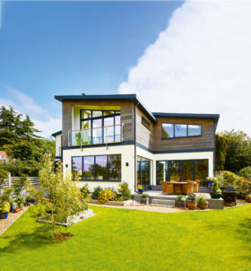
Planning permission was sought separately to replace the old conservatory, on the side of the house, with a larger garden room leading off the kitchen. Designed with an overhanging flat GPR roof and zinc trim, this avoids overshadowing the garden and creates the potential for a roof terrace to be added later, which could be accessed from one of the bedrooms above.
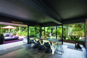
The garden room’s sturdy structural steel frame and ring beam stand on standard strip foundations. The structure has been designed to support the large spans of glazing without the need for additional posts, which would have interrupted the view. The steelwork extends out into the garden and was originally designed to accommodate a glass corner. As the family lived in the house, however, they noticed the wind always hit this area. Therefore, the opening glass was positioned more centrally instead.
“Directly outside the garden room is a lovely wood, which the Forestry Commission planted, with fields to the other side,” says Kirstie. “We wanted walls of glass to overlook the garden and connect the house to the outdoor space. The roof overhang shelters the glass from rain.” The task of completing the landscaping, which includes an outdoor kitchen, bar, hot tub and deck, became a bigger and more expensive job than the Stevenses had first anticipated.
However, it did involve numerous trips to the garden centre, which the whole family was able to enjoy together.
“We used the waste materials from the old bungalow to build up the level of the plot,” says Matt. “We’re in a flood area and the garden was boggy but adding 200 tons of hardcore created a good base for the landscaping.” The decision was taken not to install a swimming pool, as they can often go unused due to the unpredictable British weather. Instead, a spa with swim jets allows the family to exercise in a smaller space that can be easily heated.
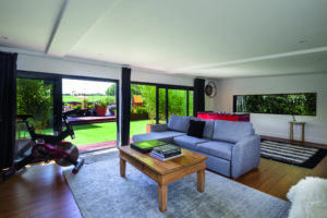
A separate garden studio is another space to enjoy the outside from. It has been designed to serve as a games room but also doubles as a guest suite. As the floorspace is greater than 30m2, planning permission was required for the outbuilding. “We like the cabin feel and got some of our ideas from holidays abroad. Fortunately, our daughters also love the black finishes we’ve chosen,” says Kirstie.
“As a family, we tend to spend as much time outdoors as we do indoors, so for us it was important to create the right setting for the house,” she continues. “Having such a comfortable home has made lockdown easier and given us space to spread out. It’s quite different from our previous house, because we’ve finally been able to put our own ideas into practice. It’s been an amazing experience.”



























 Login/register to save Article for later

