We've got the training course for you!
USE CODE BUILD FOR 20% OFF
We've got the training course for you!
USE CODE BUILD FOR 20% OFFWhen Harry and Sara Montatt decided to move from their flat into a bigger West London property, they knew that going for a doer-upper project was the best way to maximise their budget in one of the country’s highest-value areas.
They viewed dozens of houses, setting up alerts on Rightmove, and when they found this three-storey terraced house on a quiet road, they could immediately see its potential. “The layout was unusual; it looked as though extra stud walls had been added over time and, as a result, the spaces did not flow particularly well together,” says Sara. An ensuite bathroom had been installed in the lounge, and storage tacked on in every available room, leaving an awkward living arrangement.
The Montatts knew that the project would be extensive, so they enlisted the help of Lucy Kuhar, a Slovenian architect who has been working in the UK for the past decade with the likes of acclaimed architect Farshid Moussavi and Karakusevic Carson Architects. Lucy set up her practice, Lumin Architects, in 2018.
An iterative approach to the design was undertaken between Harry, Sara and Lucy, who met for a number of workshops to discuss the living spaces and features the couple wanted from their home. The wish list was extensive, comprising an entirely new layout to make fewer, more spacious rooms, lots of storage, a toilet on the ground floor and a master bedroom on the first floor accompanied by an ensuite bathroom.
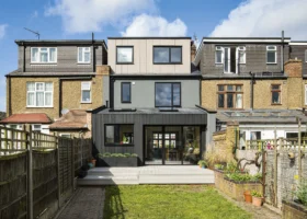
Built in 1975, this terraced brick house in West London has floor-to-ceiling glazing on all three storeys. The new brick extension was designed to tie in as closely as possible to the original building
The original layout featured seven bedrooms on the upper two floors, with a cluster of small ancillary rooms at the front of the house on the ground floor. Harry and Sara had envisioned removing all the internal walls on the lowest level to create a grand open-plan living space crammed with storage and fitted with a number of rooflights.
But Lucy came up with an innovative, more logical layout that divided the spaces carefully, providing useful rooms that make sense in a modern family home. “We knew that this project needed to be big. We had been inside other houses in the area to see what they had done, so we knew what our space could achieve with some careful planning,” says Sara.
The floorplan was intelligently designed to include a generous kitchen-diner on the ground floor, almost double the size of the previous kitchen, and a separate living room on the first floor. This allows sufficient space for a spare bedroom/study on the lower level. “We wanted a layout that would suit a family, as we plan to have children very soon. The separate living room will be a valuable space for our kids to be able to spend time with their friends as they grow up,” says Sara.
More Ideas: Open Plan Living Ideas & Advice for Kitchen, Living & Dining Rooms
Harry and Sara hired the company Daniello to act as their main contractor, a Polish building firm that Lucy had worked with a number of times before. The couple were still living in their previous flat while the building work was carried out, paying two mortgages for several months, so they were keen for the work to be finished as quickly as possible.
Waiting for the project to begin was frustrating, though, and on one visit to the house, the couple became impatient, knocking through a stud wall that they knew was to be removed. “We were messing about really, and the builder told us we had just made the process a little bit more difficult,” admits Harry, “but we were eager for everything to start! The builders were really great though, both in terms of timeliness and the quality of the finish.”
“Having Lucy on board made the entire process so much easier,” Sara continues. “She advised us when the different experts were needed on site, and she added value and expertise. Without her, the entire project would have been so much harder!”
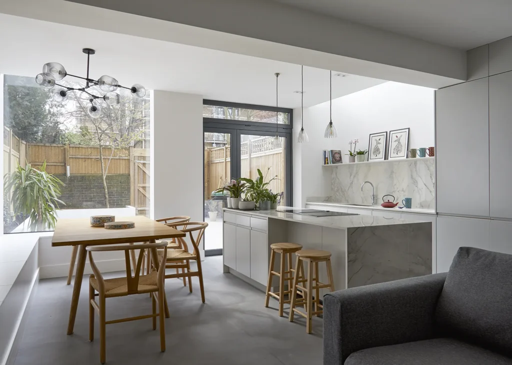
The picture window ensures there is an abundance of light in the bright white kitchen-diner, where bench seating down one side of the room provides seating for large groups at the extendable table
A prolonged planning process meant that the work had to be separated into a number of phases. The internal demolition and renovation could begin while they were waiting to receive planning approval. The construction of the extension started later once they got the green light from the local planning authority, and the joinery installation was the final piece to the puzzle.
Almost every internal wall was removed and repositioned, the floors and ceilings replaced and even the layout of the staircase was changed. Four bedrooms on the top floor were reduced to three, and the middle floor is home to the master suite and living room. There is a bathroom on each of the three floors, stacked one on top of the other in the centre of the house.
Positioning them as such simplified the building process, as this was where the water pipes and drainage were originally located, meaning there was no need to run new pipes to other parts of the house.
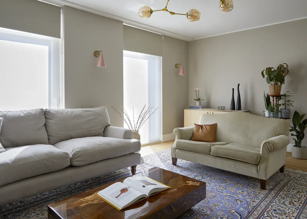
The living room has a wooden floor. It is tastefully decorated with breezy neutrals and a Persian rug that has been in Sara’s family for generations
With planning permission finally granted, attention turned to the kitchen extension. In order to create a level threshold with the garden, the extension was placed 400mm lower than the existing ground floor, which is accessed by two steps down from the hallway.
They also levelled off the sloping rear garden and excavated a total of six lorry loads of spoil in the process. A large concrete slab that once housed a giant hot tub was also dug out and removed, which considerably prolonged the process of laying the footings on which to build the new addition.
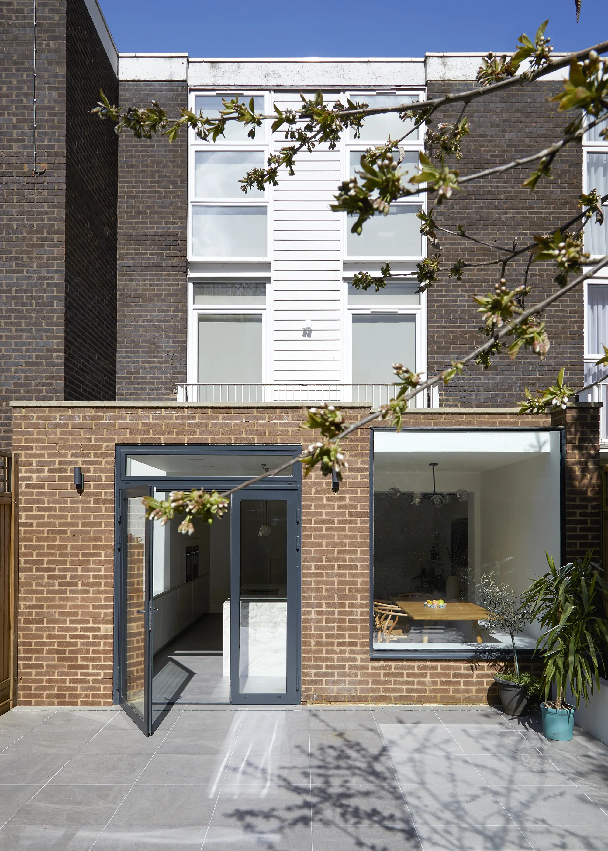
To accommodate the extension, the rear wall of the house was removed and a steel box frame was installed to support the existing structure. Concrete was poured into trench foundations and the walls were built up in blockwork, which was then clad in brick to coordinate with the rest of the house. The flat roof above is finished with a single-ply membrane and is to be planted with sedum, which will be visible from the living room and bedrooms.
More Ideas: Kitchen Extension Ideas: 21 Inspiring Designs
A key element of the design, and something very high on Sara and Harry’s wish list, is the amount of natural light that floods into the house. Floor-to-ceiling, three-panel windows were installed on both the front and rear elevations in order to maximise brightness. “The house is located on an estate that has a strict design guide to control the external appearance of the houses and control what is built.
This guide dictates that the glazing can be two or three panes, with the option to brick up the lower panel” says Lucy. “Some of the houses need the wall space in front of the window for furniture or storage, so there are many houses that opt for having just two panes. We have managed to provide ample storage space elsewhere in the house, which means we can maximise daylight through these full height windows.”
CLOSER LOOK Glazing featuresIntroducing natural light into the interior was key to the design of the kitchen. Rather than a bank of bifold doors and conventional skylights in the south-facing room, an oriel picture window was chosen that has a small section of horizontal glazing at the top edge, with a single door – with fanlight above and sidelight – giving access onto the paved garden. These illuminate the dining area, while a thin skylight in a recess above the sink provides daylight in the kitchen without causing overheating. |
Bifold doors at the back of the property were removed before the extension was built. Now, the extension has an oriel window and a glazed patio door leading out onto the garden. The roof is stepped back at the top of the oriel window, and a horizontal panel of glass acts as a rooflight, with a window seat.
This continues as a bench running along the wall beside the extendable kitchen table and provides space for large gatherings. The floor is laid with fine microcement, which is poured in a similar way to polished concrete. It’s a suitable option for the underfloor heating, as well as a neutral finish that is both stylish and hardwearing.
Built in 1975, at a time when car ownership began to grow, each of the three-storey terraced houses had integral garages, many of which have been incorporated into the living space of the home. Previously, a windowless music room lined with soundproofing material, this has been transformed into a ground floor bedroom and office suite, now complete with a window and a separate WC.
Learn More: Interior Fit-Outs for House Extensions: How to Choose Internal Finishes
CLOSER LOOK MicrocementMicrocement was chosen for the flooring in the extension, and was also used as an alternative to plaster in the upper two bathrooms for a pared back, contemporary feel. Creating an effect similar to polished concrete, microcement offers a seamless, waterproof finish that does away with the need for grout. It’s durable and resistant, meaning it won’t crack either. Thanks to its through-coloured nature, it doesn’t require painting and therefore can be left as is depending on your preference. |
Building Regulations stipulated fire doors must be fitted at the bottom of the stairs. So, to avoid disrupting the flow of space, double pocket fire doors leading into the extension recede back into the walls on each side, keeping them tucked neatly out of the way while the architrave creates a stylish wooden frame around the aperture. These doors provide good sound insulation when entertaining in the kitchen-diner space, successfully reducing the passage of sound to the upper floors.
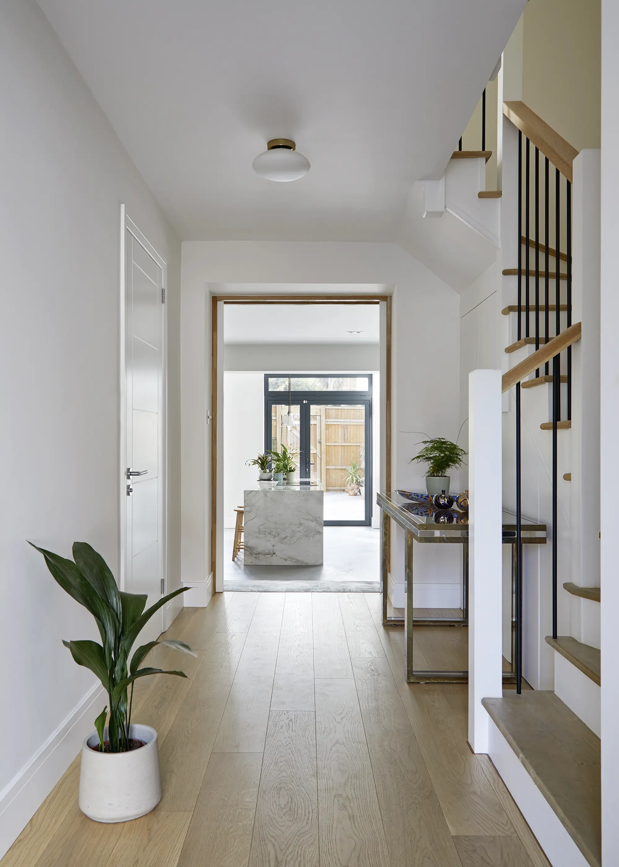
Oak treads and black balustrades adorn the staircase, which was redesigned with a different layout to increase space in the hallway
The format of the stairs was completely redesigned to create more space in the hallway. A winder staircase now replaces the original U-shaped layout, with straight and curved sections to create an elegant, space-saving design. The classic oak treads and handrail have been combined with white risers and a minimalist black balustrade for a contemporary touch.
Where some home renovators like to have every room designed and every detail decided before any work begins, Sara and Harry chose to take a far more evolutionary approach, picking their fixtures and fittings as and when they were needed and having fitted furniture designed after the rooms were plastered out.
“We made a few decisions early on, particularly about lighting products for example, but when we came to buy them, we found that most of them were either unavailable or the price had gone up beyond what we were prepared to spend,” says Harry. “We decided that it would make more sense to choose things when we needed them. This meant we could save time, as we knew what was and wasn’t available and whether or not it worked for our budget.”
Essential Advice: Extension Costs: What Kind of Extension Can I Build For My Budget?
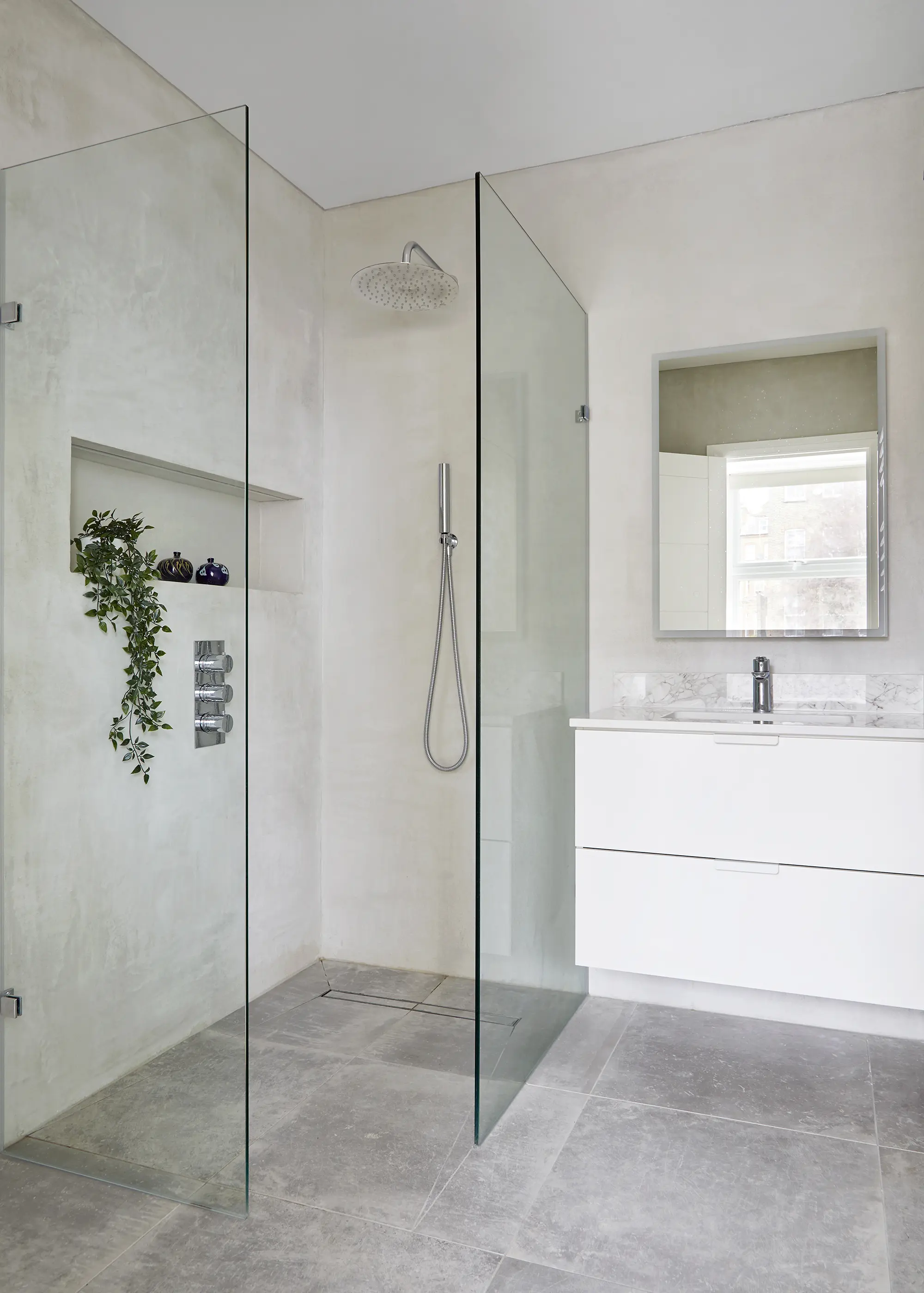
Three bathrooms have been positioned in the same place on each floor, with contemporary fittings and mostly white walls creating calming, stylish spaces
The couple lived a five-minute walk away from the site and were able to visit almost daily, chatting with builders and keeping an eye on progress throughout. They moved in 11 months after building work started. While they may take on another project in the future, Sara and Harry are ready to enjoy the ideal home they’ve created and embark on the journey of growing their own family.
WE LEARNED…
|
