Learn from the experts with our online training course!
Use the code BUILD for 20% off
Learn from the experts with our online training course!
Use the code BUILD for 20% offAs a boy, Rik Smith spent hours creating houses with Lego and Meccano, so visualising a property in 3D was second nature by the time he designed his own home 20 years later.
“I can look at a space and immediately see how it can be divided up,” says Rik. “When I walked into this property for the first time I understood what could be done to improve the layout. The challenge was in the detail.”
Rik’s father, Stephen, sold the family home and bought a period house in Ilkley, which had been divided by the previous owner into separate flats. Stephen bought the large main apartment, although there were some rooms which were surplus to his needs.
This offered a perfect opportunity for Rik – he would purchase the smaller flat and take the surplus space from his father, building a small extension to turn it into a two-bedroom house.
“This plan worked really well for both of us,” says Rik. “It gave me the chance to get on the property ladder and have independence, while Dad could be assured that he knew his neighbour pretty well!”
Rik moved into the upstairs flat while he planned what he was going to do with the collection of rooms below.
“The flat was freezing cold, with single glazing, no central heating and no loft insulation,” he says. “I lived there through one of the coldest winters we’d had for years. It was grim, but it gave me chance to decide exactly what I wanted to achieve before building work began.”
Rik, who runs his own property design business, put the shell out to tender, but wanted to bring in his own team for the internal fit-out.
He moved in with his father when building work began in April 2010. This allowed him to oversee the work on a daily basis, as the first-floor flat with extra ground-floor rooms was transformed into a stylish, open plan, two-bedroom home.
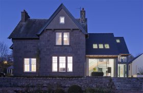
“The front of the house gives nothing away,” says Rik. “There is a double-width front entrance flanked by a garage door and study window, but it’s like the Tardis inside and your eye is drawn straight through the property and out to the mature garden beyond.”
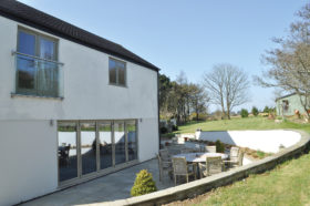
Rik wanted to make sure enough natural light came into the building, which faces south at the back but has limited windows on the ground floor at the front.
“I wanted the core of the house to be open, with light floors and walls and spaces leading fluidly from one to another,” he says. “It had to be modern but not just a square box; light and spacious, but warm and cosy.”
Rik achieved this delicate balance by dividing the ground floor into clear living spaces with flush wall alignments, varying ceiling heights and an open staircase. He also included 10 lighting circuits on the ground floor to create pockets of space and different moods in each living area.
Upstairs, the layout was less flexible. “One of the most complicated aspects of the build was achieving the different floor levels and ceiling heights,” says Rik. “For example, I wanted the floor tiles to be level and fluid from one living space to another.”
The back of the house had a timber floor, while the front, including the old garage, had a concrete floor. Rik wanted to lay wet underfloor heating across both sides and create a consistent, level floor throughout.
He was faced with a choice between lowering the concrete or raising the level of the timbers; and was already restricted by limitations incurred by the boundary wall.
“We were building the blockwork extension very close to next door’s property so we had to make sure that the foundations were no deeper than the neighbouring foundations,” says Rik. “This limited our height and avoided any party wall issues, but left us with less room to play with in relation to the height of the rooms inside.
“The most cost effective and practical solution was to create a new suspended timber floor over the original floorboards, with insulation and metal diffuser trays set between them.”
Rik worked to an approximate budget of £100,000 for the shell, drawing up a bill of quantities as a guide and investing wisely on the ‘hidden’ aspects of the renovation.
“If you don’t spend money on getting the structural aspects right at the beginning, you could land yourself with all kinds of problems later on,” he says.
Thinking ahead about cabling was important: “I wanted to include things like a zoned automated lighting system, which is much easier to do at the build stage than retrospectively,” says Rik. The house includes 2km of data speaker aerial cable and a central vacuum system.
Key to the success of the project was Rik’s exhaustive research in the months leading up to the renovation.
He spent hours searching the internet and sourcing materials, as well as making sure his plans and schedule of works were as thorough and detailed as possible – so there were no unexpected hitches along the way.
The flat roof – chosen with consideration for not blocking the neighbour’s views and daylight – features a glass lantern that draws maximum light into the room below.
The roof also includes 120mm of Kingspan insulation on top of the joists, and a fibreglass finish which seamlessly falls into the lantern valleys.
Rik’s attention to detail is in evidence with the staircase, where he has used 32mm-thick laminated and toughened glass with timber trims to create a glass floor. The bespoke treads are made with stained sapele wood.
Upstairs, Rik has created two spacious bedrooms and the main ensuite includes an open plan dressing area. A ground-floor study occasionally doubles up as a third bedroom.
“Some of my design decisions were very simple but make a huge difference when you live with them on a day-to-day basis,” he says. “I put an automatic light in the downstairs cloakroom, for example, which is much easier than fumbling around in the dark for a switch.”
The emphasis on visible – and invisible – quality and careful pre-planning has paid dividends. “It works brilliantly as a home,” says Rik. “I have approached it with loft style living in mind but it’s also very practical in terms of how I live every day. Everything I planned works exactly how I wanted it.”

