Open-Plan 1970s House Renovation
What was an uninspiring 1970s house has undergone a remarkable metamorphosis.
It all started when Rachael and Dan Gardner connected with an innovative architect who was keen to push the boundaries of design. “Our home needed reorganising, updating and extending but we didn’t want a standard structure plonked onto the back of the property,” says Rachael. “We were keen for the whole dwelling to flow and feel redesigned like new.”
Room for improvement
The couple set about their search for the perfect house, their first together, back in 2009. Keen to purchase something equidistant from their respective places of work, Rachael went to view this property in Winchester in spring that year.
- NamesRachael & Dan Gardner
- OccupationsFinance professional & sales manager
- LocationHampshire
- Type of projectRenovation & extension
- Style 1970s detached house with contemporary extension
- Construction methodExtension was built from steel frame and blockwork, with render finish.
- Project routeArchitect & builder
- Property cost£420,000
- BOUGHTAugust 2009
- House size210m2
- PROJECT cost£264,500
- PROJECT cost per m2£1,260
- Total cost£684,000
- building work commenced November 2015
- building work TOOK Seven months
- moved inJune 2016
- current value £795,000
“Dan was in the army and stationed in Afghanistan at the time, so I came on my own,” she says. “I loved the location because it’s so quiet. The house overlooks the countryside. We put an offer in straight away, as I could really see us bringing up a family here, which is what we went on to do.”
The pair were immediately drawn to the dwelling’s living spaces and large garden. While they hadn’t planned to take on a renovation scheme, it was obvious from the start that the property came with various problems that would need to be addressed.
Featuring a series of poky and dated rooms, the downstairs floorplan lacked the flowing feel the couple craved. The dark dining room was enclosed by an unwelcoming conservatory, and there was little connection to the outside. Upstairs fared better, with a wide landing with views across the fields and four good-sized bedrooms in each corner of the house.

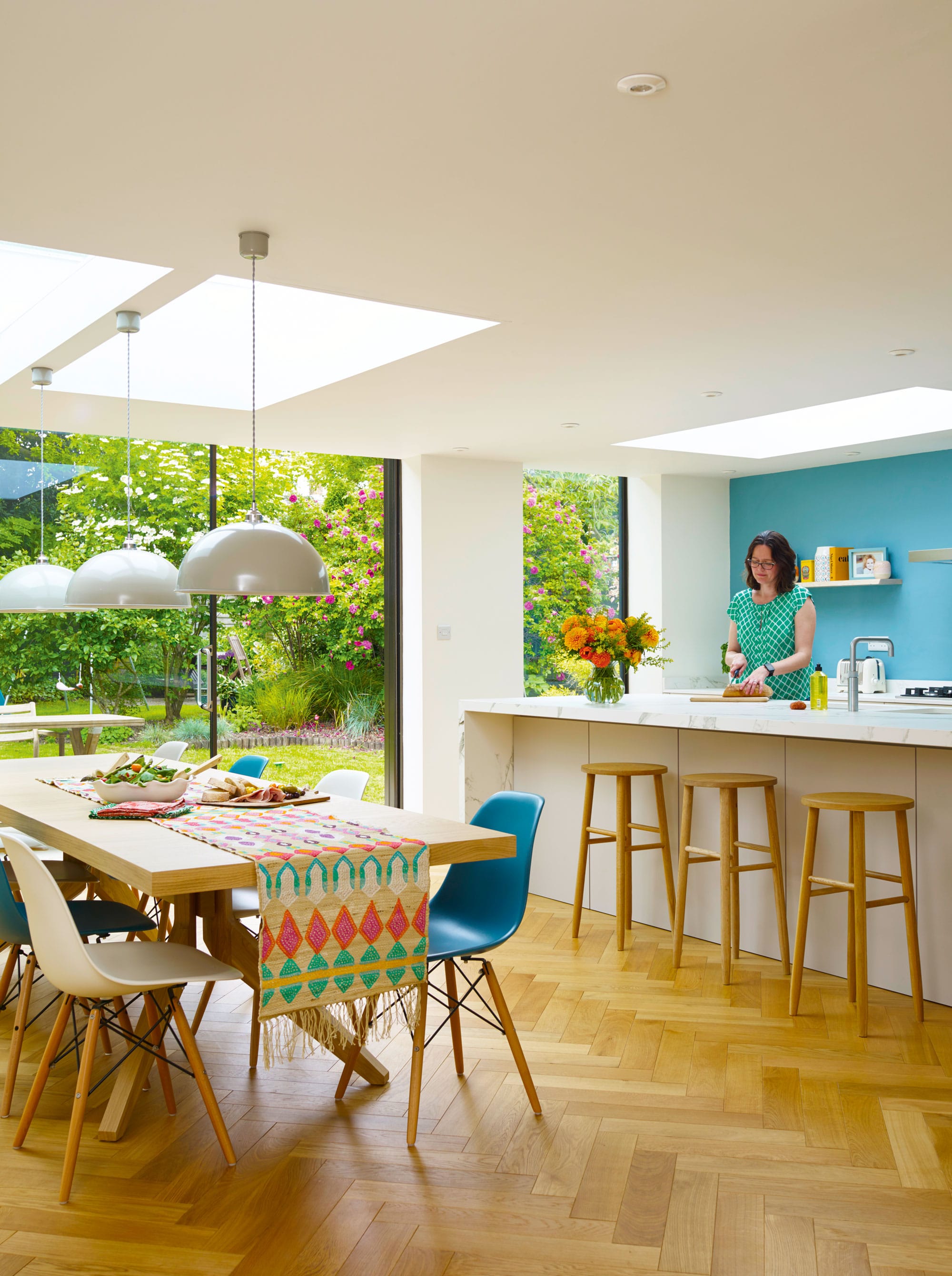
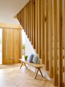
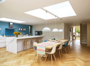
The raw oak floor came from Andy Pool Flooring. It is laid in a herringbone pattern throughout the downstairs and is finished with a clear oil
From the outset, then, the couple knew they had a big job on their hands but they weren’t ready to begin straightaway.
About a year after they moved in, Rachael decided to make a start. “I’d lived in a nicely decorated house before and I couldn’t stand that everything looked so dated,” she says. “I was losing patience, so we decided to get going on the upstairs as we knew the changes wouldn’t affect the bigger project on the ground floor later on.”
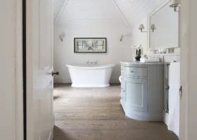
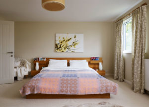
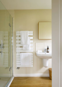
On the upper storey, work revolved around the installation of two new bathrooms and redecorating. The main bathing zone and separate WC were knocked together, while the window was repositioned to the centre of the space. In the master bedroom, Rachael and Dan transformed their ensuite into a wardrobe.
They then created a new bathroom that linked to their bedroom by removing built-in wardrobes from the master and adjoining bedroom. But then work came to a halt.
Next phase
The years passed and Rachael and Dan’s daughter, Eve, was born in early 2013. This prompted the pair to get on with revamping the downstairs, so they began the design process. However, with Dan’s job taking him abroad and Rachael’s demanding full-time work schedule, they remained relaxed about the project timeframe.
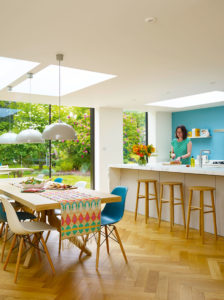
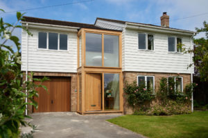
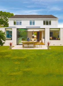
An open, bright extension was at the top of their wish list, to create flow between all the downstairs rooms and a strong connection to the garden. The pair wanted to enlarge the porch and increase the size of the entrance hall, as well as improve the appearance of the front facade.

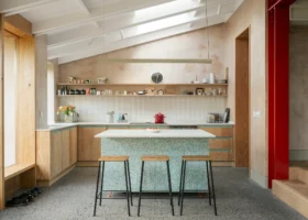
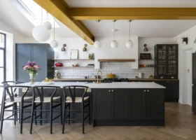
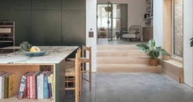
Dekton’s Aura15 marble-effect quartz worktop is 50mm thick and strong enough to frame the island
New cladding on the upper floor, along with replacement windows with a slimmer aluminium profile, would give the house a facelift. On a practical level, the Gardners were keen to allow space in the floorplan for a study, downstairs WC and utility, plus a spot for the piano.
“We wanted to rejuvenate our home,” says Rachael. “I didn’t want to step out of the new part and feel like I was walking back into the same old house.”
Rachael spoke to some local architects but didn’t feel inspired until she met Olly Bray from OB Architecture. “Olly produced a range of innovative ideas that showed he had a good understanding of every single component that was important to us,” she says. “We took our time with the process and spent nearly a year finalising the design.”
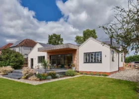
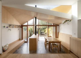
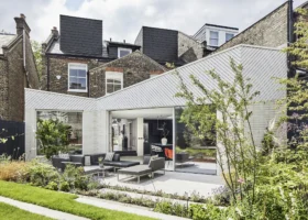
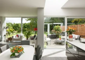
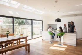
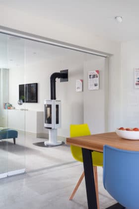
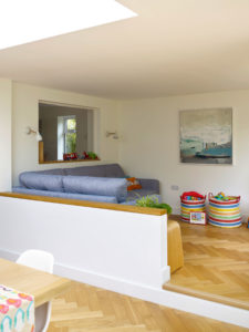
The couple settled on a generous 38m2 rear kitchen-diner extension, with a raised snug area and a separate study. A double-storey glazed porch adds a modern flourish to the exterior of the house, while the bespoke new timber staircase and glass sliding doors in the kitchen have revitalised the interiors.
“What we liked was Olly’s 3D visualisation of the open space downstairs, but with different zones,” says Rachael. “He showed us how having the raised snug would feel cosy, and when I sit at the desk in the study I have a direct view into the garden.”
Getting started on site
The proposal needed consent for the alterations at the front of the house. It was submitted to planning in January 2015 and approval arrived a month later, so the process to find a builder began.

The raised snug and half wall provides a cosy division of space from the rest of the kitchen
Olly put the tender package together, which went out to three builders. By the summer, Samuel Property Development had been selected. Groundworks began in November. Almost straight away an issue cropped up when the builders uncovered soakaways beneath the soil. These had to be reinforced using steel cages filled with concrete.
“They were fairly big chambers and were likely part of the military camp that had been here years before,” says Rachael.
In January 2016, the building team were ready to start inside, so the family decamped to a rented bungalow just a 10-minute walk away. “It was perfect as I was on maternity leave with Bella, our second daughter, and able to focus on the project,” says Rachael.
“I liaised with the joiner on design decisions, answered questions from the builders and spent time sourcing the kitchen and flooring.”
The reconfiguration of downstairs began with the transformation of the old utility room into a study. In turn, part of what was previously the dining room became the new utility. The kitchen
and dining area were opened out into the extension, which now also features the raised family snug.
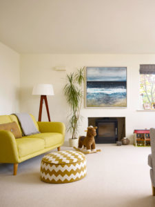
The front living room remains in the same position, however, the ugly 1970s fireplace has been replaced with a stylish woodburner. The door was also moved down the hall and new fenestration has been fitted. “I always thought the windows were too boxy and high,” says Rachael. “But we decided it wasn’t worth spending the money to change the shape of the openings. We fitted models with slim aluminium frames, which let in more light. They’ve made the spaces feel quite different.”
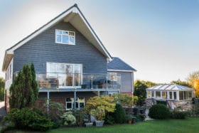
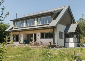
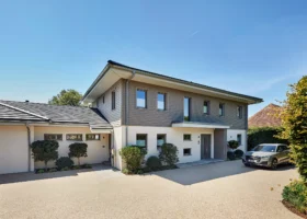
Outside, the old cladding was taken off and the entire upper floor was insulated. The couple chose Cedral Lap white weatherboarding, a low-maintenance wood-effect cement composite.
During construction, another problem arose when the builders fitted the structural beam to link the extension with the existing house. “To have a flush ceiling in the new space, the support needed to connect into the upstairs bathroom. But the floor above was too low,” says Rachael.
“The team did a great job by changing the way the bathroom waste ran so they could push the beam into place.”
Another question mark arose regarding the support for the original corner wall adjoining the snug. “Building control came and ran some checks and decided we needed a supporting pillar,” says Rachael. “It sticks out a bit, but it isn’t the end of the world.”
Olly put together the kitchen layout and specialist company, Controlled Interiors, finalised the plan. At their suggestion, the Gardners have an invisible pivot door within the bank of cupboards, which opens into the utility room and downstairs WC. When the kitchen suite arrived, however, rather than all the cupboards being a stone colour, part of the order was white.
Not wanting to delay moving back in, the couple accepted the compensation offered. In fact, Rachael says the colour contrast has ended up working well.
Pleasing result
The couple’s home features a simple palette of white, pale grey and light wood, echoing the understated appeal of Scandinavian aesthetics. This allows the detail of the herringbone oak floor and bespoke joinery to take centre stage.
WHAT WE LEARNEDHiring the right architect is essential. Olly understood exactly what we wanted and really focused on the detail. It ended up being the making of our project. |
“Olly’s ideas were really simple but turned our ordinary house into a space that feels original,” says Rachael. “We ended up more than doubling our budget because we upgraded the specification on the doors, chose oak frame windows for the porch, and decided to replace the entire staircase. However, this was a one-time project and it was definitely money well spent.”
That’s reflected in the value of the finished house, which is worth a cool £100,000 more than the property cost to buy and update.
Seven months after starting work on site, the family were able to move back in and they’re delighted with the outcome. “Olly’s done a great job of transforming our home into a visual design statement,” says Rachael.
“The light and connection between all the rooms and the garden is amazing. Views we didn’t have before keep appearing – like the tree in the front garden coming into blossom, which we can see from our dining table. Our whole house is just lovely now.”

























 Login/register to save Article for later





What a lovely home! Would it be possible to see the before and after plans?
Hi Michael,
Thanks for your comment – glad you appreciate the project.
You can view the floorplan here: https://www.self-build.co.uk/house-plan/open-plan-70s-renovation/ (sadly we don’t have the floorplan of the home before the renovation and extension project).
– Lucy (Build It Digital Editorial Assistant)