
When Julia and Nick Keem moved to the Kent home they share with their two children, they knew they wanted to do something interesting with the property. “We just weren’t sure at the time what that was,” says Julia.
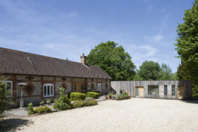
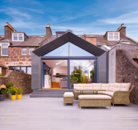
The project the couple eventually came up with has almost doubled the size of the original property, with a curving contemporary side extension that contrasts from the existing red-brick house.
Their scheme also involved making sense of what was previously a jarring layout that had been added in a piecemeal fashion over several centuries.
The pair comprehensively upgraded the fabric of the house, revealing and restoring traditional features that work in juxtaposition to the modern addition.
“We swore that we wouldn’t buy a doer-upper,” says Julia, after having renovated the family’s previous home near Croydon. But the Keems fell in love with this property, which was in desperate need of some TLC.
“It was okay – liveable, but pretty run down,” she says. The key draw was the site itself, which was on a pretty rural lane and came with its own orchard and field. The house may have been draughty, the cellar was prone to flooding, the boiler broke down a week after they moved in – but they had a long-term plan to make things better.
|
This home was nominated for the Build It Awards 2019! |
“The whole thing needed cohesion,” says Julia. Originally a farmhouse, the oldest parts of the property dated back at least four centuries, and the front door stepped into a timber-beamed kitchen with a huge inglenook fireplace.
There was a Victorian extension to the rear of the dwelling, plus two poorly constructed 1980s additions at the front and back. The old and new parts were on different levels, with the Victorian reception rooms sitting a few steps up from the kitchen, which made the layout even more incongruous.
It was clear from the start that this was going to be a complex job for any architect. They would have to rationalise what was already there, be sensitive to the building’s heritage, and answer a brief that called for the various requirements of modern family living.
“We definitely wanted a kitchen-diner,” says Julia. “I work from home, so I wanted a space where I could do that. Another priority was to incorporate somewhere for family to stay when they were visiting.”
She rang round various local architects, and Cranbrook-based Richard Gill was the one who expressed the most interest in the project, with an understanding where the couple were coming from.
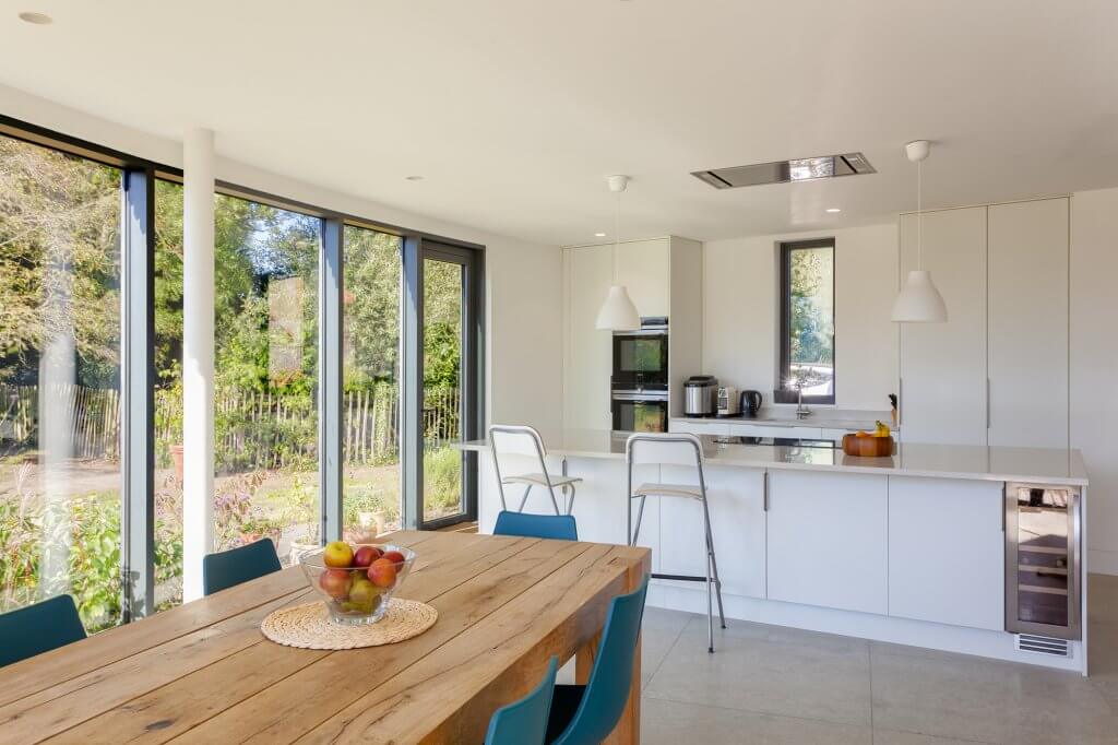
To achieve a light and modern kitchen, the Keems opted for a natural colour palette with wood and steel accents
Richard proposed several ideas for the extension, but one grabbed the couple straight away – a curved building that fanned out from the west side of the house.
The ground floor would contain a new entrance area leading to a large kitchen-diner, plus a utility room and cloakroom. Upstairs there would be a spacious master suite and a guest bedroom, bringing the total to five bedrooms.
In the original property, the old kitchen would become Julia’s workspace while the compartmentalised Victorian reception space would be merged into one living area. A top-lit staircase would unite old and new.
Richard used his knowledge of local planning policy to shape the design. Knowing that Tunbridge Wells Borough Council had a preference for extensions that look definitively new and separate from the dwelling they’re attached to, he proposed a larch-clad addition whose materials and curving shape were very different to the red-brick building beside it. The parish council had other ideas, however.
“We got consent the first time round, but it was a bit touch and go,” says Julia. “The parish council objected as they felt the new structure was too big for the size of the property. They also didn’t feel that our proposal was in-keeping with the current dwelling. This was confusing, since the borough council had specifically stated that it shouldn’t be. In the end, neither of these arguments went against us.”
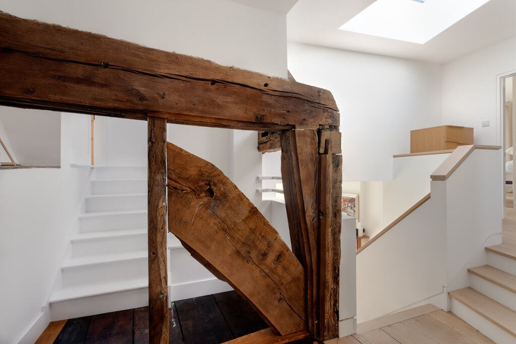
Despite modernisation, the home’s stunning Victorian period details are left to shine
The Keems used a local main contractor recommended by their architect. “I had a lot of time for the builders, they were great,” says Julia.
Work began in summer 2015. It was to be an 18-month-long slog, throughout which the family lived in the house. This was even more remarkable given that, by that time, the couple had a new baby daughter to join their older son.
Plus, Julia was still working from home doing her job as a garden designer. “I don’t know how we did it. It was horrible – dreadful to be honest,” says Julia. “But we were just trying to save money, even though we were told it would extend the length of the build. I didn’t want to live in a caravan.”
Things were relatively manageable while the extension was being built separately, but when it broke through to the original house, there was no keeping out the dust and the noise. “We moved out for 10 days while the kitchen was being installed, but that was it,” says Julia.
The old house was stripped of its internal finishes, rewired and replastered. All the windows have been replaced with energy-efficient aluminium-framed units.
As it didn’t have any foundations, the floor in the old kitchen (now the study) was dug out and screeded. A sump was fitted in the cellar to prevent future flooding. Large-format limestone tiles unite the old and new on the ground floor, which has underfloor heating.
It wasn’t long before the couple’s carefully set budget veered off-course. They had financed the project through savings and a mortgage, but costs started to rise.
Many problems were unforeseen, such as the more expensive foundations needed once it was discovered how heavy the clay soil was. There were also the inevitable issues associated with restoring a period property, including damp joists and window sills that crumbled away, all of which needed replacing.
Other additional outlays were simply an unwelcome surprise, such as quite how much the glass was going to tally up to in the heavily glazed extension.
Fortunately, as the build progressed, Julia and Nick were able to remortgage based on the value they had added to the property by the work they had already completed on the extension.
However, they had no sense of certainty about this at the time, and it was highly stressful. Deciding what they might reasonably cut back on wasn’t straightforward. “We wondered about not having the balcony in our bedroom,” says Julia.
“But we couldn’t get rid of the steels needed to support it, as it was an integral part of the structure. Once you’ve found the money for the steels, which are non-negotiable, you might as well go the whole way and have the balcony.”
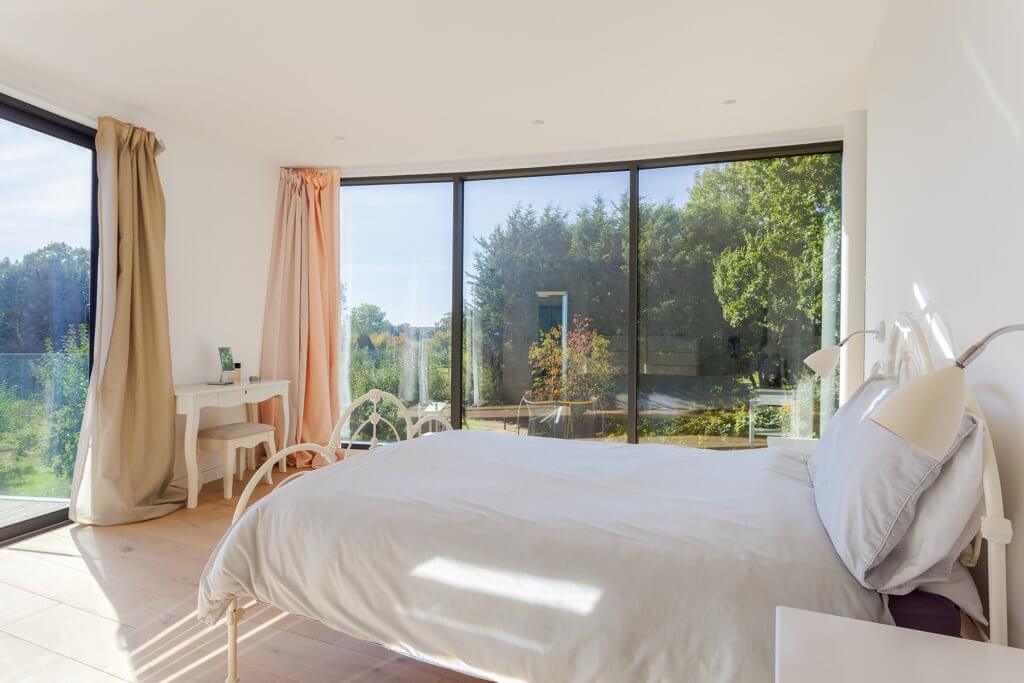
This bedroom benefits from fantastic light and views thanks to the full-height glazing
In the end, the Keems have been sensible, spending on the fabric of the building, but slashing the budget on anything they could reasonably re-do at a later date.
The glazing – including that bedroom balcony – has all been installed as per the original design, but their decorating plans were scaled back.
Unfortunately for Julia, given her vocation, her plans for the garden were also shelved so that all the money could be ploughed into finishing the house.
Now the financial uncertainty is over and the dust has settled, the couple are thrilled with how the project has turned out.
“It’s really been life-changing,” says Julia. “It feels contemporary, spacious and bright. I have an amazing area to work in – my own office with 400-year-old panelling in it. I also like that the kids can be playing in the living room but I still feel like I can interact with everybody if I’m working. Plus, my family can come and stay now and there’s lots of space to host them.”
The house may have had its quirks before but the more unwelcome idiosyncrasies have gone, replaced by a much more streamlined layout. Original beams have been exposed and restored, including a huge oak plank you have to duck under to reach the two top bedrooms.
The way the house sits so beautifully in its wider environment is also a triumph – this is partly to do with Richard’s clever architecture. For instance, the windows in the Victorian part of the house have been enlarged and lowered to floor level, so the minute you come through the front door you can glimpse the old orchard beyond.
But it’s also to do with the headway that Julia has made in the garden, softening the boundary between the angular corner of the curved extension with naturalistic planting. The property has gone from a confusing jumble – albeit one with a lot of potential – to a breath of fresh air.
