
When Joe and Rachel Nicol started searching for the property that would become their first family home, the pair simply could not find anything that ticked all the boxes.
Remaining close to relatives and a mainline station was very important, especially as Rachel was expecting their first child.
Then while taking a drive one Sunday, the couple stumbled upon a property on the outskirts of Etchingham in East Sussex that they could see met a number of their needs.
When they went to view it, however, they found that while it did lie within a mile of the nearest station and was situated close to the couple’s relatives, the house on Burgh Hill simply wasn’t cut out for family living. Plus, despite being modern for its time, the 1960s property was beginning to show its age.
Although in need of work, Joe instantly recognised the dwelling’s enormous potential, and within 24 hours an offer was made. With the help of family, the couple were able to finance the purchase as cash buyers.
As the pair exchanged, Joe called upon his brother, a master draftsman by trade, and together they drew up the plans.
As he had an initial budget of only £125,000, Joe had anticipated doing much of the work himself. But with a wealth of construction projects under his belt, he was certainly no stranger to property development.
However, as this was the first scheme he’d live in, Joe felt compelled to thoroughly plan and customise the home down to every minor detail.
“Upon a closer inspection of the house, it seemed its succession of owners had been much more preoccupied with maintaining a beautiful garden than tackling any form of modernisation internally,” says Joe. “White PVCu windows and doors were throughout the home, which weren’t to my taste at all.”
The couple even learned that, at one point, two ladies had shared ownership of the property but then lived independently on separate floors.
A maze of corridors and doors left the inside feeling very confined and dark. Joe’s overall vision was to extend the back of the kitchen to create an open-plan living space and strategically reposition the windows at the rear of the home, so they could maximise light and capitalise on the beautiful vistas overlooking the Etchingham valley.
Joe intended to introduce a number of skylights into the main bedroom, ensuite and loft. However, one neighbour opposed this plan in fear that his property would be overlooked.
To rectify this, Joe invited him over to the house and explained that you would not be able to see into his home from where the skylight was due to be positioned and they would be blocking off all windows facing in his direction.
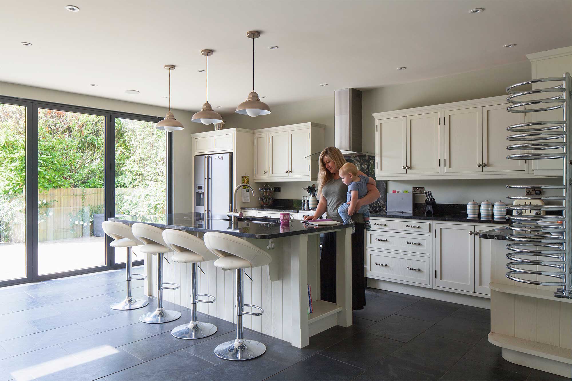
The kitchen’s cream colour scheme contrasts with the slate floor tiles
“Personally, I would always advise this approach to others who are experiencing challenges from opposing neighbours,” says Joe.
“Be open and honest about your plans – welcome them on site if you have to. A transparent approach is the simplest way to gain the trust and approval of your immediate community.”
The internal walls were knocked through on both storeys and repositioned to alleviate the linear footprint of the home and open up more useable space.
Elsewhere, on the first floor, a separate WC and bathroom arrangement was not practical for family life, so plans were drawn up to create a large bathroom and extend the main bedroom to accommodate an adjoining ensuite.
“On the upper storey there were originally two bedrooms,” says Joe. “However, they were disproportionally large and we felt we could still create two sizeable bedrooms and a nursery by simply repositioning the walls and adding in a third one.”
Downstairs, a cluster of small zones at one end of the house, including a WC, shower, boiler room and bulky cupboards, offered huge potential to create something more accommodating for a large family and guests.
The boiler was relocated outside, a new toilet and bathroom installed and practical storage units were fitted.
At the opposite end of the ground floor, a small kitchen and separate dining room were crying out for expansion. Joe had envisaged extending the back of the property so that a new open-plan living/dining area would sit flush with the existing reception zones.
Extra foundations were laid and an internal steel column was installed to accommodate the remodel and further extension works.
Externally, the authentic 1960s composition of the house was what had originally attracted the couple to the property.
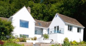
The building was clad in white render and Joe was keen to retain this existing feature. Luckily, the exterior wasn’t in a bad state, so the pair could just patch up the rendered walls and gave the facade a fresh lick of paint.
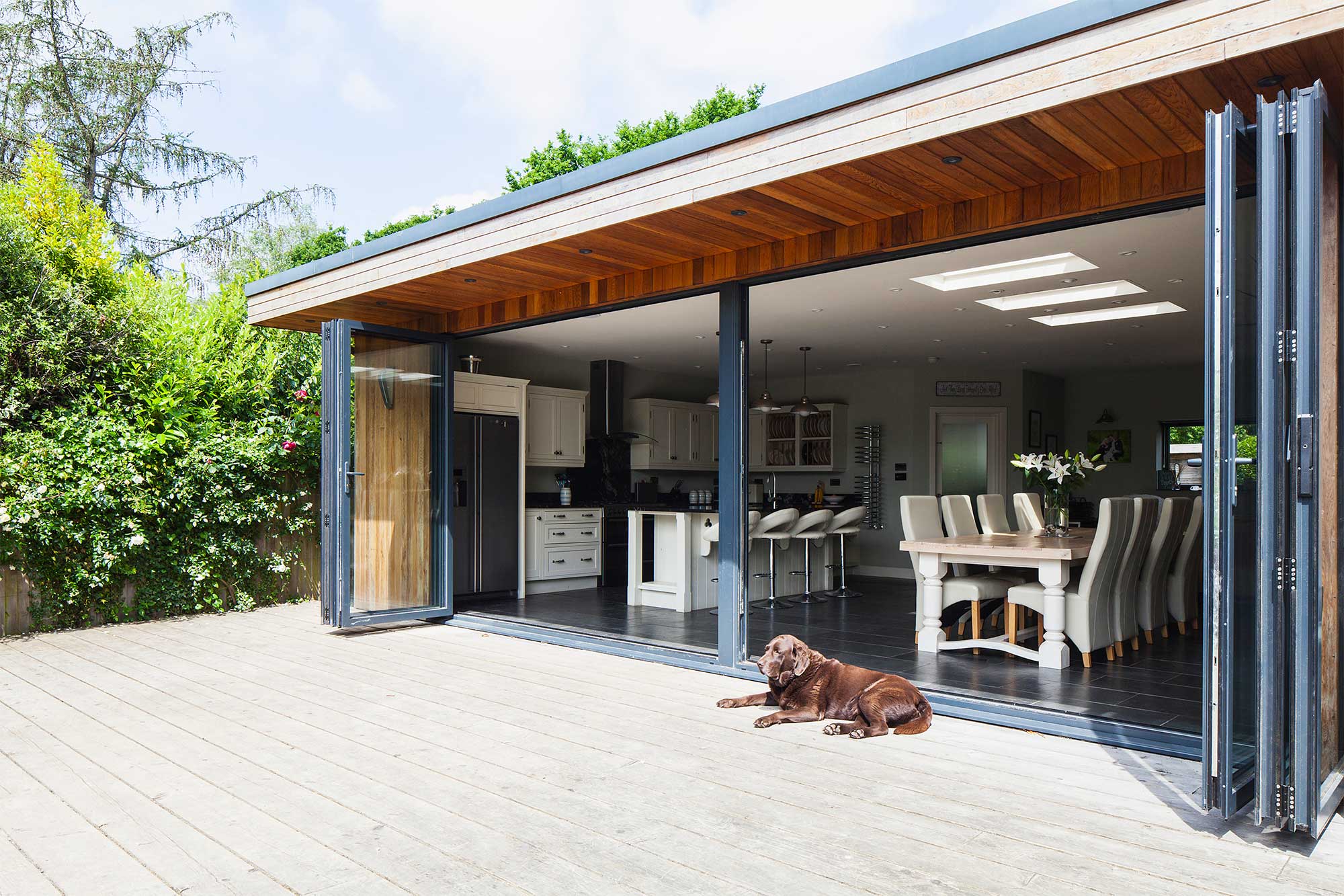
A large decking area provides a place to relax and entertain during the summer
“For the fenestration, I was desperate to replace the white PVCu windows,” says Joe, who spent a lot of time scouring the internet for an efficient, economical and aesthetically-pleasing solution before deciding on aluminium casements.
“I have always admired the anthracite tone and felt this colourway would be perfect to create a bold and modern contrast,” he adds.
To marry the extension hosting the open-plan kitchen/dining area with the original house, the Nicols applied vertical cedar wood cladding to draw parallels with the home’s countryside location.
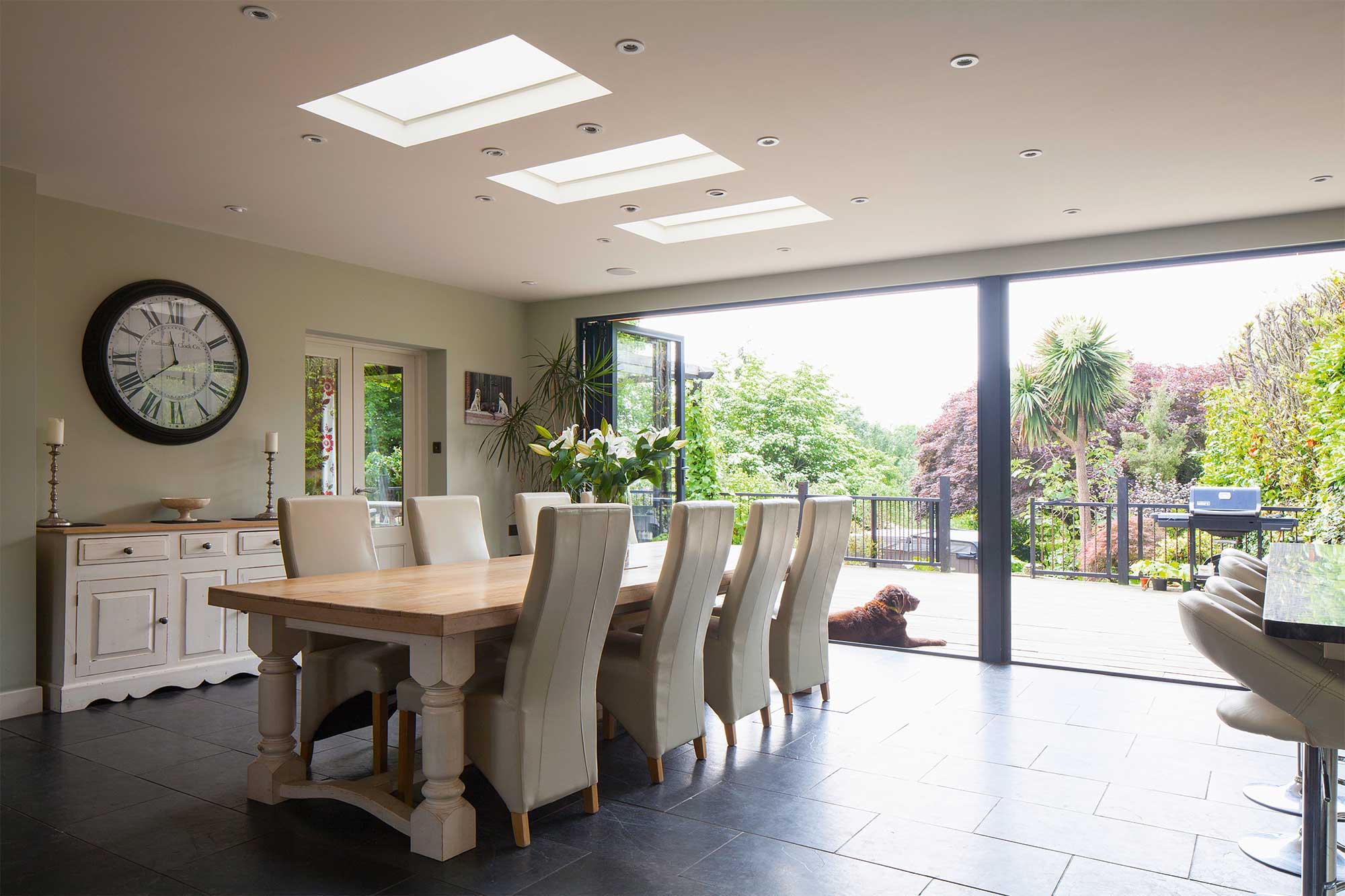
Expansive glazed sliding doors provide inspiring views of surrounding countryside
They opted for a fibreglass flat roof, which was a great choice as it’s geared up for the later addition of solar panels; however, they’re not entirely happy with the results.
“In hindsight, I wish we had used another material,” says Joe. “When the temperature changes, it sounds as if someone is walking across the roof.”
In the centre of the original front elevation, a glazed panel neatly framed the internal staircase. This was a feature Joe deeply admired – but he had bigger plans for it.
He explains that while the exposed staircase was a very attractive element of the facade, he knew more could be done to make it a real focal point.
Inevitably, remodelling the staircase ended up being one of the trickiest elements of the build. Joe was very conscious the glazed unit had to work with the architecture of the steps.
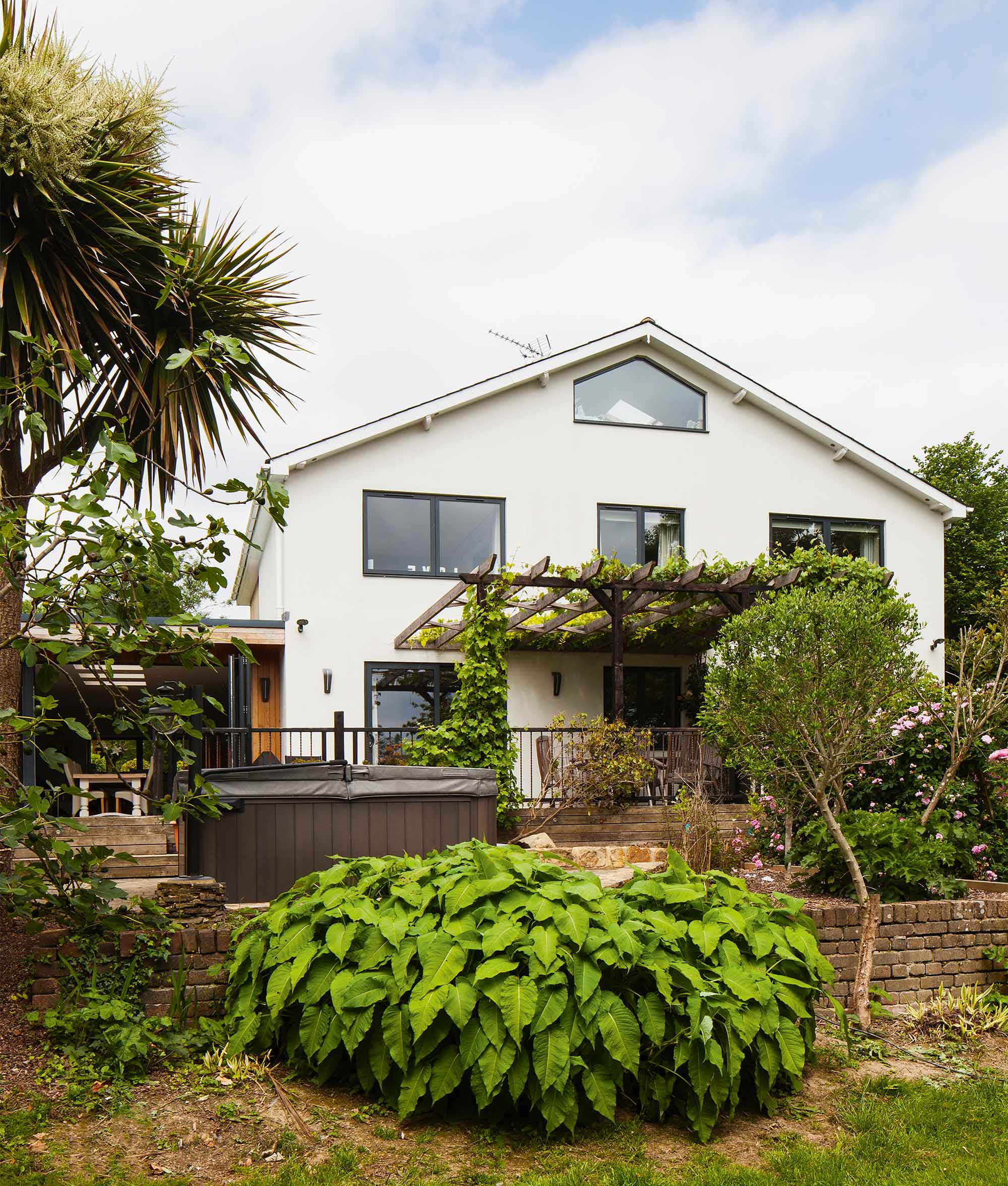
Anthracite grey casement windows give the property a sleek modern finish
Ultimately, he altered the height of the panel so the window wasn’t obstructed by the landing between flights. LED lighting was installed throughout the glazed balustrades and a bay tree, to signify the property’s name, was etched into one of the panels.
“I would say that the approach to the house at night is one of my favourite parts of the project,” says Joe.
“When you come down the drive and see this feature lit up through the glazed window, combined with the four external lights illuminating the house, it’s a very satisfying moment.”
Despite having a modest budget set for the renovation works, Joe was adamant this wouldn’t compromise the quality of products he specified or stop him from paying close attention to the finer details.
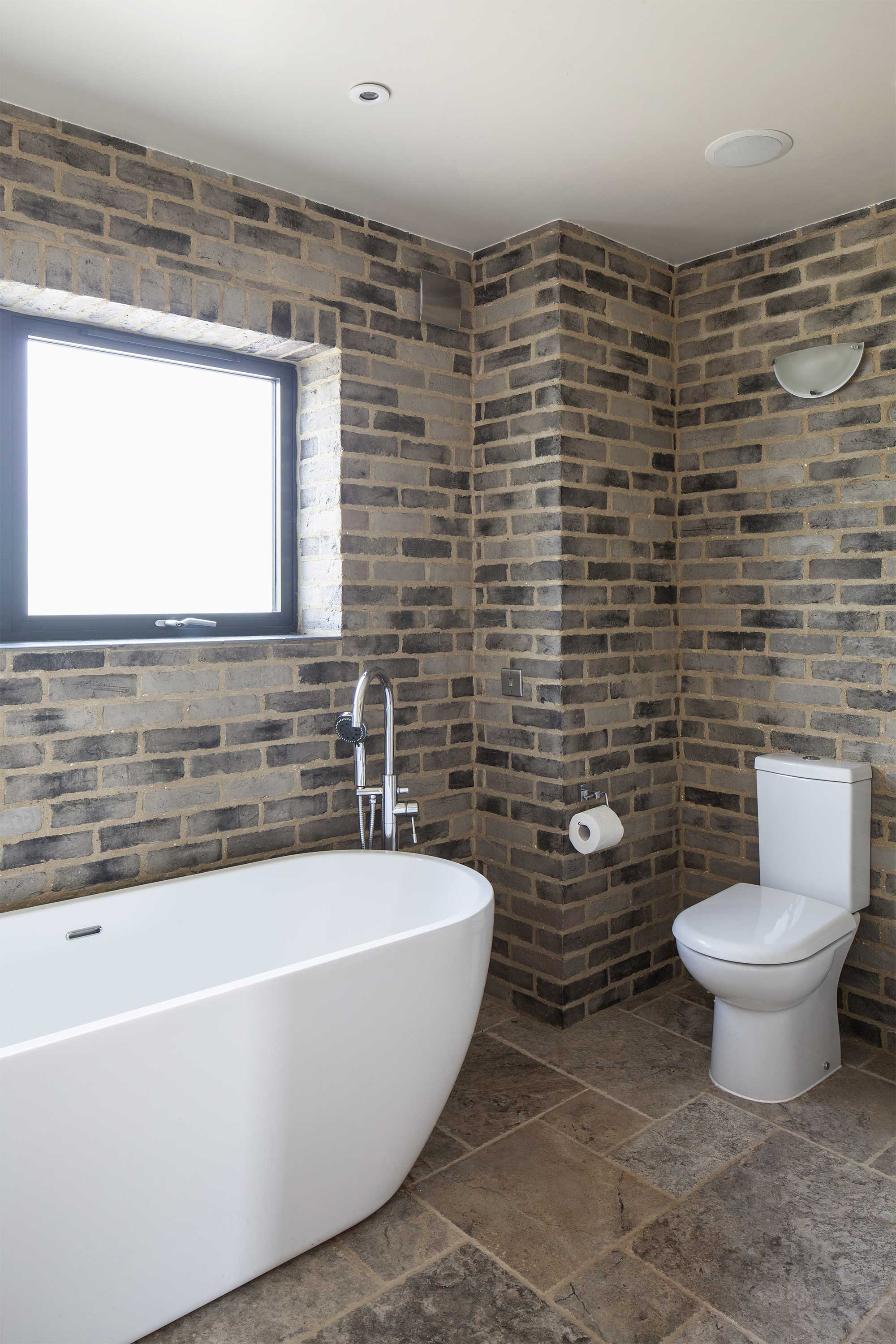
Brick slips create an authentic masonry feel in the bathroom
The couple cut costs where they could by salvaging materials and got creative with how they used them, too. “The decking we installed at the rear of the extension was crafted from scaffold boards,” says Joe.
“In the family bathroom and ensuite we used brick slips to give the appearance of authentic masonry but at a fraction of the cost.”
Each room within the property was carefully considered with great attention to detail, and where budget allowed, a few little luxuries were thrown in.
For instance, the family bathroom features a walk-in shower/steam room, complete with a hub-wired sound system that controls music throughout the kitchen, lounge and main bedroom.
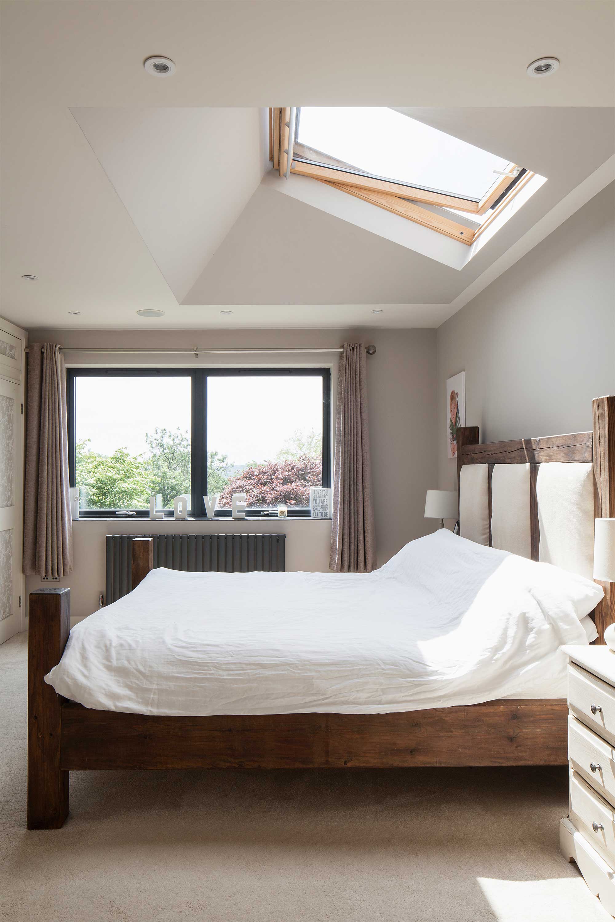
The bedroom skylight allows the couple to enjoy the stars at night
Low energy lighting has been installed in each room and in the kitchen, LEDs have been positioned to cater for all scenarios. “The lighting is definitely one of my favourite aspects of the internal modifications,” says Joe.
“One illumination zone has been installed specifically for family meals around the table and another sequence of LED downlighters are for if you are playing cards.”
Building a family home for the life you want to live is by far one of the greatest opportunities for any willing self builder, but it can still have its drawbacks.
Despite feeling very relieved about moving into the property in time for Christmas, the family has had to make a lot of sacrifices over the past year, and Joe admits he does feel that he missed out on a lot of their child’s first year.
He says if he were to do another renovation or take on a self build, it would be far less intense and conducted at a much more leisurely pace.
Indeed, having welcomed their third child last year, Joe and Rachel are now both beginning to see what they could have done differently.
For instance, the Brazilian slate floor tiles that were chosen to tie in with the anthracite window frames were right for the property but not practical for the footfall they have.
With three children and three dogs, the dark floor highlights any bit of dust or dirt. “This
is something we would have changed, looking back,” says Joe.
Regardless of the limited pot Rachel and Joe had available to fund their renovation project, the pair have demonstrated that being rich in vision pays dividends when making a budget stretch further.
“We have custom built our first family home,” says Joe. “And there’s not a single aspect that hasn’t been geared towards our household’s needs. This is what has made the experience all worthwhile.”
