Early Bird Offer! Free tickets to meet independent experts at this summer's Build It Live
Save £24 - Book Now!
Early Bird Offer! Free tickets to meet independent experts at this summer's Build It Live
Save £24 - Book Now!With two young children growing up quickly and another baby on the way, Becky and David Innes decided it was high time to undertake a home improvement scheme that would boost their house’s living space.
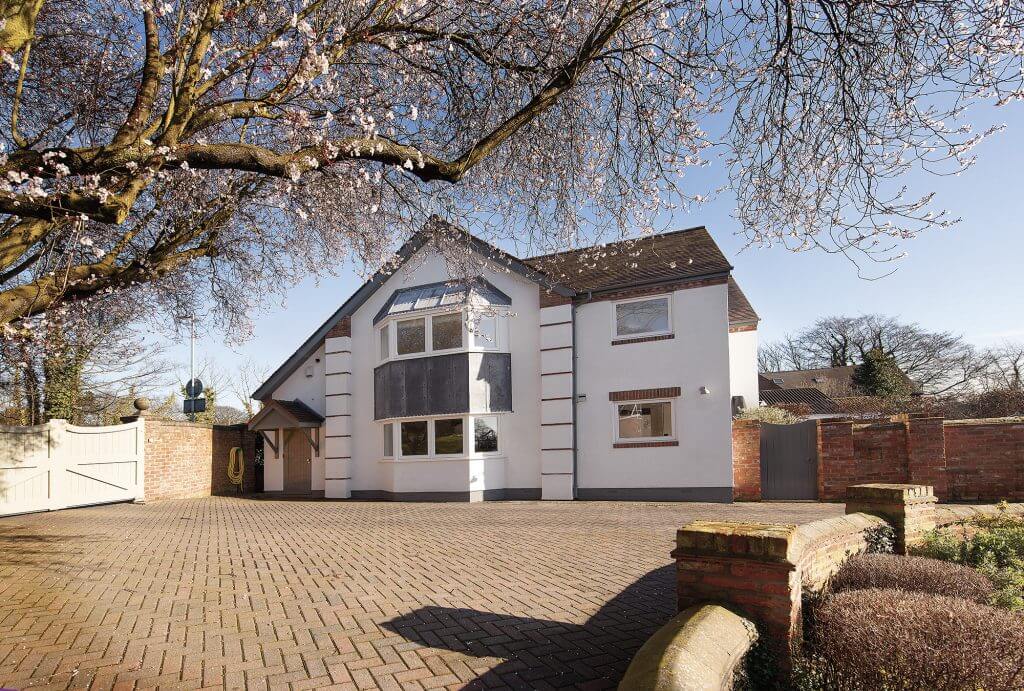
For the Inneses, what began as a straightforward attic conversion scheme soon evolved into a much larger project, which eventually led to a second-storey extension and a major remodel of the interiors.
“It really ran away with us, but we have no intention of moving from here, so we reasoned that if we were going to all the expense and upheaval, then we should get everything absolutely right,” says Becky.
The redesign has totally transformed the building, which once served as a garage in the grounds of David’s parents’ home. “I grew up in the house next door, where my mother and father still live,” he explains. “But when I started looking for a property of my own there was nothing affordable and suited to me. I really wanted a home with plenty of light and space.”
David began to wonder whether the former coach house, which had been turned into the family’s garage, might be an option. There was already planning permission in place to turn the structure’s loft into a studio apartment, so it was a short step to gaining consent for a full conversion.
The planners stipulated that David stick to the existing footprint of the 100-year-old detached building. He also had to use the same reclaimed building materials to go ahead with his plans to turn the structure into a modern, two-storey house.
The project wasn’t without its challenges, and proved to be a huge learning curve. “I hadn’t done anything like it before, so I was literally winging it,” says David. “But the experience stood me in good stead when it came to making further changes – I knew what to expect.”
The original conversion involved a simple division of the existing building, creating an open-plan ground floor with bedrooms and bathrooms up on the second level. By the time that Becky moved in, the former garage was unrecognisable. Light flooded through the interiors and a combination of open spaces, glass block details, white walls and characterful wooden floors paved the way for the couple to indulge their taste in modern furniture.
In 2005, the pair added a single-storey extension across the back of the property to create a new kitchen and family room. “It was a very simple scheme, but made a big difference to the way we lived, opening up a lot more space and linking the rooms, making the overall layout much more flexible,” says David.
It took the arrival of David and Becky’s third child, daughter Darcy, in December 2013 to trigger the property’s biggest revamp since the initial change of use from garage to residential dwelling. “It started with the idea of converting part of the attic into a nursery for Darcy. It wasn’t long before the scheme escalated,” says David.
After months of discussing, planning and researching, the couple were finally able to draw up formal plans for the redesign. “Our initial idea was to create an attic bedroom, which we thought would be the quickest and easiest option. However, this was soon knocked on the head entirely,” says David. “We had a builder come and look at our ideas, and he told us that the room would be far too small and that we’d essentially be wasting our time and money.”
The Inneses were told that it would cost £30,000 to add the new zone. “We realised we could get a lot more for our money by re-thinking our plans. After discussion the idea of extending above our single-storey extension at the back of the house was suggested,” says David.
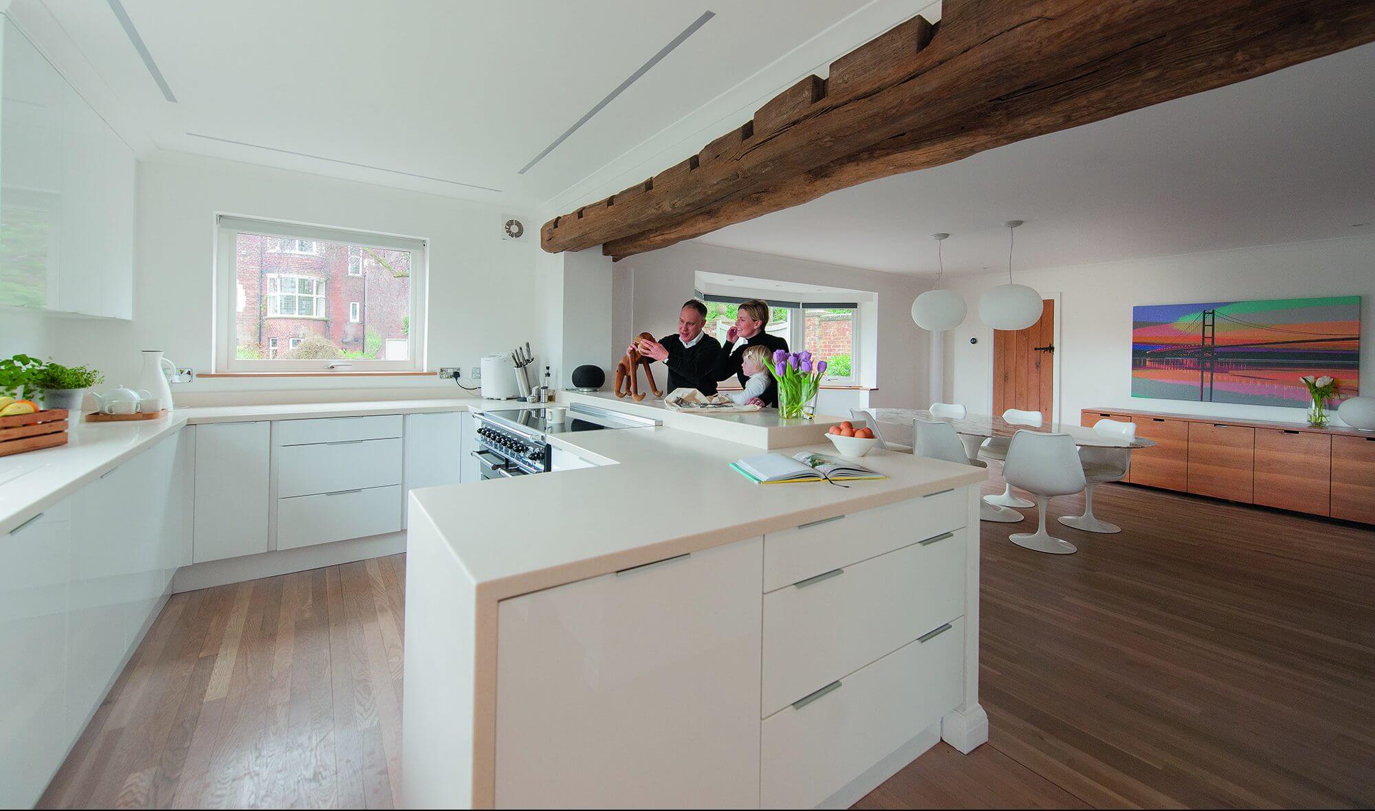
The couple also decided to remove the wall between the kitchen and dining room to create an open-plan ground floor.
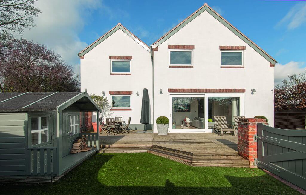
The day the build started, the family moved into David’s parents’ house next door. Being in such close proximity to the property allowed the couple to keep a close eye on the project’s progress, and they visited daily. Construction work involved adding a second-storey to the existing extension to create a fourth bedroom, new family bathroom and dressing room.
To keep the roof in line with the original building, Becky and David had to lower the ceiling in the family room slightly. To compensate for the reduction in height, the pair knocked down the external wall and installed a support beam so sliding doors could be fitted. “We were able to offset the lower ceiling by drawing in more light via the new glazed entrance,” says David. “We also wanted to make more of the views from the back, as we look directly onto the River Humber and the Humber Bridge.”
Upstairs, the changes were even more dramatic. The builders removed stud walls and remodelled along, thin corridor to create a study/landing area leading off to the bedrooms. The wide part of this zone has been fitted with rooflights to channel maximum brightness into the space. The roof of the extension has been fitted with standard trusses and finished with Rosemary tiles to match the rest of the house.
“The project actually proved very straightforward,” says David. “We didn’t suffer any major disasters or setbacks along the way, and there were no unpleasant surprises on the financial side.” The main additional cost was a new log-burning stove, which the couple only decided to install as they were coming towards the end of the build. They also invested in new oak internal doors and a Corian worktop for the kitchen.
The final change has been the creation of an entrance lobby leading into the dining area. “We lost a rear door so we had to form another entrance, with a cloakroom for coats and shoes, which was easy to access from the driveway,” says Becky.
The interior decor complements the light-filled, modern design of the building, with a strong emphasis on clutter-free storage systems, statement furniture and sociable living. This approach was particularly important with the couple’s children growing older. “We wanted the house and its fittings to be able to withstand the knocks it gets with a young family,” says Becky. “Everything is robust and easy to keep clean.”
One of the biggest successes of the project, however, has been the innovative use of light. As well as introducing plenty of natural brightness to the house, David was also keen to establish different ambiences throughout the day and at different times of the year, drawing on his family’s background in photography to maximise the impact of a well-executed illumination scheme.
To soften the effect of such a contemporary decor theme, David and Becky have introduced texture, warmth and colour via wooden beams, carpets and large, colourful prints created by the family’s interiors firm. Designer children’s furniture that’s both practical and stylish adds another eye-catching flourish.
“We’ve finally got the house just as we want it, and it’s perfect for a growing family,” says Becky. “We started with a plan to create a £30,000 attic room and ended up with a complete remodel.” However, the couple are pleased that they decided to go all-out, rather than compromising and developing something that didn’t quite fit.
