Early Bird Offer! Free tickets to meet independent experts at this summer's Build It Live
Save £24 - Book Now!
Early Bird Offer! Free tickets to meet independent experts at this summer's Build It Live
Save £24 - Book Now!Kate and Gary Westlake’s urban home in South East London really pushes the boundaries of what you can achieve with a Victorian end-of-terrace property.
The cleverly-designed family home now benefits from a luxurious feel. Side and roof extensions have created bigger bedrooms upstairs, while the ground floor has been rearranged and enlarged to create more usable space and a stylish snug, complete with a sociable outdoor area and separate garden room.
The couple bought the property in 2004, when their now eldest child Archie was only a year old – and younger daughter Bea wasn’t yet born. It was here that the seed for open-plan modern living was firmly planted in their minds.
The previous owners had already extended the rear to create a galley kitchen, with a bathroom at the end. At the time, Kate and Gary worked with Kate’s brother – architect Ben Minifie – to knock down partition walls and create a glass infill side return to provide an open-plan kitchen dining area, keeping the bathroom where it was.
After 13 years of living in the home, Kate and Gary realised that their existing home wasn’t big enough for their now family of four, and pet cockapoo Luna. The couple desperately needed more space.
Reluctant to leave their beautiful light-filled house, surrounded by Blackheath’s green area, they embarked on a half-hearted search for a new property, but struggled to find anything that made them happy.
Learn More: Home Extension Guide: How to Extend a House
“We actually had an offer accepted on a house on the other side of the road from ours,” says Gary. “Unfortunately it didn’t work out, otherwise we probably would have moved there. We started looking further afield, but soon realised that we didn’t want to move. We were emotionally connected to the area.”
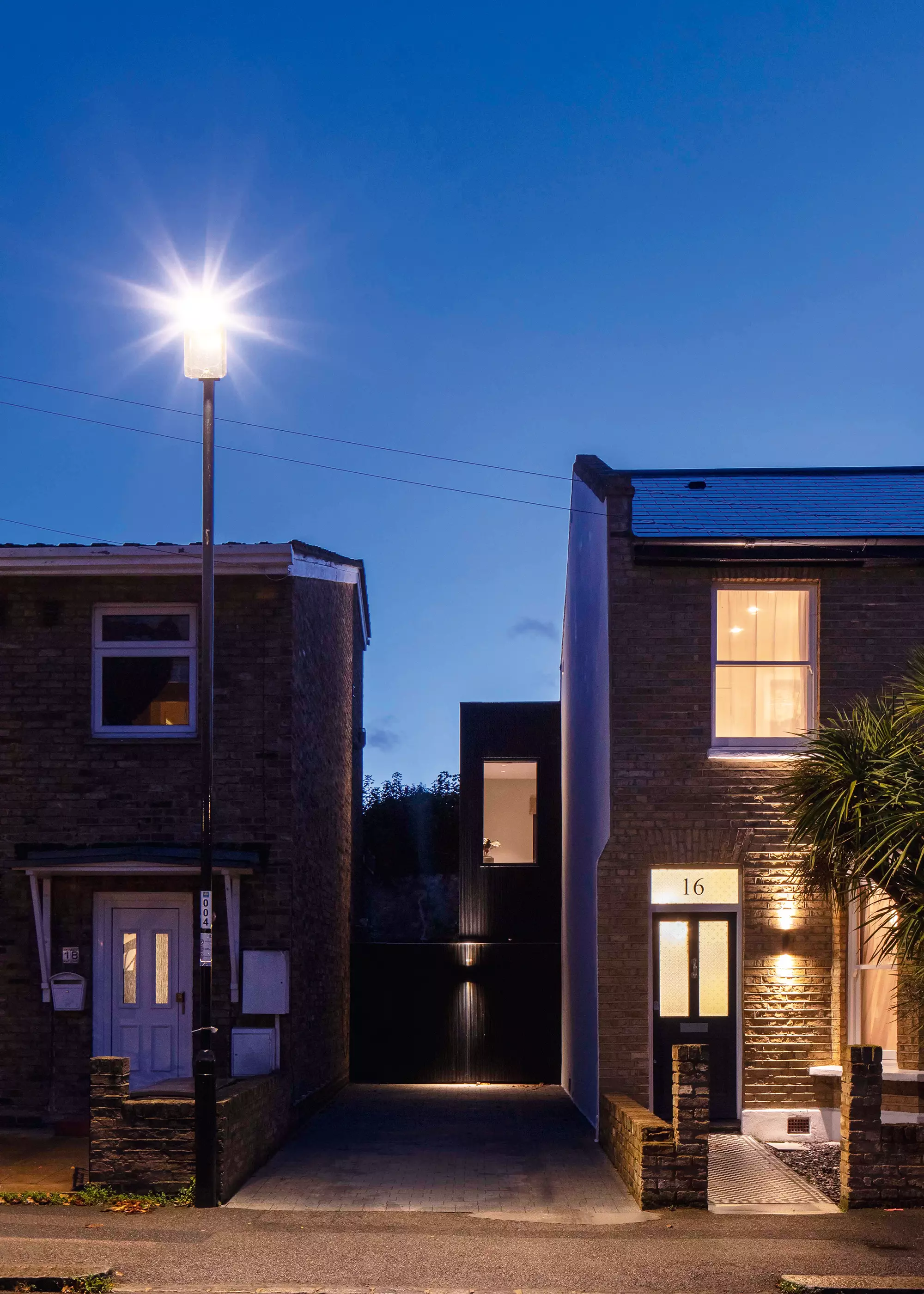
The new side extension has been clad in black painted wood with a hidden door which opens into the bike storage room with the hot water cylinder for the bath in the room beyond
With the decision firmly made to stay put, the couple decided to use the money they were going to spend on a new house to adapt their existing abode. They wanted to create something that would make it more comfortable for them as a family. At this point, the couple once again asked Kate’s architect brother Ben to work with them on the next stage of development.
Ben began drawing up plans to reconfigure the first-floor space by adding a two-storey extension at the side of the property, across the driveway. This would create a double-bedroom for the couple’s son Archie (who is now 18 years old) on the first floor and a family bathroom with a sunken bath, plus a separate bike and utility storage underneath on the ground floor.
He then reconfigured their 13-year old-daughter Bea’s box bedroom at the back of the house, by taking the whole rear roof off of the dwelling and reconstructing it with a dormer. Inside he removed the ceiling and opened up the space into the loft.
Doing this effectively doubled the floor area, allowing enough head height to build a staircase up to a mezzanine level. This would accommodate a double bed, a bespoke designed wardrobe and cupboard storage under the stairs, with room for a desk area.
Looking to maximise your home’s plot? Read our Complete Guide to Designing a Side Return Extension
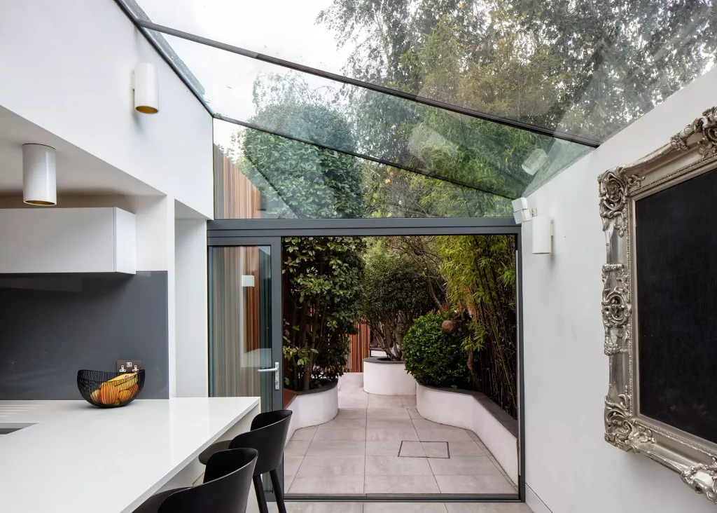
The kitchen was renovated with open glazing back in 2012, with relatively little change made to it in the most recent building works
In the master bedroom, a simple redecoration was planned and a master ensuite shower room added. Downstairs, the family bathroom was relocated to the front of the house, placed under the new side extension. So, the old WC at the rear of the property could be extended out to the side (in line with the new two-storey addition) and transformed into a snug TV room/guest bedroom.
Outside, a new garden room was planned at the rear to create additional living space, as well as a much-needed office area for Gary.
With planning approved, work began in December 2018 and took around 18 months to complete. To save money, the family remained in the house while the building work took place. “The contractor organised it so that each area he worked on was self-contained, so Bea and Archie could move out of their rooms as and when required,” explains Gary.
“It was manageable, but of course schedules do slip and, on reflection, it probably would have been less stressful to rent somewhere close by.”
More Inspiration: 14 Glorious Garden Rooms
Work ran relatively smoothly until Covid hit in March 2020. Sadly, the main contractor became unreliable towards the end of the scheme and had to be let go. “We think he took on another project and it couldn’t have come at a worse time for us. We had just gone into the first lockdown, so finding materials and tradespeople to finish the job was really difficult,” says Gary.
“Fortunately, because I was now working at home I was able to take on a lot of the work, such as the exterior cladding.” Thanks to Gary’s additional involvement, the project was completed in June 2020.
It was a real labour of love trying to ensure the building tied back into its environment and didn’t look out of place. One of the planning requirements was to clad the side extension in matching brickwork to what was there originally.
Read More: 10 Top Tips for Project Managing Your Self Build or Renovation
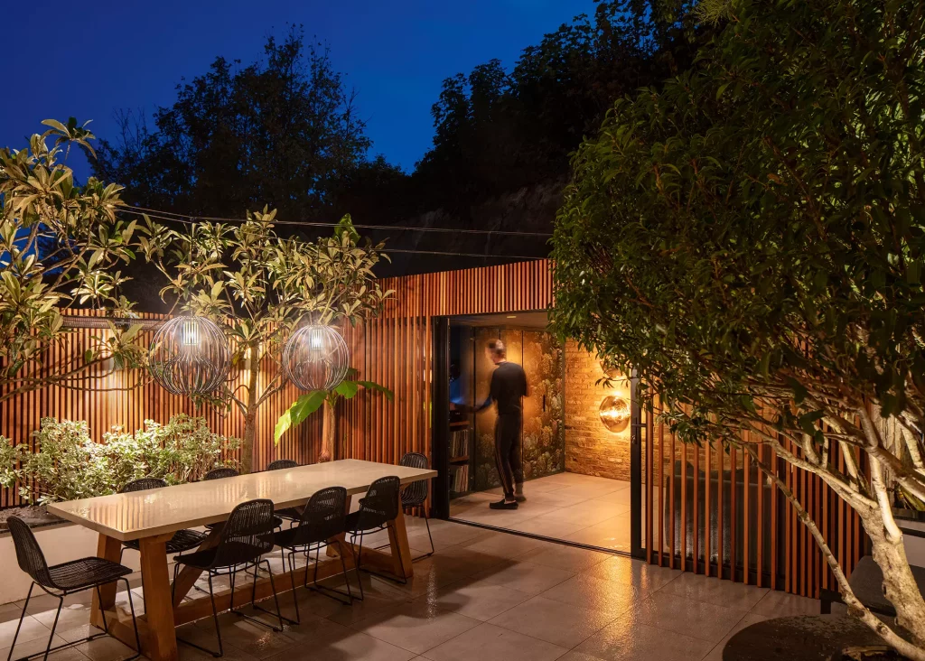
The garden area has been decorated with lighting to make a statement in the evenings, helping the cedar cladding and contemporary design to stand out
“I didn’t really want to use cavity walling for the main construction, as that would have made the walls too thick,” explains Gary. “Instead, our builder made his own brick slips by buying London Stock Bricks and cutting two sides off of them to get a really good match to the rest of the house, but in a thinner profile.”
It’s that level of detailing and commitment that made this project so seamless. “It obviously cost more to do, but it meant I could maximise the space and still get the right finish to comply with what the planners wanted.”
More Inspiration: The Best Brick Ideas for your Project
We Learned…A CLASSIC MISTAKE that I think a lot of people make, is that we didn’t allow enough contingency for unforeseen problems. I wish I had put more money aside to allow for any issues that inevitably arose. WORK CLOSELY with the planners. Ben wasn’t initially convinced that we would gain consent for the side extension. He already had a good relationship with local planners due to other projects he had worked on in the area, so he made sure to consult with them before we put in our application. There was a clear and open dialogue with constant revision and tweaking of the designs before we put in our final application. AS WE HAD LIVED in the house for some time, we knew our neighbours well. We wanted them to be on board with our scheme, so we made sure to consult them. We ensured that they were aware of our design and the impact it would have on them. IT’S NOT ALWAYS easy to buy the right furniture for small spaces. We realised early on that we needed bespoke furniture to help maximise the available footprint. |
The finished result is a stylish and modern urban home that makes use of every inch of space. The new bathroom was fitted into an extremely narrow area in the new side extension, with a large and dramatic sunken bath carefully structured out of porcelain slabs – installed to allow enough height for a shower overhead. Floral jungle ceramic panels cover the walls and help to create a hotel spa-like hideaway.
CLOSER LOOK: The unique snug zone…The new 3m2 snug room has a frameless oriel window wrapping over the roof, which provides as much natural light as possible.
It is lined with birch ply and features two hidden retractable screens in the walls, to close off the window for privacy or keep the sunlight out when watching TV. A wall-to-wall sofa with a pop out double bed transforms the space into a guest bedroom when required. “We love Scandi interiors and, having visited Japan for work, I was exposed to how timber can be used successfully both internally and externally. It inspired me to use plywood in the snug and red cedar externally,” says Gary. “I think the use of timber throughout the property helps the home flow and connect.” |
“It was an awkward space to work with, but by stepping down we gained extra head height for a shower and Ben designed a floating ceiling with recessed light all the way round, which gives the illusion of more height, as well as helping to frame the space,” says Gary.
Even the newly landscaped outdoor space and garden room was thoughtfully designed to be an extension of the home’s interior, with hanging pendant lighting over the dining table, flush fitting interior and exterior floor tiles and mature planting installed to gain instant impact.
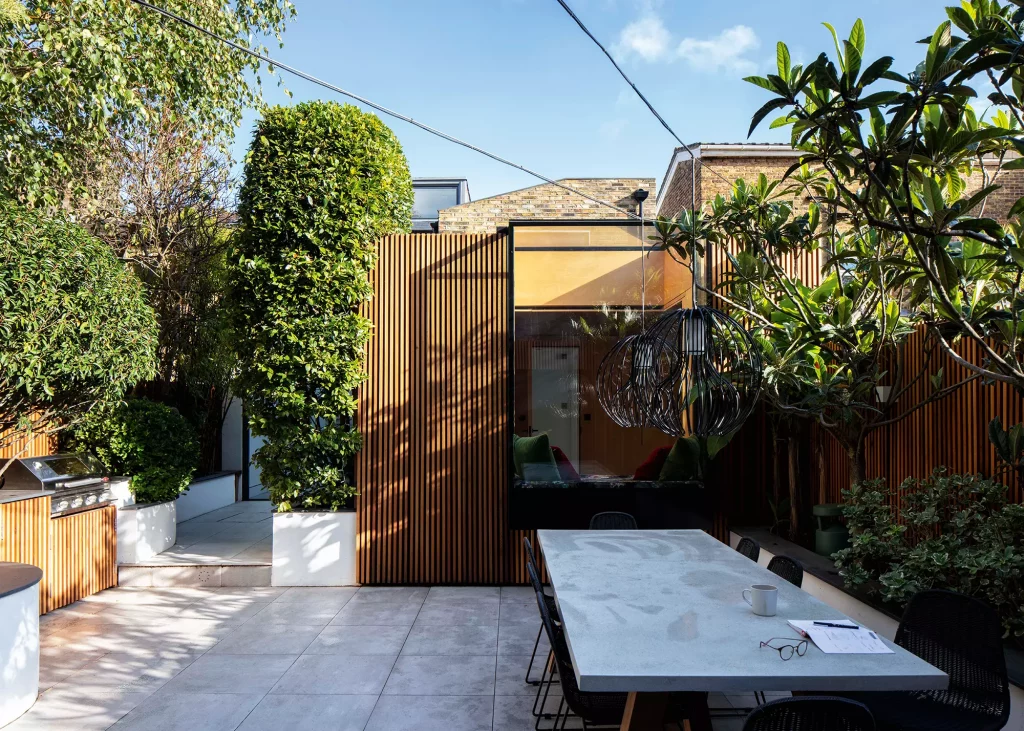
The cedar cladding to the back of the house is also used for the garden fences. It is reflected in the glass of the garden room, which helps connect everything together as one seamless space
The new garden room space creates a chill-out zone, complete with bar, TV and decks for long summer BBQs. It also converts into a home office during the week, which was especially handy during the pandemic. “Before it felt like a garden, whereas now it feels like another room in the home,” says Gary.
The couple are delighted with their finished home. “The children really appreciated the benefit of having double bedrooms with desk areas for home schooling during Covid,” says Gary. “And if there is one good thing that has come out of the pandemic, it’s that for us it has been really enjoyable being at home together.”
