Victorian Renovation with Modern Extension
Jeremy Witt and his partner Hannah Smith are far from newcomers when it comes to renovating homes. They have worked extensively on two previous properties, the last being a grade II listed building, and the couple share a common interest in design.
Marrying their mutual hobby with property renovation has allowed their creative side to shine through.
The couple had been looking for a new project to sink their teeth into for some time when Hannah spotted a ‘for sale’ sign in one of the most desirable areas of Colchester, Essex.
“I would walk past the house every day on my way to work”, says Hannah. “I always thought how lovely the building looked, but assumed it would be too small for what we were looking for.”
- LocationEssex
- ProjectRenovation with rear single storey extension
- StyleContemporary
- Construction methodSteel frame plus blockwork
- House size180m² (1,937ft²)
- House cost£285,000
- Project cost£159,100
- Cost per m²£884 (£82 per ft²)
- Construction timeOne year
- Current value£525,000
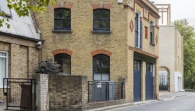
The couple booked an appointment to view the house and immediately fell in love with it. It was much larger than they had originally anticipated, with three double bedrooms on the first floor and another two large living spaces in the Victorian purpose-built attic, accessible by two original narrow staircases.
“I was on the way to the airport to catch a flight to Taiwan to visit my brother when we telephoned the estate agent to put in an offer. It was below the asking price so we didn’t think it would be accepted, but it was,” says Jeremy. “We were totally amazed, but over the moon.”
The first thing the couple had to secure was finance. Early calculations told them they would need to borrow £70,000. This was released by re-mortgaging another property that they owned.
However, Jeremy and Hannah knew there might be a chance that they would have to sell another property if they wanted to complete the build to the high quality to which they’d become accustomed.
Getting the design right
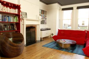
Having decided that their next house would be a mixture of old and new, Jeremy and Hannah felt it was important to keep the original features of the Victorian property.
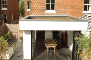
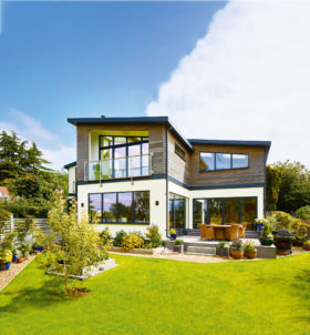
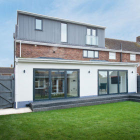
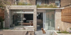
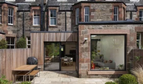
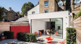
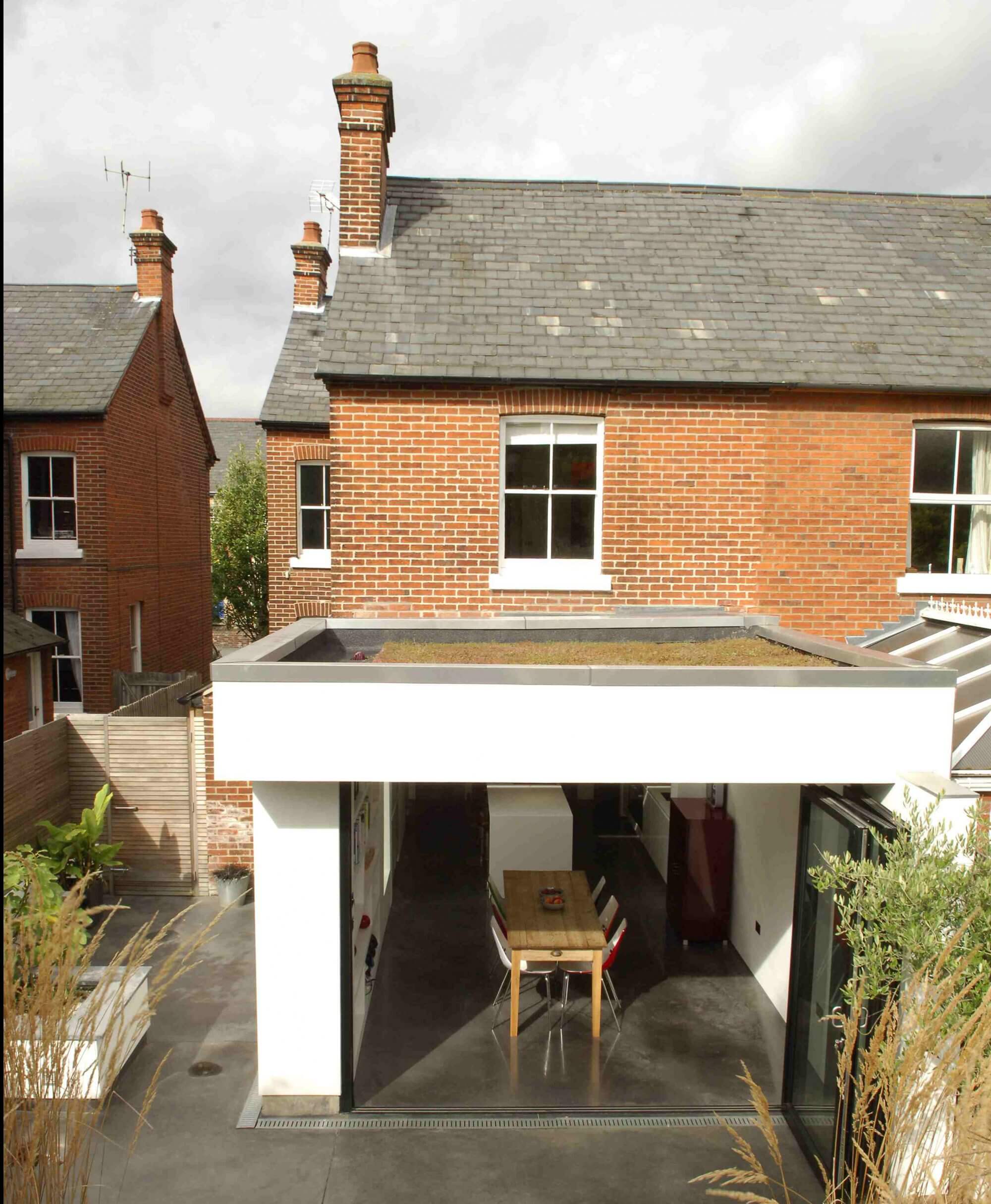
They planned to add on a modern extension to the rear with a clear distinction between the two sections.
“We are lucky to have similar tastes,” says Hannah. “Although we consulted each other throughout the entire project, it was reassuring to know that each part of the build would go smoothly if either one of us was called away.”
A good designer is paramount for a successful scheme, but with Jeremy and Hannah’s exacting standards and eye for something a little different, they knew it was important to select the right person.
The couple approached David Nossiter Architects as the practice specialises in merging period buildings with something more contemporary. After several meetings to finalise the plans, a simple but beautiful layout was agreed upon.
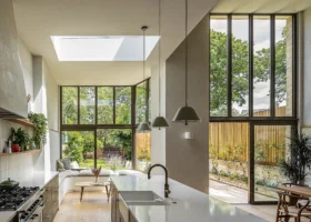
The floor plan consisted of two main areas on the ground floor to create a modern living space filled with natural light.
The hard work begins
“We were really pleased when planning permission was agreed within 12 weeks,” says Jeremy. “We were itching to get going with the project and had Hannah’s father standing in the wings with his team of builders just waiting to get the go ahead.”
The site was quickly cleared – including the removal of the old lean-to in preparation for the new foundations for the extension.
“Everything seemed to be going as planned,” says Hannah, “but the only thing we hadn’t worked into the budget was the amount it was going to cost us in tea and biscuits.”
With most builds, the landscaping tends to get left until the end, once the site is cleared up. For Jeremy and Hannah it was a different story.
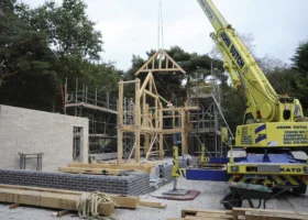
“It was really overgrown and on the boundary there was a line of 30ft conifers,” says Jeremy. “It was important to get this cleared and the hard landscaping complete before we began construction as all the machinery, equipment and materials had to go out past the extension down the side of the house.”
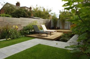
A flat concreted area was created around where the new extension would be sited. Slate steps were cut into the soil behind to gain access to the elevated part of the garden, which would be fitted with a large pond with interconnecting decks and paving at a later date.
Building the extension
The foundations were dug and filled without any problems and it was time for the team to move onto constructing the walls of the new extension. They were made with thermal block work and steel beams for reinforcement.
“We had to remove a lot of soil to accommodate the new extension due to the steep change of levels at the rear of the site,” says Jeremy. “It was costly and time consuming, but essential to the project.”
The couple also wanted to create an energy efficient roof so they appointed specialists, GRM roofing, to construct and plant a sedum topping, which would outlast other more conventional systems for lower long-term maintenance.
Inside the main house, the layout could start to be seen once the ground floor’s existing internal walls were pulled down.
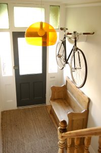
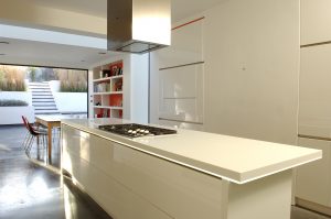
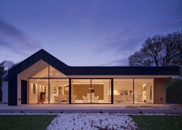
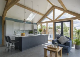
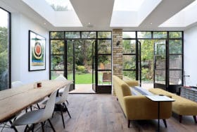
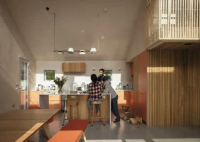
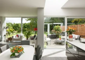
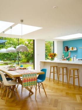
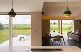
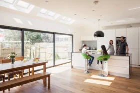
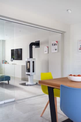
The design allowed for a large living room at the front of the house with multiple seating areas and a bright open plan kitchen diner in the new extension. The two zones are connected via the grand Victorian hallway.
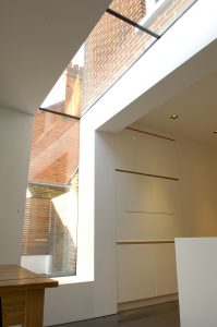
“It is so rewarding to see all your ideas coming together,” says Hannah. “There was something really special about the glazing going into the new extension. It was snowing outside and what had been a cold, dark shell suddenly became this bright, warm space.”
The couple decided to install a mix of heating appliances. Conventional radiators are seen in the original part of the house and underfloor heating is fitted in the new section, covered in a specialist polished concrete finish.
With all the flooring complete and the decorating well on its way, Jeremy and Hannah started work on getting the sleek look they were after for the interiors.
A modern interior
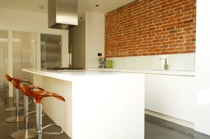
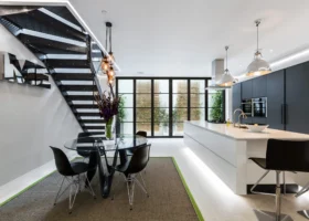
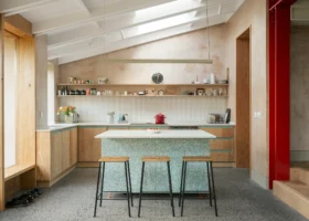
The couple knew they wanted to spend a lot of time in the kitchen. They were after something bespoke so approached Rousseau Design in London with their ideas.
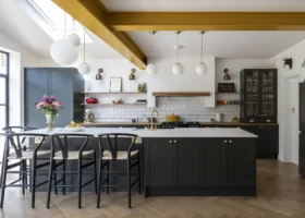
The finished look is striking, with clean lines devoid of any clutter and a Corian worktop that is underlit by strips of LED lights.
“We wanted this to be the hub of the house, so we installed a large flat screen TV into one of the wall cabinets, hidden for the majority of time but there for when we want to use it,” says Jeremy.
The remaining rooms were decorated in a similar style to the kitchen, with plain white walls to brighten the entire dwelling.
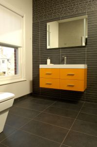
The master bedroom is the only exception. Here, the couple chose opulent wall coverings and soft furnishings. This was extended into their en suite where the rich slate coloured tiles form a backdrop to the orange vanity unit, a colour seen commonly around the house.
“All the workmanship was completed to a high standard,” says Jeremy. “When finishing a modern renovation, all the interiors need to be sleek and crisp.”
Another project looms
The finished home Jeremy and Hannah have created for themselves is simply stunning and the mixture of old and new works harmoniously.
“If there is one thing we have learnt from our renovation project, it is to set your budget then double it,” says Jeremy. “It can be hard work but the end results are so rewarding. We are already looking for our next challenge.”

























 Login/register to save Article for later

