Snug Room Ideas – How to Plan & Design the Perfect Snug Zone
When planning a house’s layout, more self builders and renovators now seek the perfect balance between large, sociable spaces and rooms that offer a more intimate and cosy setting. So, it’s no surprise a snug room is often on the list of requirements.
If you’re interested in creating this kind of zone and are looking for snug room ideas, it’s important to allocate space on a floor plan from the start of a project. Think, too, about what your ideal setup would be. Common uses include as a TV room, reading nook, games room or simply an inviting seating area with a relaxed ambience.
Other snug rooms perform multiple functions, from home office areas with sleep space for occasional guests, through to an evening chill zone for adults that’s also a playroom or teen hangout during the day. The key to a great snug is to make sure comfort and purpose are prioritised from the beginning.
Where’s The Best Place for a Snug Room?
A successful design should be inviting, functional and easily accessible. Think about how the room and its use will best integrate into your daily life. If it’s tucked away too far from the main living areas, you might find you don’t use it as often, but if you walk past it every day, it will naturally become part of your routine.
It’s helpful if a snug is on the ground floor, but not essential. “It will likely get more use if it’s easy to get to, such as off the main living area or at the entrance of the house,” says Hannah Connellan, lead designer at Revival by Design. “A north-facing area can make for a wonderfully cosy snug, and a great use of space, due to there being less natural light here. Avoid placing it next to the kitchen or utility room, which could be noisy.”
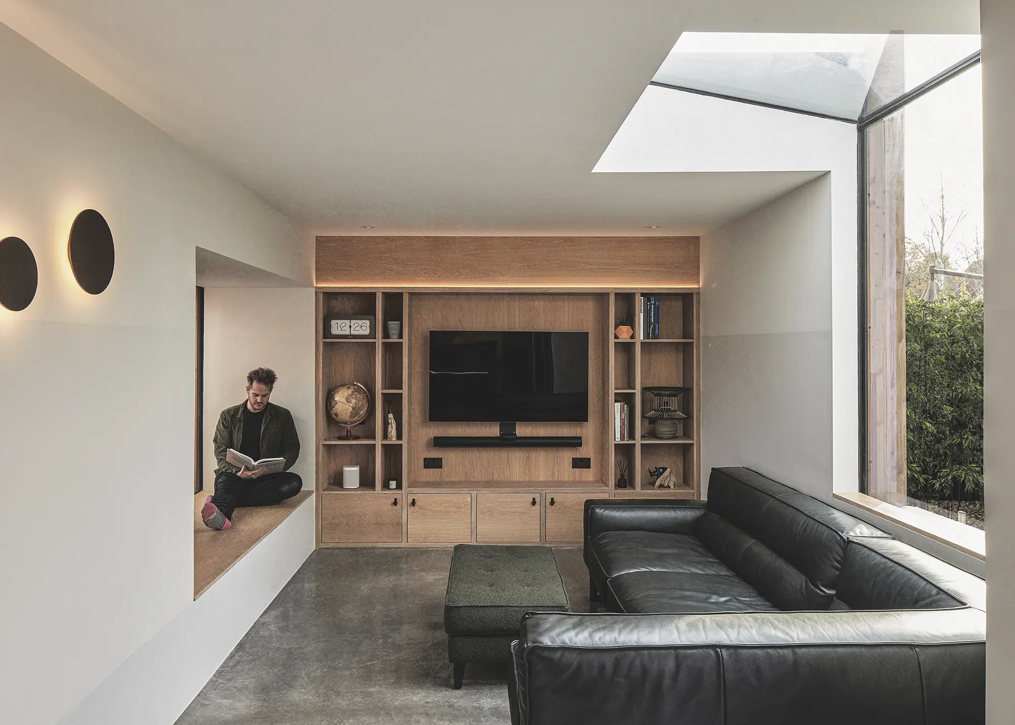
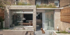
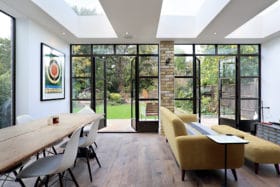
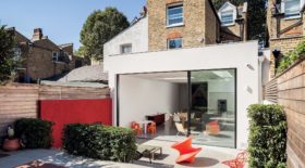
Located within a new extension to this property in Wanstead Village, east London, Rees Architects designed a snug as a secondary living/TV room. It features double-aspect windows, providing garden and sky views and ample natural light during the day. Photo: Chris Snook
Caroline Milns, head of interior design at Zulufish, agrees that considering daylight is a good way to decide on the ideal location. “Planning a snug within a basement extension is an excellent choice,” she says. “The lack of natural daylight, which can be an issue for other room functions, is in fact an asset here, as it enhances the feeling of escapism and cosiness.”
Where you’re working with an existing room plan, a spare bedroom on a first or second floor can work well, too. “If the snug is intended as a more private retreat, locating it on an upper floor or in a quieter area of the home can accentuate its sense of seclusion,” says Daniel Rees, principal architect and founder of Rees Architects.
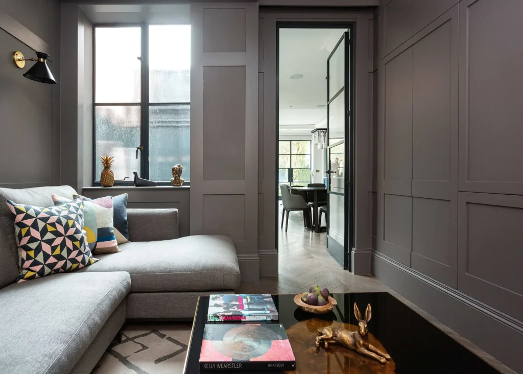
For example, a snug adjacent to a bedroom or study can serve as a peaceful space for reading or unwinding at the end of the day. But cosy doesn’t have to mean closed-off. “For a more open feel, consider positioning it in a part of the house that offers natural light, views of nature or a connection to an outdoor space,” suggests Daniel. “This is a good way to enhance the snug’s calming environment.”
Should a Snug Room Be an Individual Space or Part of a Broken-Plan Layout?
Decide whether you want your snug to be closed off from other rooms or as a zone within a larger living area. “I personally feel that a snug should be a separate room,” says Hannah. “Sectioned off with sliding internal doors is fine, but I think it needs to be classed as an independent space.” Doing things this way means there’s no doubt about the designated function of the space. It also helps to enhance that feeling of privacy and intimacy, particularly if used for reading, study or doubling as a guest room.
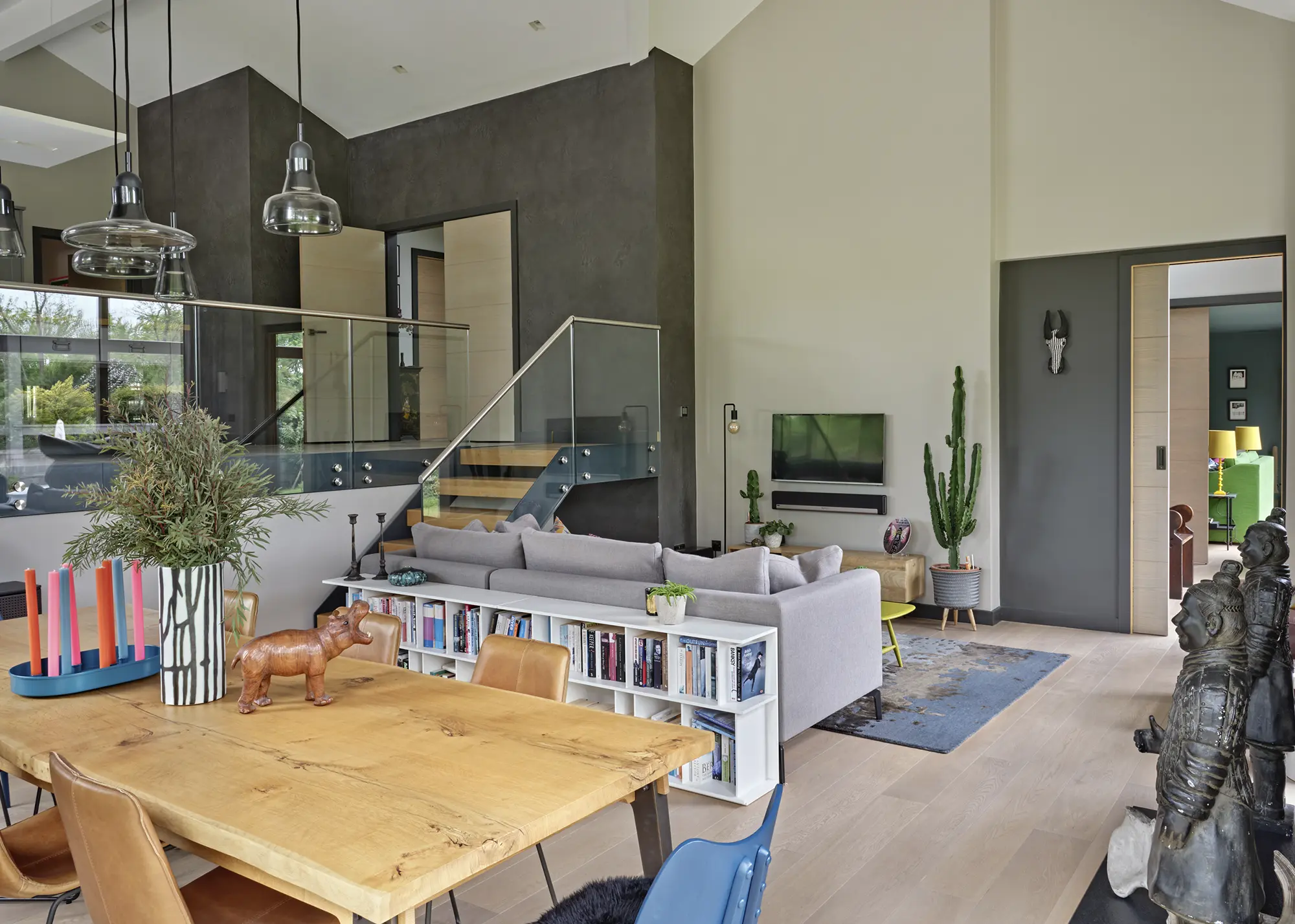
By facing a sofa away from the rest of the living space, with a shelving unit to further delineate the TV area, the snug zone within this open-plan arrangement by Susan Venn Design offers a sense of intimacy. Photo: Nick Smith
As you develop your plans, refer back to the intended use of your snug. While a quiet reading nook may well be better closed off from other areas, somewhere that acts as a playroom for part of the day, for example, might need to be within view from other living areas. “Due to the smaller size of a typical snug, it can be cleverly designed to fit into spaces that perhaps are rather tricky in terms of framework or footprint,” says Caroline. “For instance, it might be located on a mezzanine floor or around the corner of a room in a broken-plan arrangement.”
Consider installing sliding pocket doors so the snug can be opened or closed off when required. Another option is to go for glazed internal doors, enabling light to filter through for a visual connection between spaces. In very open-plan living areas, you can still achieve a snug zone by sectioning it off from the rest of the floor.
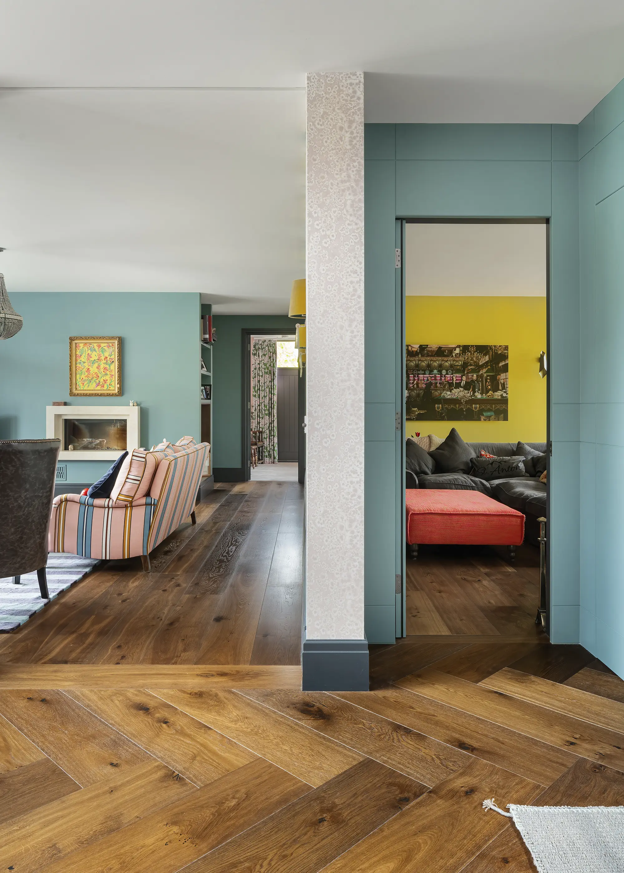
Deep Smoked Tectonic Oak engineered wood boards, from Chaunceys Timber Flooring, was used throughout the living areas of this sea-front house in Cornwall – including the snug – for continuity. Yellow colour accents help to visually connect the spaces. The project was designed by Rachael Harding, with bespoke joinery by Moon Workshop. Photo: Robin Quarrelle
A change in levels or the introduction of half walls can successfully create the feeling of a dedicated zone, for instance. “Creating a change in level is a great way to divide a room into two while still keeping it as one space. A lower level will always provide a cosier feeling,” says Claire Garner, director at Claire Garner Interiors.
If you have an architectural feature (such as beams or half-walls) delineating the snug from the rest of the house, try accentuating this with lighting or colour to create a visual portal. Other options include using a room screen or bookcase to divide a large area. “They can be designed with half height shelving, panelling or glass, which zones the space but doesn’t close it down,” says Hannah.
EXPERT VIEW How is open-plan different to broken-plan living?Davide di Martino, a director at Unagru Architecture, reveals the different design tools you can use to create a successful broken-plan layout A broken-plan layout seeks the balance between a traditional, fragmented floorplan and one that’s completely open. The entire space is tempered with architectural features that provide pockets of privacy, changes in the atmosphere and – in the right scenario – the option to close a door to contain noise, kitchen smells or heat. What are your tricks for zoning the space effectively?I follow a three-step process. First, I imagine the room as a series of distinct uses separated by filtering or threshold elements. The areas are interconnected, but do not merge into one. Secondly, I identify strong and weak zones. The former are noisier and more rigid in terms of function – kitchens are a good example. Weak uses are ideal threshold zones for creating distance between the strong areas. For instance, the dining and entrance spaces form distinct, transitional zones. Finally, I separate each section within the whole sequence by incorporating architectural features such as interior windows, steps, bench seating cut into bespoke furniture, steel columns, rooflights, lightwells, slatted screens etc. What are the key design pitfalls to avoid when planning a broken-plan layout?I would generally advise against incorporating a kitchen or a central island that’s too dominant. It works well to have the culinary zone slightly peripheral to the rest of the space, positioning it so it’s not always the main focal point. Careful planning is required if you want the kitchen, dining and sitting areas near one another. In several ways, employing the broken-plan technique helps avoid the risk of over cramming the space. At the opposite end of the scale, too much separation between zones can be detrimental. If there are too many fixed obstacles and architectural features, you run the risk of recreating the boxy Victorian interior but with the accompanying noise of an open-plan layout. What’s the best way to achieve this type of layout on a tight budget?A lot depends on the condition of the house. In some cases, you can’t avoid structural work if you need to remove walls. If you already have an open-plan layout, you might be able to use furniture to create distinct zones. Bespoke joinery also goes a long way to establish areas that can be flexibly separated. What structural work is required when creating a broken-plan layout?Most of the time, you’ll need to join several rooms by (at least partially) demolishing the existing dividing walls. This often entails knocking down a structural partition, which requires the insertion of a steel or glulam supporting beam. The new support may provide an opportunity to incorporate a striking aesthetic feature, for instance, if you paint overhead steel beams in a bold colour. Do you have any further advice on how to craft a broken-plan layout?At the outset of the design process, format the spaces you’d like to include into a list. Assign each area with its own name and try to get a feel for what its character might be once the project is complete. For instance, some zones perhaps receive a cold, northern light while others will be brighter. Some will be loud and others will be quiet. You can use this process to hone your vision for how the entire space will be. |
Fittings & Furnishings for Snug Rooms
Don’t discount the power of interior finishes for carving out and elevating your snug room. Rugs, different wall coverings or colours and the arrangement of furniture can all help visually mark out an area. “An L-shaped sofa is an easy way to help make a defined snug section in an open-plan zone,” explains Gisela Lancaster, head of buying at Sofology. “By positioning the sofa with its back towards the rest of the room, you can create a boundary. Or, if you are working with a smaller space, two loveseats facing each other makes an intimate seating area.”
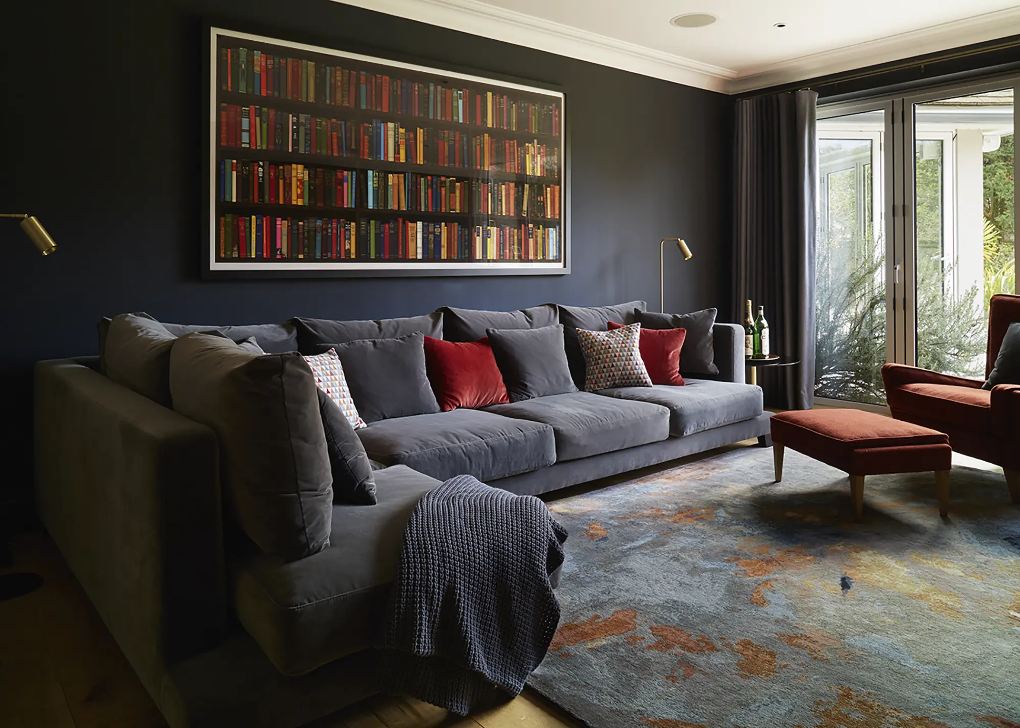
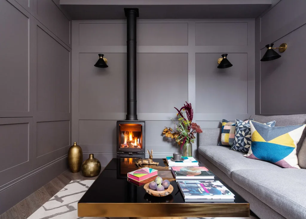
Located at the centre of the floor plan, this room lacked natural light. Pascoe Interiors’ design therefore leans into the dark nature of the space to create a cosy snug, which acts as a family TV room for the multigenerational household. The walls feature a rich, soft black paint, set against graduated grey wool curtains and a dark grey velvet sofa. Photo: Richard Gooding
Whether broken or open plan, maintain a calm ambience by streamlining design choices and keeping clutter to a minimum. Built-in furniture and storage will maximise practical space while keeping the look sleek, and integrated technology such as ceiling-mounted speakers, seamless smart systems and a TV on the wall will negate the need for additional units and fittings. “While there isn’t a strict minimum size, a snug can be effective in as little as 4m² to 6m², provided the space is thoughtfully designed,” says Daniel.
CLOSER LOOK Snug room ideas for lighting & decorThe lighting plan and choice of interior finishes are key to achieving a welcoming and relaxing feel. Here’s how they can help make the most of your snug:
|
How Can You Create a Multi-Functional Space?
Where a snug has more than one use, clever planning is essential. Leaving the options too open-ended can result in the room feeling incomplete. So, establish the core functions you want the room to perform and, once you’ve decided on these, you can then identify the best furniture and joinery to accommodate your requirements.
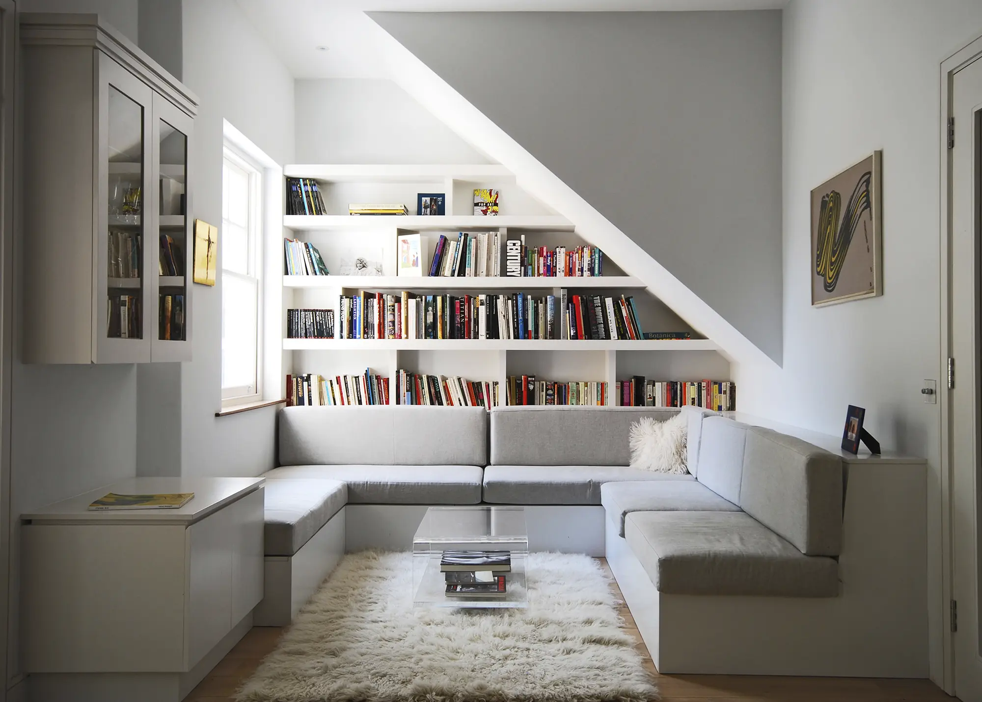
Alex Findlater’s space-saving bespoke joinery maximises the use of quite an awkward area. The client wanted a snug reading nook with custom-made sofa and shelving, which follows the angular line of the stairs
“A workstation featuring a drop-down desk that can be closed away at the end of the day, for example, will instantly allow the zone to be transformed into a great playroom, media room or cosy seating space,” says Claire. “The key is to tailor your design to visually allow the room to transition from one function to the next.”
Very rarely does a cluttered space deliver the calming and relaxing vibe you’ll want for a snug. “Clever storage is so important, so that things like toys can be hidden away easily,” says Hannah. Caroline agrees, suggesting: “ensure cables and technology are tidy and out of sight.”




























 Login/register to save Article for later

