Stunning Workshop Conversion
When Natasha Marshall told her family and close friends that she and her husband Neil Fullerton had bought an old building in Glasgow city centre – an ex-furniture restorers’ workshop – people were not immediately convinced it was a good idea.
“We’ve got a bit of a thing about seeking out unloved properties in the heart of the city and bringing them back to life,” says Natasha. “For example, our office was once a glue factory and a slaughterhouse. But now that our home is complete, we’ve won over the hearts of those who doubted the project initially.”
The couple head up their own wallpaper and textile design business, Natasha Marshall Ltd, so they are used to the creative process, which really helped when conceiving a plan to transform the property.
“I went to nursery in London with Miranda Webster. She and her husband, Stuart Cameron, are now both partners in Cameron Webster Architecture,” says Natasha. “In fact we all studied at the Glasgow School of Art and we now share office space – so it made sense to borrow their talents for our new home.”
- Location:Glasgow
- Project:Shop conversion
- Style:Contemporary
- Construction method:Brick & steel with timber cladding
- House size:239m²
- Property cost:£300,000
- Conversion cost:£245,000
- Conversion cost per m2:£1,025
- Construction time:12 months
- Current value:£800,000
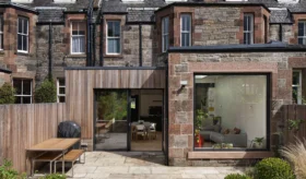
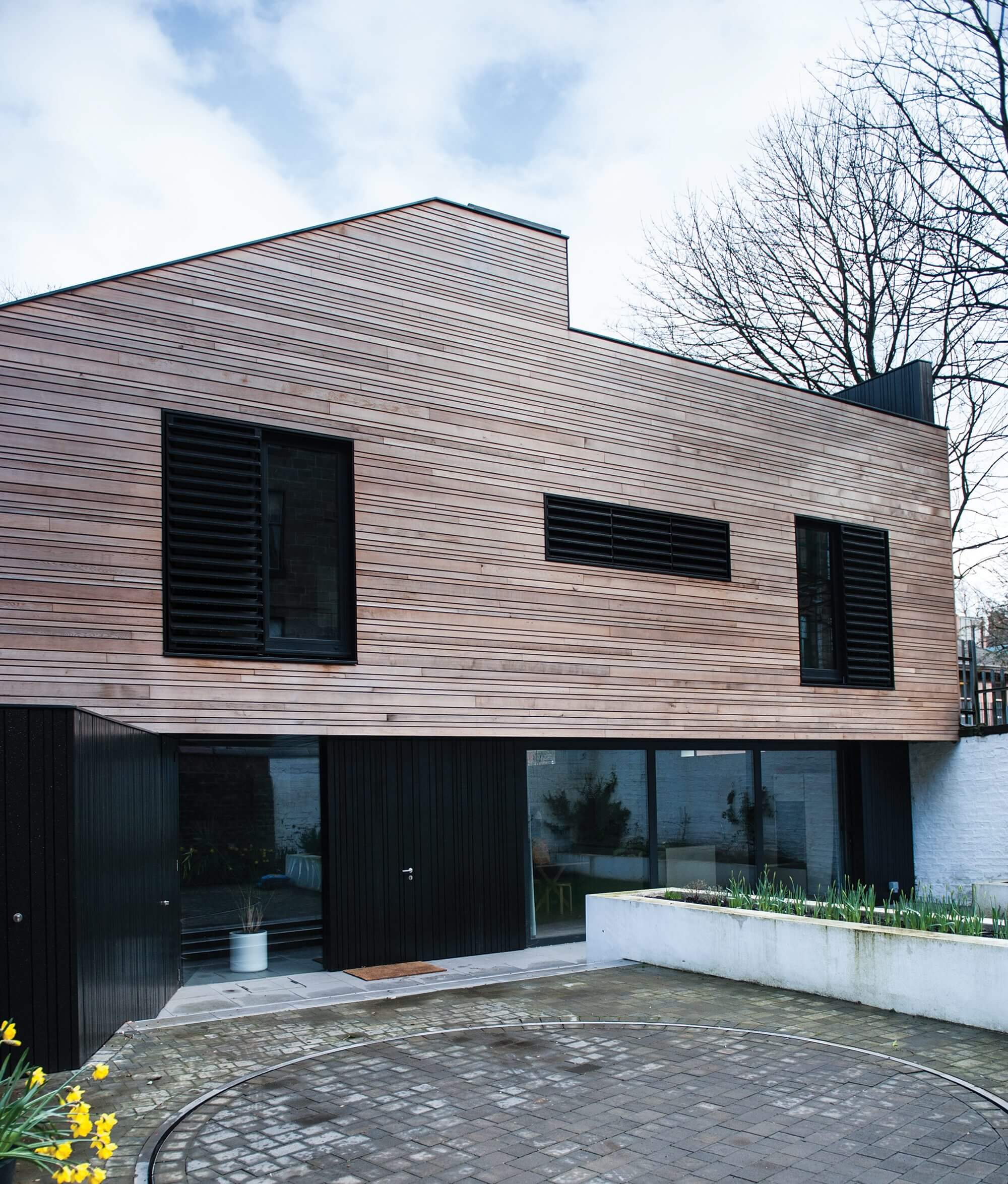
Using their creative credentials and their close relationship to the architects, the couple have created a sleek, modern three-storey townhouse for substantially less than a similar property in the same location would cost. Their new home is timber-clad, rich in architectural detail and nestled among traditional stone tenements in Glasgow’s trendy West End.
Residential conversion
When the workshop was initially put up for sale it attracted a lot of interest. Natasha and Neil, keen to be a step ahead of the crowd, had a word with the local planning department who intimated that there may be an opportunity to turn the building from commercial premises to a residence. The couple also visited the site with architect Stuart, who immediately saw its potential.
With no hesitation the couple lodged an unconditional offer for £300,000. “Lots of people put in bids but ours was the only one that was not subject to planning and I think that’s why we got it,” says Natasha.
In terms of design, the couple wanted something contemporary and bright – a contrast to their old home. “Our tenement was great – the rooms were huge and the ceilings about 3m high – but we wanted a house that was light and airy, where there was scope for an open plan configuration,” says Natasha.
Friendship aside, the couple knew that they had picked the right architects. “We really like the work of Cameron Webster and that’s vital,” says Natasha. “In particular we love their use of windows to create light and a sense of space. You can’t work with a designer if you don’t like their style. We had a creative chat at the beginning of the process to gauge how the building would work and how we wanted it to feel. The key aim was to transform the semi-derelict workshop and office into a calm, private city house.”
A detailed design
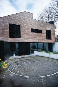
The property is accessed via a passageway below a tenement block and a narrow lane. It is orientated east-west, and bound to the north, south and east by the site boundary and adjacent backcourts. A car turntable has been installed on the forecourt of the house, allowing for off-street parking and a safe means of exiting the lane.
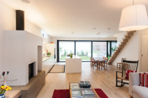
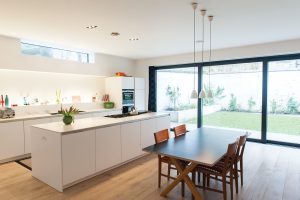
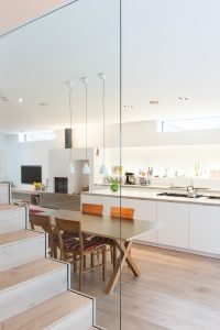
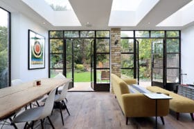
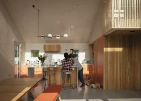
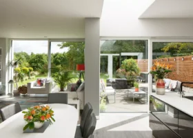
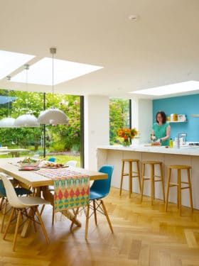
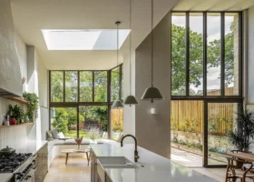
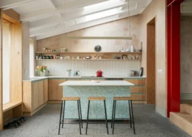
Because the site was so comprehensively enclosed, the architect had to come up with some creative ways to get light into the new house. On the south-facing ground floor there is a single-storey extension that contains the open plan kitchen, living and dining area. Floor-to-ceiling glazing on this aspect allows in bountiful natural brightness. A roof lantern on the eastern side of the house boosts this further, in addition to large patio doors that lead out to a private walled garden.
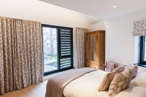
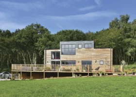
The new west elevation of the property is split into two elements, with a lower storey that’s a mixture of glazing and black-painted cedar cladding. The cantilevered level above is finished in attractive contrasting tones, with natural cedar cladding and black window frames and shutters. These materials were all selected to be low maintenance, partly because future access to the exterior would be difficult – the cedar cladding will gradually fade to a natural matte silver and won’t need treating, for example.
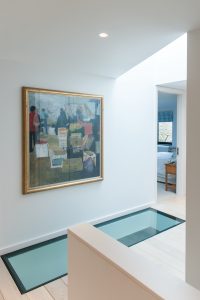
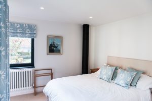
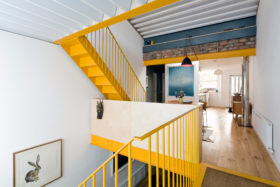
The interiors create a calm, light and spacious environment, and allow Natasha and Neil to display their textile designs to full effect. The first floor accommodates four bedrooms and a family bathroom, all positioned around a double-height hallway topped by a large rooflight. A further staircase leads to a loft and roof terrace.
“We wanted to create a sense of softened minimalism by subtly using textiles to get warmth into the space. So there was to be nothing to fight with your eyes – just a neutral background so that textiles on windows, cushions on sofas and paintings on the walls would be shown to their best advantage,” says Natasha.
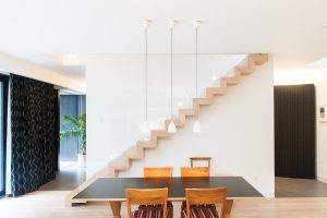
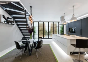
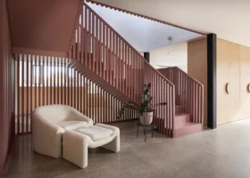
Throughout the entire work there was only one occasion on which fidelity to the carefully drafted design plans was abandoned. The couple had originally wanted to put a solid balustrade at the side of the staircase and to incorporate shelving underneath it. But when they saw what a striking feature the floating structure was, they decided to border it with glass and dispense with the storage.
Building up
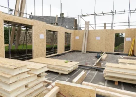
Neil and Natasha oversaw the conversion project themselves, hiring a firm of local builders and making site visits on most days to check progress. They’ve retained the two side walls of the existing structure, along with two-thirds of the roof. The back and the front of the property were pulled off and the internal partitions removed.
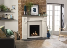
Unfortunately, the couple spotted several mistakes on the job early on. “A partition wall between a bathroom and bedroom was out of kilter to the extent that the bath would not have fitted, and the kitchen cabinets were in danger of not quite connecting with the fireplace as we had intended,” says Natasha.
In the end, they had to let the original firm go, and it took a succession of three further builders to take the project to completion due to a variety of hiccups.
“In future I would ensure that we got a quote for all the work that needed to be done in advance of anything starting – rather than just proceeding on a day-rate basis – and I would try to put penalty clauses in place for delays,” says Natasha. “We ended up going over budget by £70,000. We were living in rented accommodation and our furniture was in storage, so every penny was a prisoner, as it were, and it was quite stressful at times.”
Despite the inherent challenges in starting with an existing building, there were some financial advantages. The couple were able to get a special refurbishment mortgage, which had more flexible terms and conditions than a development one. Also the utilities were already on site, so those costs were taken care of.
Worth the effort
Since the day they moved into it, the refurbished building has continually repaid all the effort that was put into bringing it back to life. In summer, the couple like to sit on the roof terrace with friends and watch the sun set over the surrounding tenements. And the interior is proving pretty restful all year round.
“There are links to nature everywhere,” says Natasha. “I like to lie on the couch after work and gaze at the moon. Trees can be seen from every window and you feel like you’re in the country.”
This is a home for the long term and the couple doesn’t foresee moving from it in the near future. However, Natasha and Neil will continue to apply themselves to the rigours of renovation. They are now focusing on their small hilltop holiday cottage in the Scottish countryside in an effort to make it every bit as comfortable as their city home.































 Login/register to save Article for later
